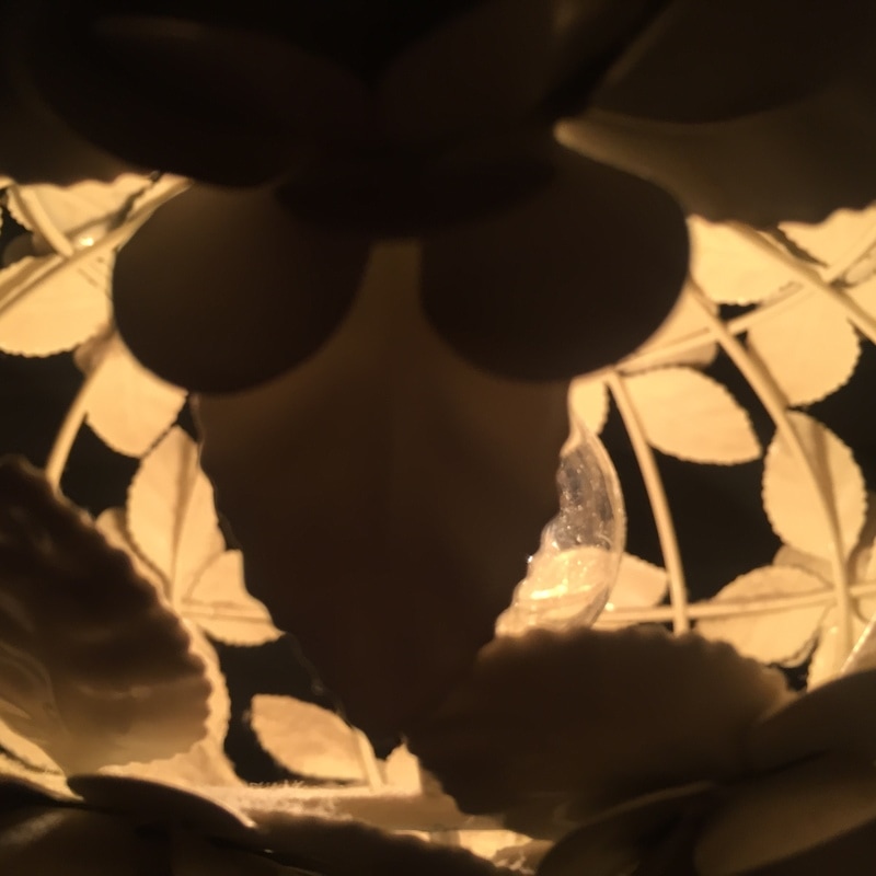
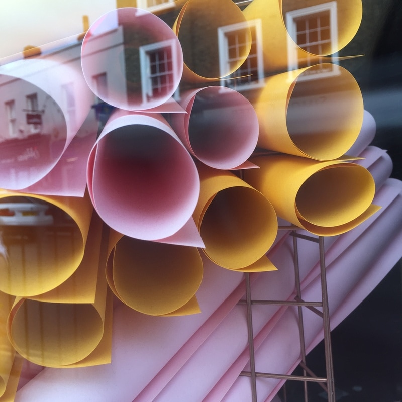
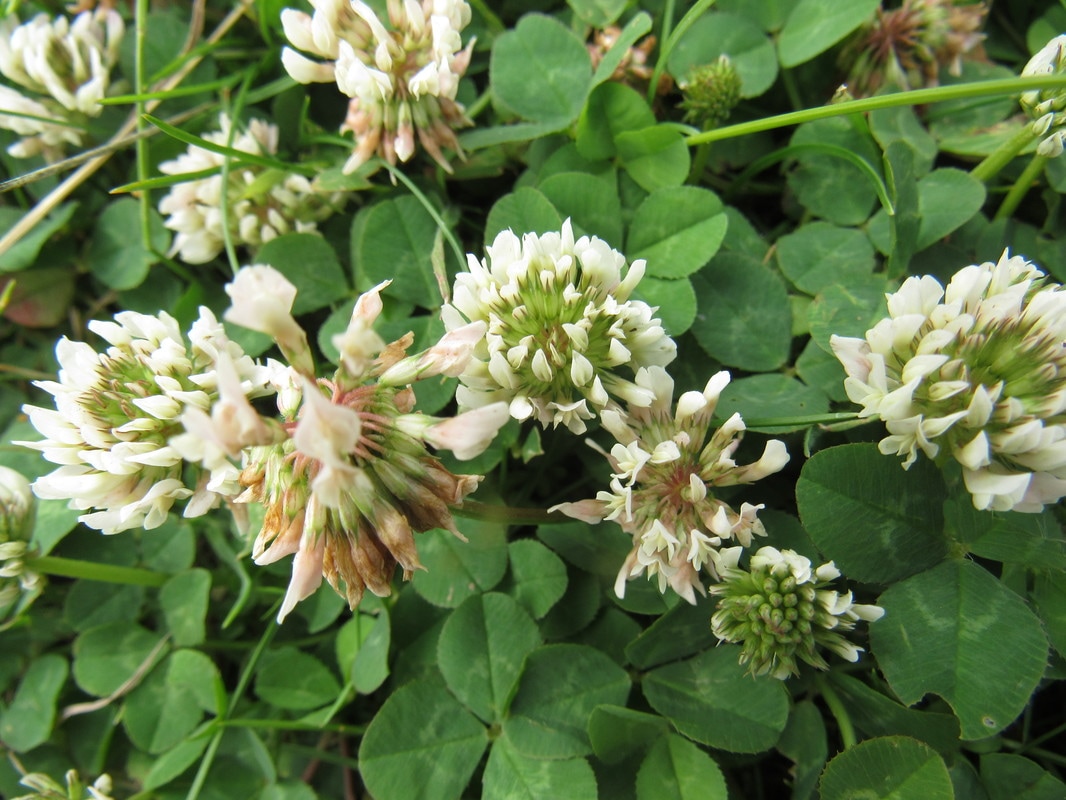
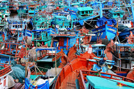
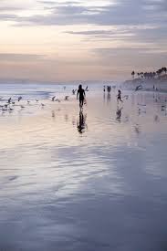
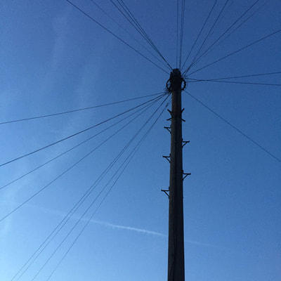
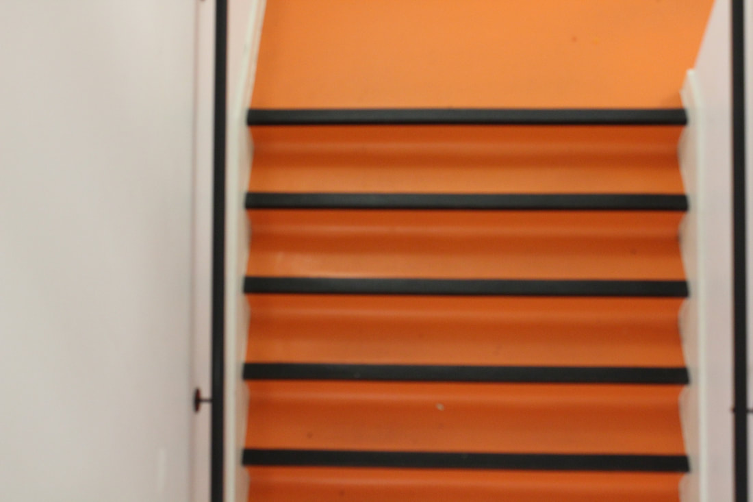
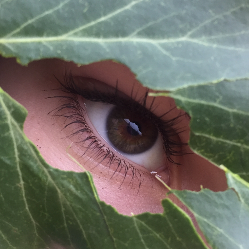
My spider diagram:
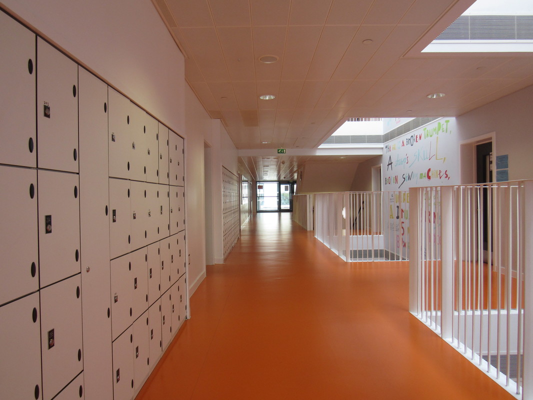
I have chosen to do openings as I feel that it is a very interesting topic yet there is also a lot of freedom within the subject to personalise it to my own style. There are a range of things that could be photographed such as the ones displayed above. These are just some ideas of objects or areas I may take photos of/in. However, at the moment I am indecisive of the focus of my topic: openings. With some more research, I am confident that I will have some ideas to think about whilst producing my final piece.
Rinko Kawauchi
Rinko Kawauchi is a Japanese photographer who incorporates soft pastel colours into her work. I'm very fond of her style and I definitely have been inspired by her photographs, and I will think of her work when I'm creating my final piece. After observing her photos, I have realised that she uses elements of nature in her work whilst also capturing openings, which is exactly what I intend to do. She uses animals, plants, flowers and fruits which are all things I enjoy taking images of too. Due to her use of pastel colours and natural imagery, she has quickly become my main inspiration for my final piece.
If there is a main subject within her pictures, the background is often out of focus. I like this because It makes the lines in the background softer, matching her colour scheme and style. In addition, she frequently incorporates femininity into her images, for example, flowers and nature.
If there is a main subject within her pictures, the background is often out of focus. I like this because It makes the lines in the background softer, matching her colour scheme and style. In addition, she frequently incorporates femininity into her images, for example, flowers and nature.
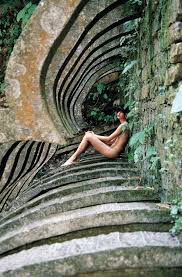
One image analysis: Rinko Kawauchi
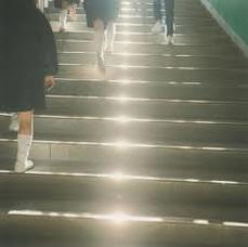
The photo displayed on the left was taken by Rinko Kawauchi. She uses stairs as a man-made opening for the focus of her image. I like the photo and I think stairs was an appropriate choice for this topic as they create an opening to many different places and it leaves us questioning as to where this particular set of stairs may be leading to. All the people in the image are dressed in all black with white shoes and socks yet they don't appear to be walking as a group. Some of the legs are blurred and this may indicate that this picture was taken whilst the people were in motion.
There are many straight lines in the picture such as the edge of the stairs and the line of lights in the centre of the photograph. However, the image is taken at an angle which causes these lines to be slightly horizontal. The picture is quite dimly lit despite the path of lights running through the middle of the stairs; creating an offbeat ambience.
There are many straight lines in the picture such as the edge of the stairs and the line of lights in the centre of the photograph. However, the image is taken at an angle which causes these lines to be slightly horizontal. The picture is quite dimly lit despite the path of lights running through the middle of the stairs; creating an offbeat ambience.
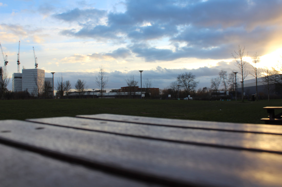
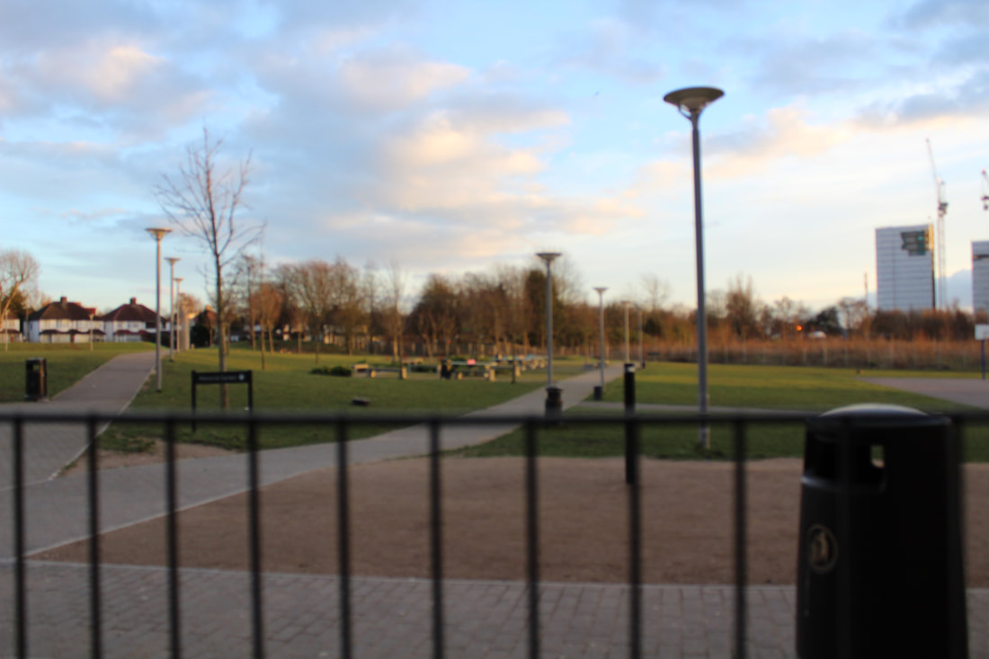
My initial response:
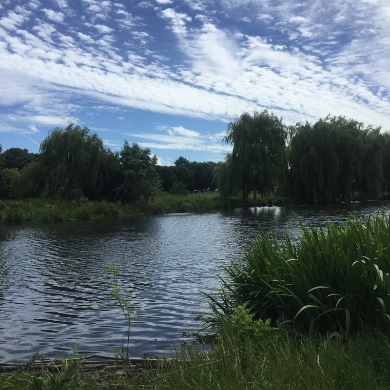
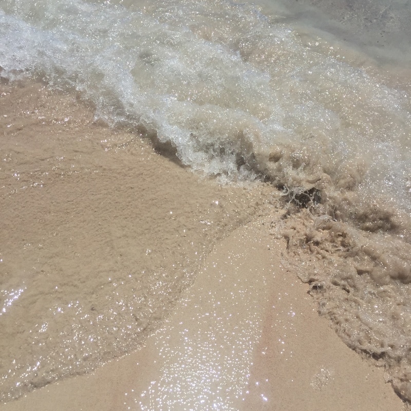
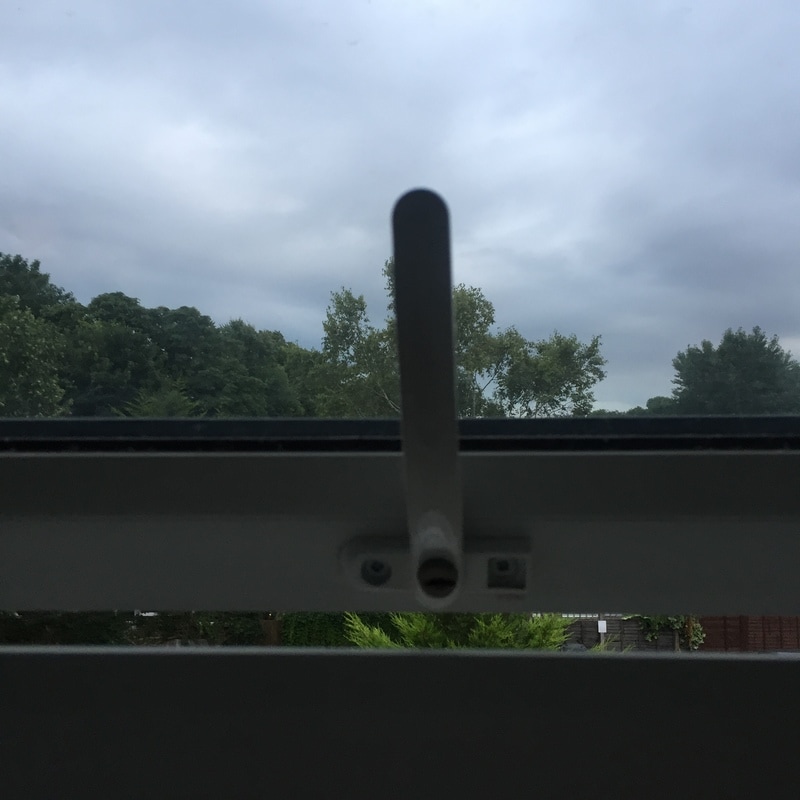
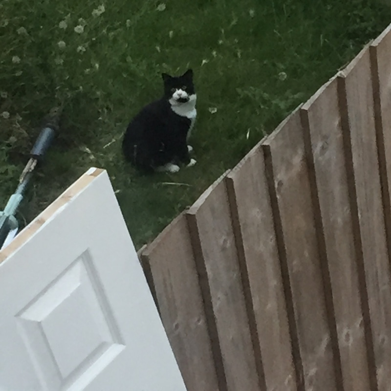
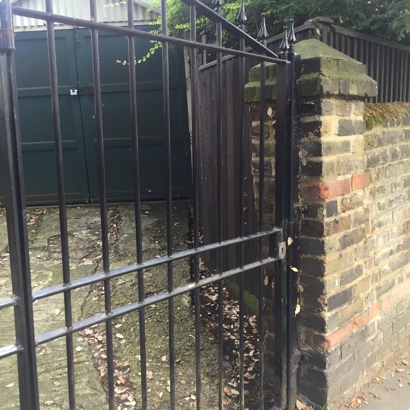
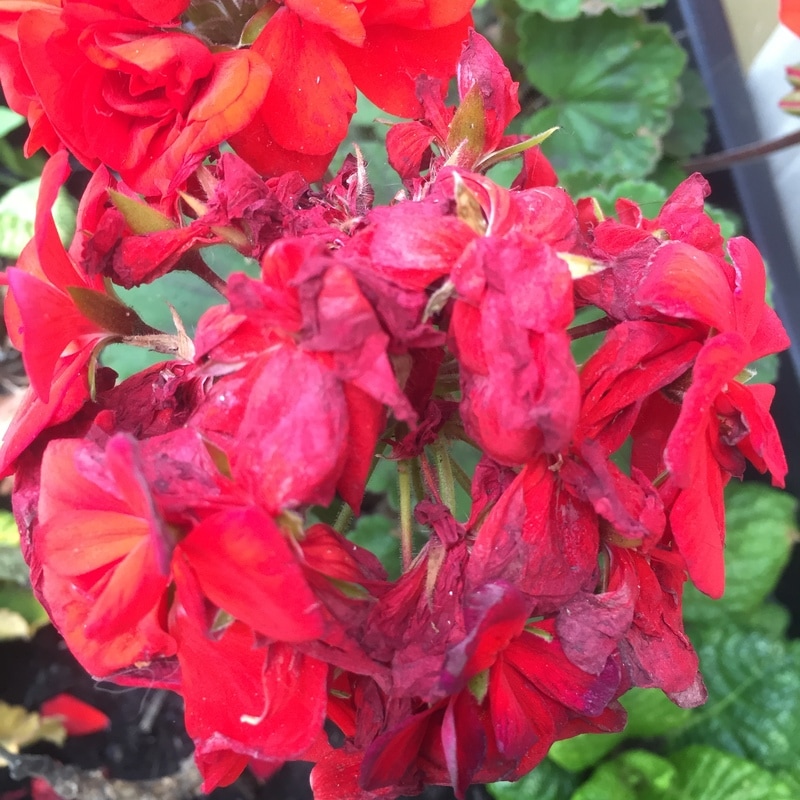
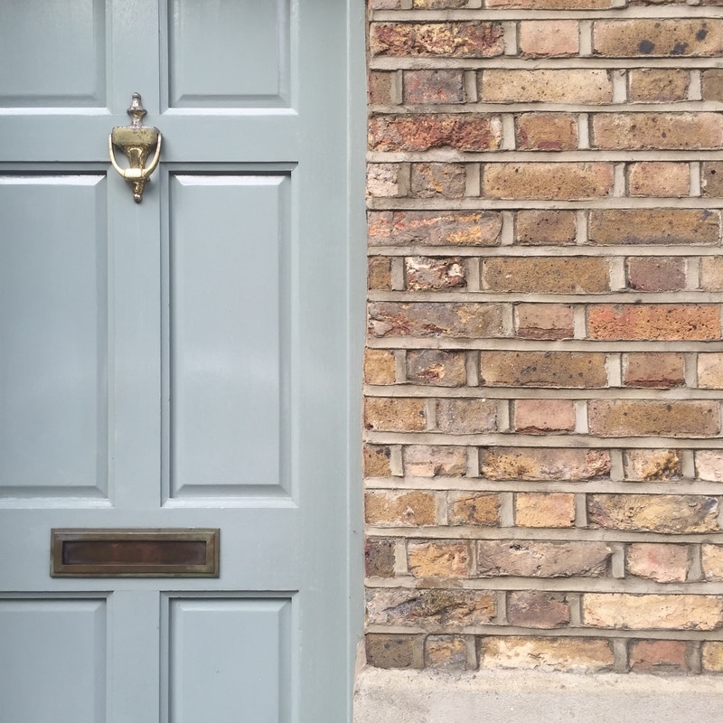
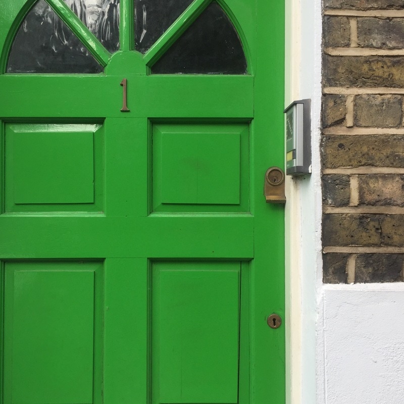
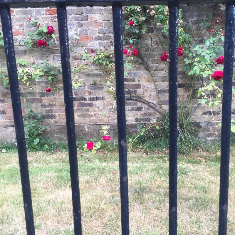
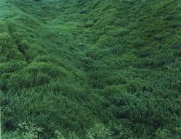
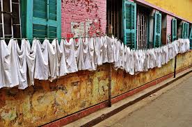
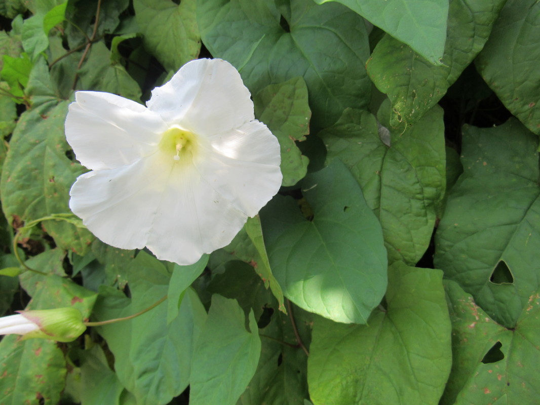
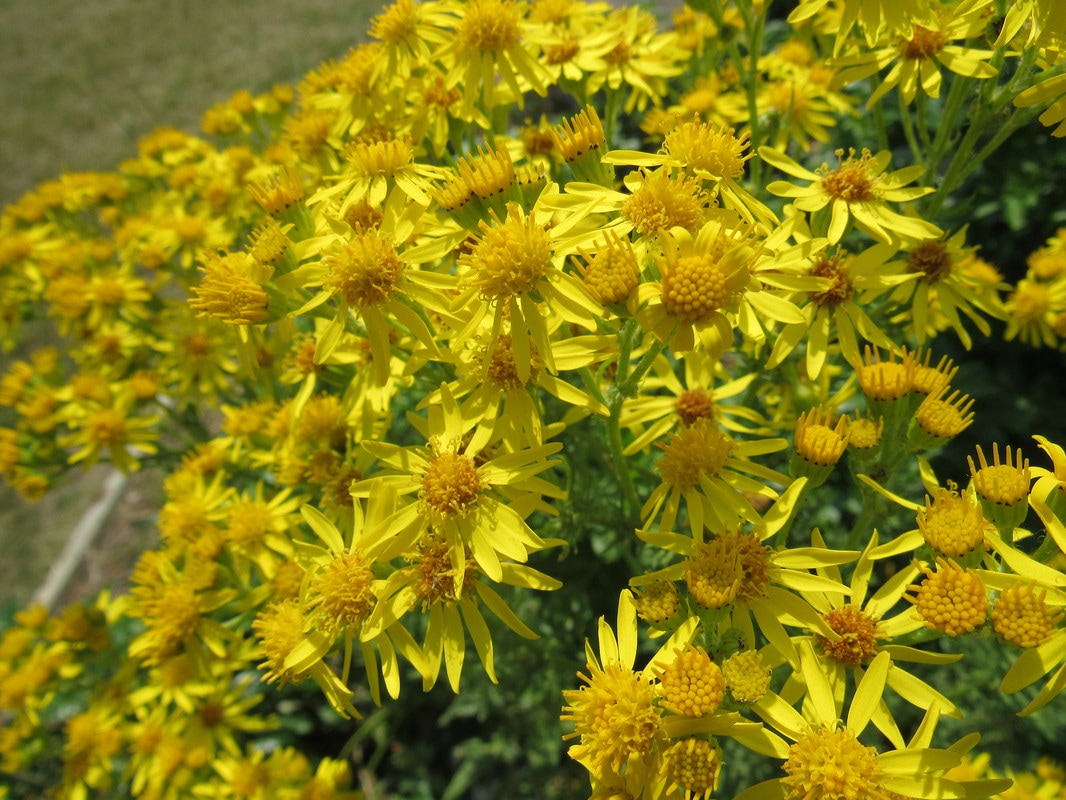
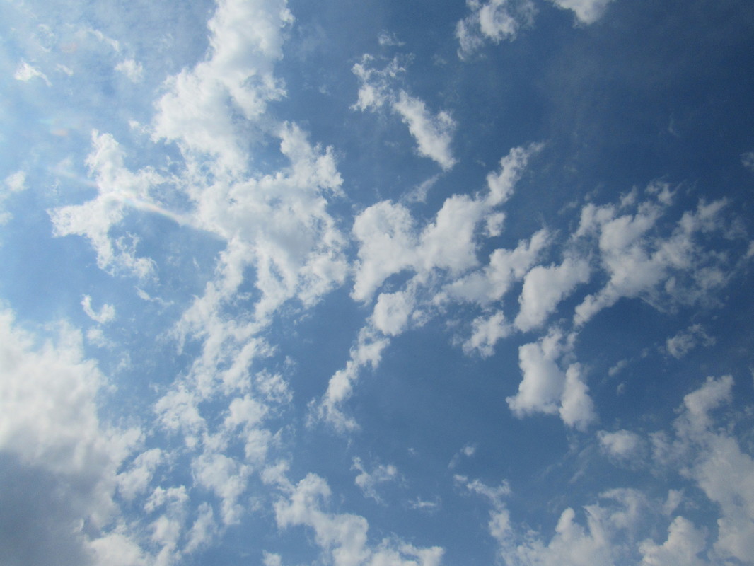
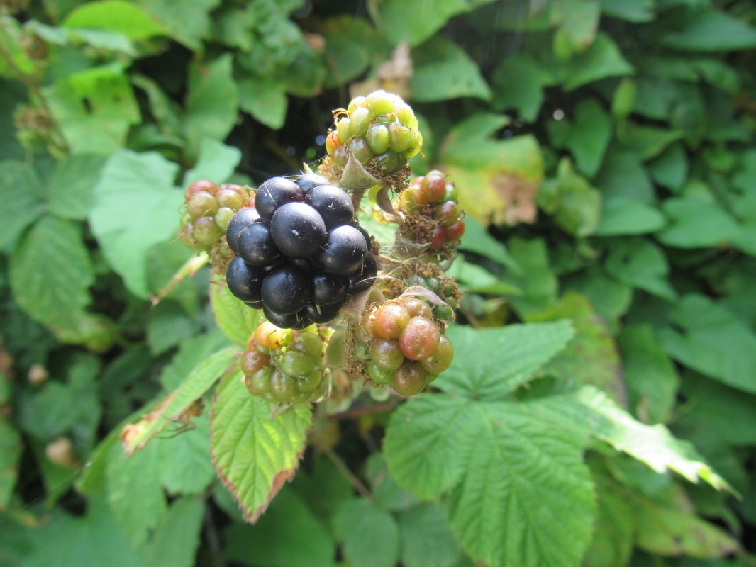
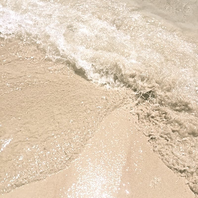
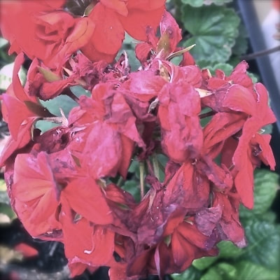
The images displayed above were taken by me over the course of five days. I wanted to find different openings in a variety of different locations which included my garden, my route to school, the beach, a public park and inside my home. This provided me with many opportunities to see how we use openings throughout out daily lives. I like the bright bursts of colour such as the green door and red roses. Throughout the project as a whole, I enjoyed it because it allowed me to practice my observation skills, because although I may walk the same route to school five days a week, there are plenty of things I hadn't noticed before. Next, I think I will take images of elements of nature for example flowers and greenery because I feel that the images that included this in this experiment were more successful and engaging than the others.
Shizuka Yokomizo
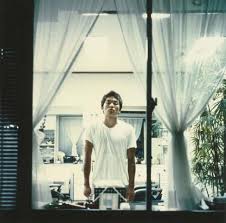
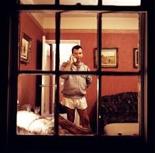
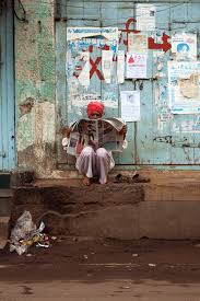
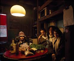
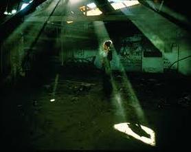
Shizuka Yokomizo is a Japanese photographer who is well known for taking images of strangers through the windows of their homes. I find this very interesting as when we meet people for the first time it isn't usually in their own home, and this gives us a first impression that we don't usually have. This allows us to see their personality and style through their clothes, appearance and their own personal space. He also seems to take photos with a red hue quite often which creates a unique style which is personal to him. His last image from the six I have chosen is actually in black and white. Although this looks odd amongst the others, it still matches the intriguing yet some what bewildering atmosphere in the rest of the images. After investigating his photographs, I would like to experiment with filters and dramatic changes in light because this is the most intriguing thing in his images to me.
One image analysis: Shizuka Yokomizo
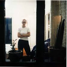
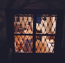
The image shown above is one of my favourites from this photographer. I think it is effective because we can see how the woman presents herself by her body language, facial expressions and her home, this gives us an insight into her character. The lady is on the left of the image and stand with her arms folded and a serious expression on her face, this shows that she may see herself as powerful or formidable. In the foreground of the photograph, there are plants and two bold black lines blocking the window, although I'm not sure of why they are or the purpose of them. In addition, the colour scheme is mainly black and white yet there are some accents of green in the plants and also on the curtains adjacent to the woman. I like this as it is a subtle hint of colour and it doesn't overpower the neutral tones. The most interesting thing about this photograph is how we can obtain a small insight into her personality and her daily life by observing her posture and her room. Yokomizo's work has encouraged me to think more deeply about what message I'm trying to illustrate within my own photography.
Dragan Todorovic

I have chosen Dragan Todorovic as the subject of my artist research as his combination of colourful and dark photographs stood out to me. There are generally people in his images however they aren't usually the focus of the photo. I will definitely use his work as an inspiration as I also like creating a contrast in colour in galleries of images I produce, unless the main focus of the photographs are the colour. He uses dark colours and orange/red hues. Although this is not a colour scheme I'm personally fond of, I like the way the colours look together, I will try to recreate this however I will aim to use lighter pastel hues in contrast with white.
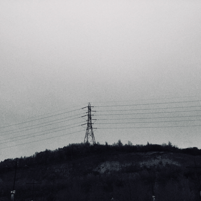
I have also noticed that Todorovic consistently uses clouds within his images, which was actually in my spider diagram, the first piece of work I done on openings. Therefore, presuming the weather is suitable; I will try to photograph clouds in my next piece of work in some way, perhaps I will dedicate a project to it.
I have also noticed that Todorovic consistently uses clouds within his images, which was actually in my spider diagram, the first piece of work I done on openings. Therefore, presuming the weather is suitable; I will try to photograph clouds in my next piece of work in some way, perhaps I will dedicate a project to it.
One image analysis: Dragan Todorovic
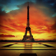
My favourite image from the six of Todorovic's I have chosen is definitely the image of the Eiffel Tower. The Eiffel Tower is a famous French landmark that is visited by hundreds of tourists every single day, therefore there are thousands of photographs of this monument all over the internet. However, Todorovic has managed to capture it in a different way from the rest. The colour scheme of dark and orange is fairly unique and give the photo a mysterious ambience. Furthermore, the image looks clean and presentable due to the fact that the tower is perfectly aligned in the centre of the photo which creates symmetry.
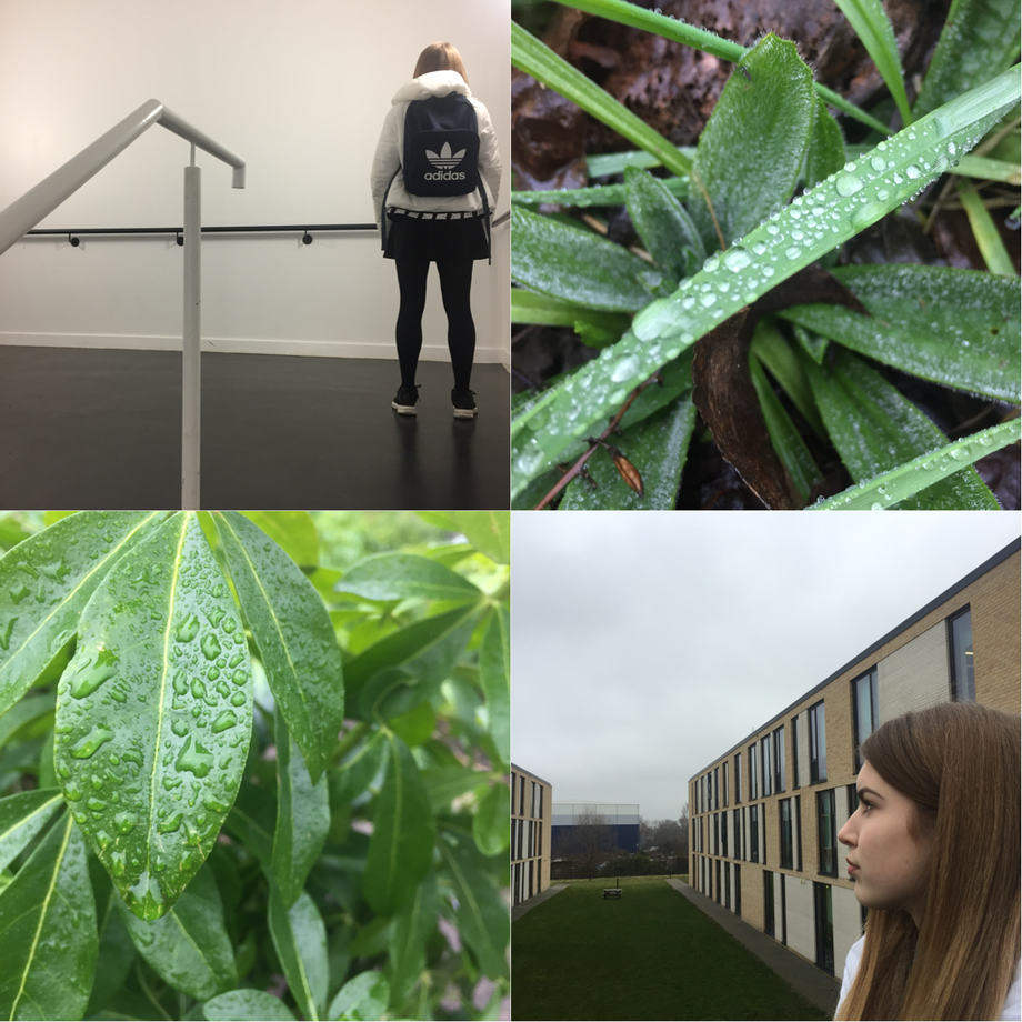
My initial response photographs.
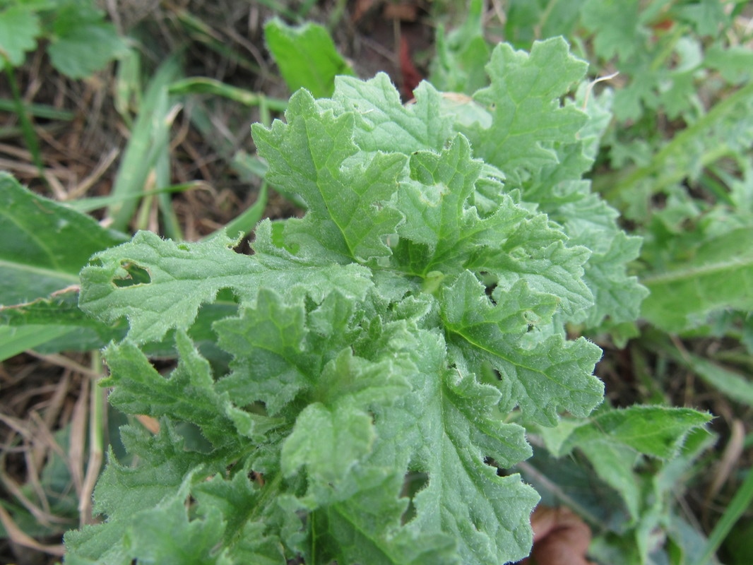

In this project, I tried to use the theme of nature in my photographs although I didn't stick to this in every picture. For the majority though, I captured nature in my pictures whilst also sticking to my topic of openings. I liked this task as it allowed me to see aspects of the natural world in detail and I realised that there were many different types of plants in a very small, secluded area. This allowed some great oppurtunities for both close up and long distance images. One thing I particularly like about my final result is that I have ended up with a collage of mainly green with flashes of other vibrant colours such as purples, pinks, reds, whites and yellows, all of which were not man made.
I'm glad I decided to take images of openings in nature as this meant I would stay away from the typical openings such as doors and windows, leaving me with a more unique result. As a consequence, I will still be aiming to use greenery and plants in my next project too so I can further and improve my final results.
I'm glad I decided to take images of openings in nature as this meant I would stay away from the typical openings such as doors and windows, leaving me with a more unique result. As a consequence, I will still be aiming to use greenery and plants in my next project too so I can further and improve my final results.
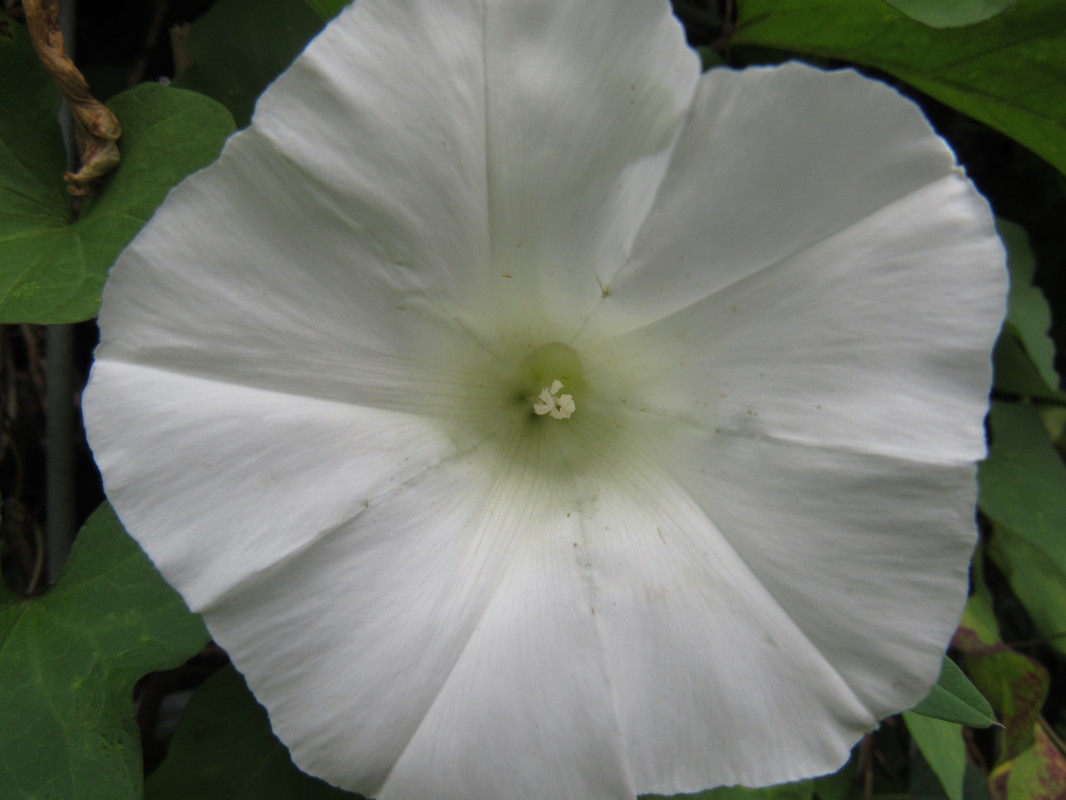
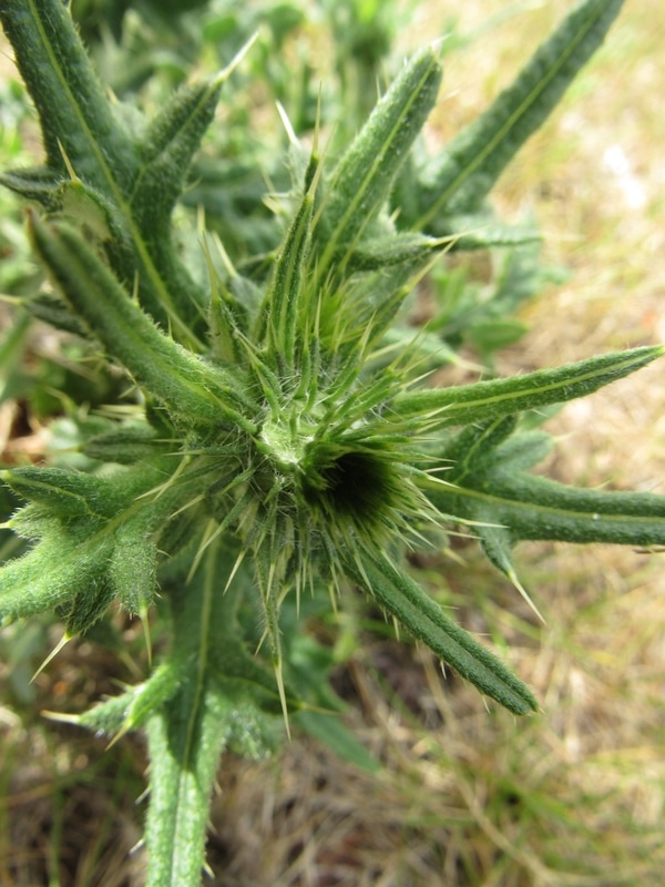
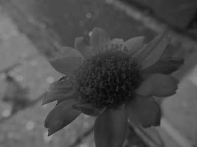
Detailed image analysis:

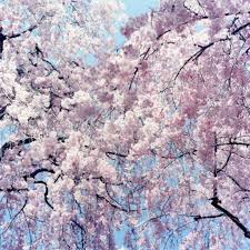
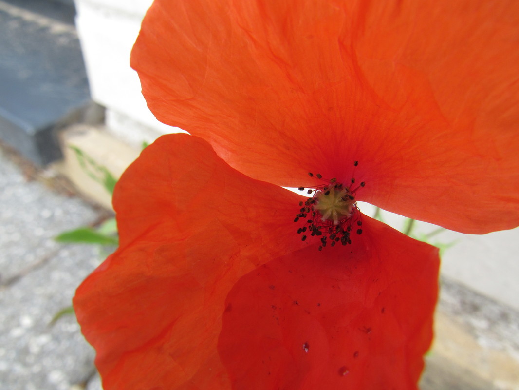
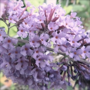
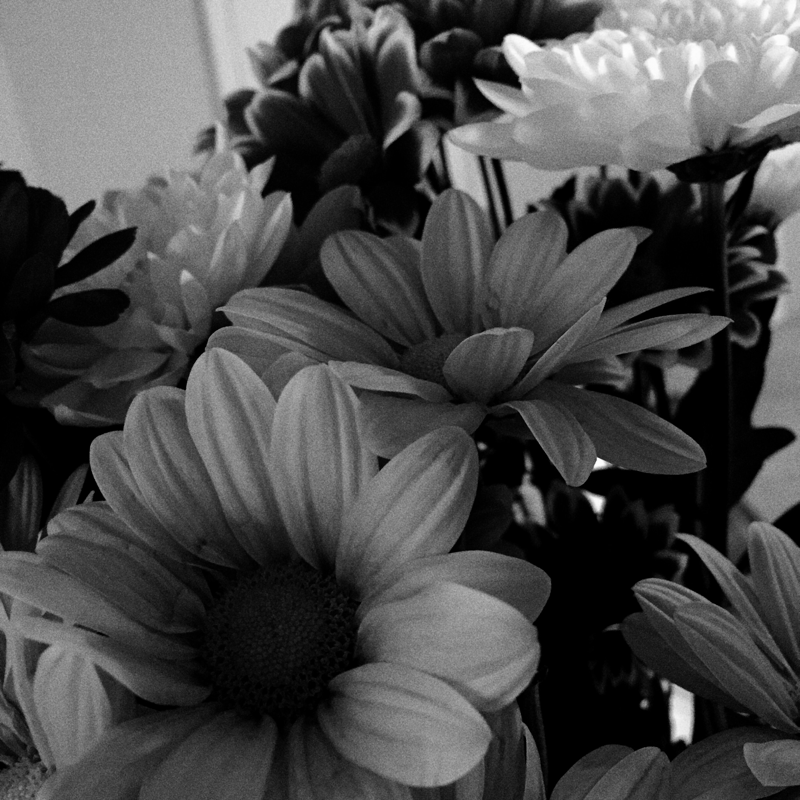
The most striking thing about this photograph to me is the different shades of colour and how they blend in with each other perfectly. Furthermore, the background is blurred and this works well with the intention of the image as it brings our attention to the flower in the centre. Each component of the flower is in such detail that we can see the transparency of the petals. The spacing in this photo is also something that is eye catching to me. The flower covers most of the image although we can see some of the background. There isn't much symmetry in the image as it is naturalistic, hence the edge of some petals have been slightly cropped out of the photo.
In regards to openings, I do think this photograph is effective as we can see how each petal is opened out and the cluster of stigma in the centre. The way that the petals are flicked at the ends is almost inviting, it frames the flower perfectly and I think this is shown nicely in the image. The background is out of focus yet we can see that there is grass, leaves and other flowers there. This adds more colour yet it doesn't distract us from the focus of the picture, it simply adds contrast.
In regards to openings, I do think this photograph is effective as we can see how each petal is opened out and the cluster of stigma in the centre. The way that the petals are flicked at the ends is almost inviting, it frames the flower perfectly and I think this is shown nicely in the image. The background is out of focus yet we can see that there is grass, leaves and other flowers there. This adds more colour yet it doesn't distract us from the focus of the picture, it simply adds contrast.
Colin Roohan:
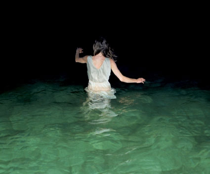
Colin Roohan is a travel photographer who is "interested in documenting experiences with culture and life." I absolutely love all of his photos and I also think they often have an amazing representation of openings in photography. All of his photographs are colourful, exciting and full of life, and tell stories from around the world. He beautifully depicts foreign lands through his photography in the most vibrant way, which look phenomenal together in a collage. Although my chances of going to a location as exotic as this in the near future are low, his work has still deeply inspired me and I will try to refer to it when possible within this topic.
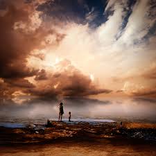
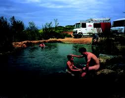
This is my favourite picture of Roohan's; it's exquisite. I particularly like how the the top half of the image is reflected in the water as this emphasises the soft pastel colours in the sky, and how they effortlessly blend in to each other. The water seems very still and calm and we can see people and animals playing in the ocean, however, we cannot see this in detail as they appear as silhouettes, allowing us to focus on the scenery more. The lines in the image are very soft, matching the colour scheme and creating dream like scenery. Furthermore, the lighting used is also very soft and mellow, so as we can see, there is an overall theme of softness within the photograph.
Themed opening boards:
Further experimentation:
For this experiment, my goal was to take several close up images of the objects in focus. I like many things about the images including the definition and the bright colours. However, this didn't meet up to my personal expectations and I think in the future, I will try to create more interesting images that encourage people to seek the deeper meanings within the photographs. Therefore, next time I take images for this topic, I will try harder to make them more engaging to the viewer.
Experimentation with photoshop:
Due to my research on Karl Blossfeldt displayed under my 'artist research" page, I was inspired to take some plant based photos in black and white whilst also including openings. I like how the photos are ordered as the image in the centre as there is more space and simplicity, whereas the other two images have less space and have a variety of textures and more complexity. I like these images in both black and white and in colour although when they are in black and white it allows us to focus more on other interesting elements rather than just the bright colours.
Out of the three, the photograph on the right is the most visually striking to me. I think this is because its high definition and that the opening is directly in the centre, furthermore, the background being blurred emphasises this high level of definition and draws us to the subject of the photo; the plant. I definitely think that this process has encouraged me to use photoshop more in the future and to improve on previous tasks by experimenting with different elements, styles and arrangements.
Out of the three, the photograph on the right is the most visually striking to me. I think this is because its high definition and that the opening is directly in the centre, furthermore, the background being blurred emphasises this high level of definition and draws us to the subject of the photo; the plant. I definitely think that this process has encouraged me to use photoshop more in the future and to improve on previous tasks by experimenting with different elements, styles and arrangements.
Amanda Charchian
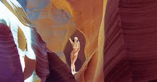
Pheromone Hotbox is a book by Amanda Charchian that captures the nude female body in various locations across the world. As you can see above, openings also play a large role in her work and they almost seem to frame her images. I like the wide mix of settings in her photos which she achieves by taking the images as she travels the world. Each photo seems to have it's own atmosphere and it's own colour scheme, and as the viewer, I feel as though this helps to keep me interested in her photographs and eager to see more due to the fact she is never repetitive.
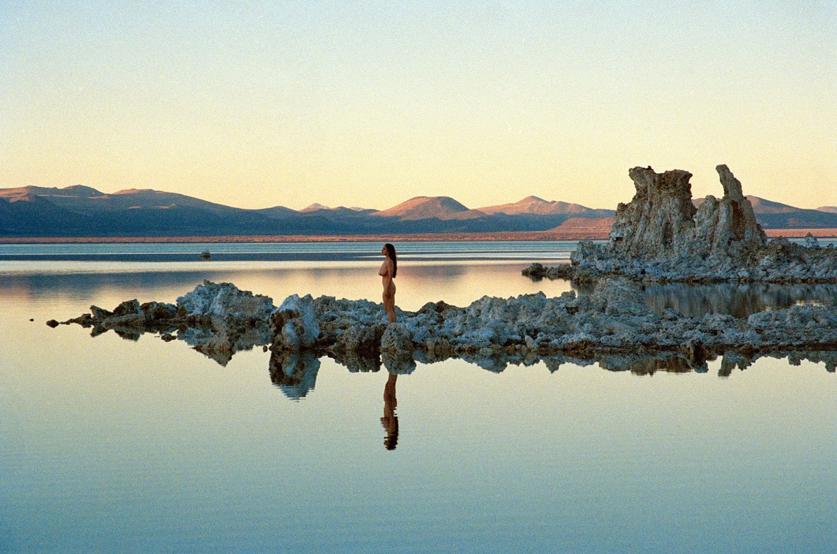
This is my favourite photo by Amanda Charchian. I thinks its really beautiful because the location is really picturesque and the sun is rising creating a bold reflection on the surface of the water. One thing I find particularly intriguing about the image is that she has managed to waste no space in the photo; both the background, foreground and centre of the image are being used and the colours harmonise perfectly together. The image is very naturalistic which is something we don't often see in our society today so this makes a nice change to see humans and nature together in an image. I think the use of nudity is not only empowering but it also helps to emphasise the use of nature in the image as clothes are man made.
The water, mountains and rocks all have very different textures which immediately become clear when even just glancing at the image. I think the first thing that catches my eye though would probably be the rocky landscape in the middle of the photo, this is because it is far darker than the rest of the scenery.
The water, mountains and rocks all have very different textures which immediately become clear when even just glancing at the image. I think the first thing that catches my eye though would probably be the rocky landscape in the middle of the photo, this is because it is far darker than the rest of the scenery.
Photographic experiment inspired by Rinko Kawauchi:
For this experiment, I decided to use six existing photographs from my website and edit them in order to achieve Rinko Kawauchi's soft, pastel style. I do think I was relatively successful in this, however, there are some clear differences between my photos and hers. Firstly, although I did edit my photos using photoshop, mine are significantly darker and more harsh than her style. In order to mimic her style more accurately, I think I would have to have this in mind whilst taking the images, opposed to using pictures from experiments prior to the task. Additionally, she often takes pictures of animals such as fish an insects, but I didn't have any existing photographs of these animals so I stuck mainly to the flower theme instead.
Despite this, I think the images that I did use worked well and the editing process certainly helped with this. For my next experiment, I hope to focus on openings again whilst also trying to achieve a similar approach to that of Kawauchi's. However, this time I will take new images and see how this affects the final result.
Despite this, I think the images that I did use worked well and the editing process certainly helped with this. For my next experiment, I hope to focus on openings again whilst also trying to achieve a similar approach to that of Kawauchi's. However, this time I will take new images and see how this affects the final result.
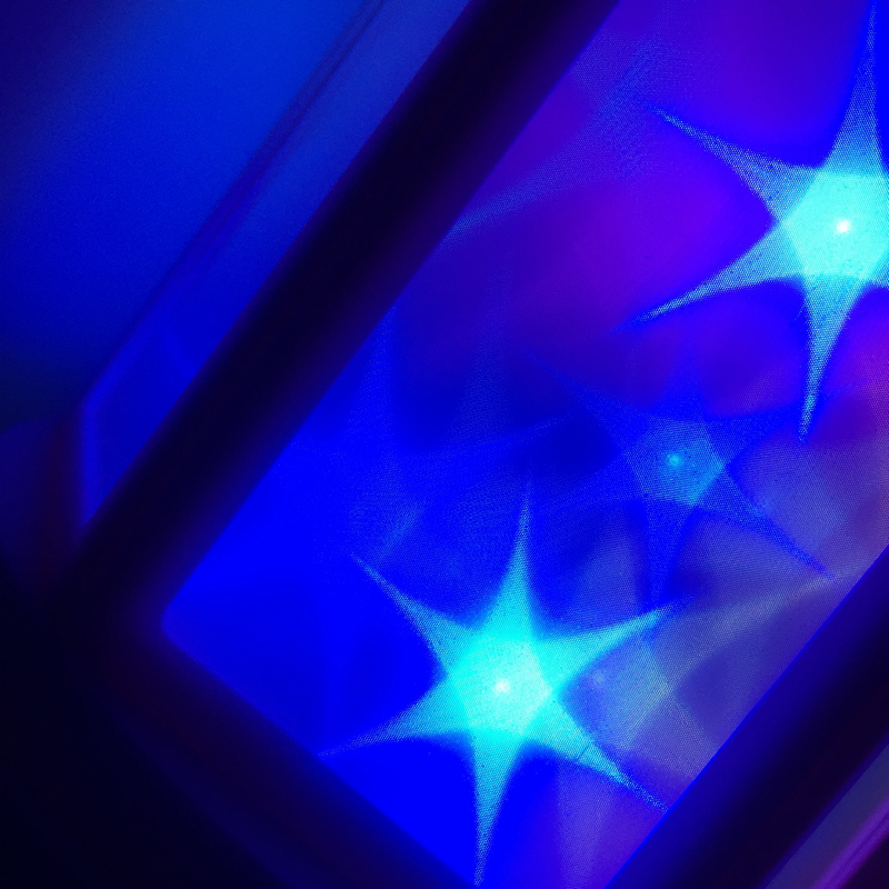
Neon openings board:
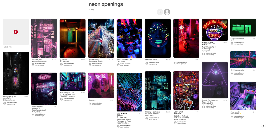
So far in this topic, I have noticed I have used a lot of pastel colours; I was inspired by my artist research on Rinko Kawauchi. Therefore, I decided that it was essential to change my theme in order to explore the topic of openings in its entirety. I have decided that for my next images, I will be using a sharp contrast of darkness and neon, hopefully to achieve results similar to that of the ones displayed on my mood board.
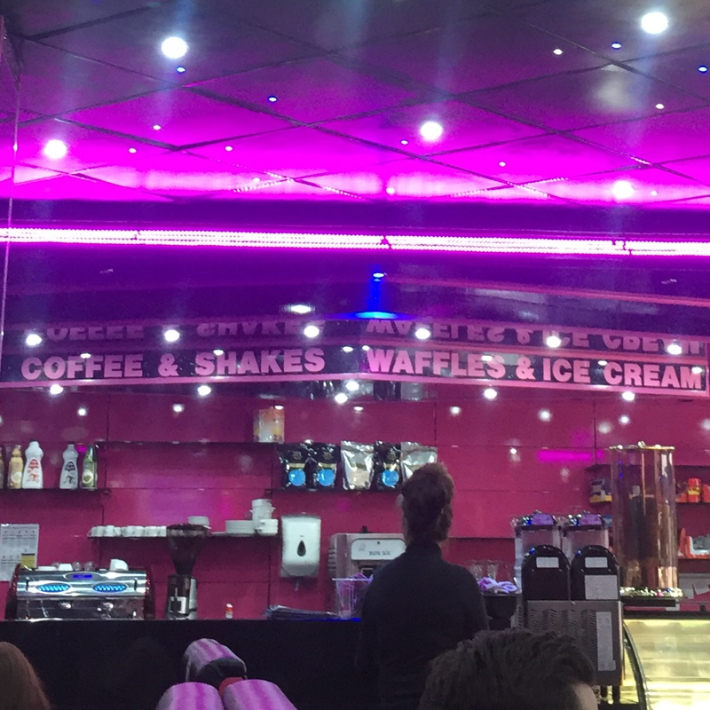
Hid Saib
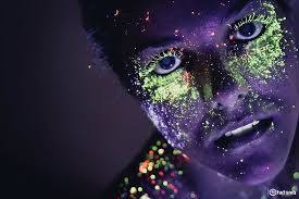
Before I attempt to start my experimentation, I decided to research a photographer that used neon. Hid Saib is from Brazil and the photos I have selected are from his project 'projecto neon'. Despite the obviously bright colours, his work stood out to me because the images were usually of the human body and to me this made them seem more alive. I'm unsure wether I have the right equipment to create photos as bright as his but I will still try. The thing that seems the most challenging to me is getting the neon to work how I intend it to and also keeping it relevant to my topic of 'openings'. I'm most excited for my work on openings to look more vibrant and I also want to challenge myself to try something that I haven't done before.
Sky openings:
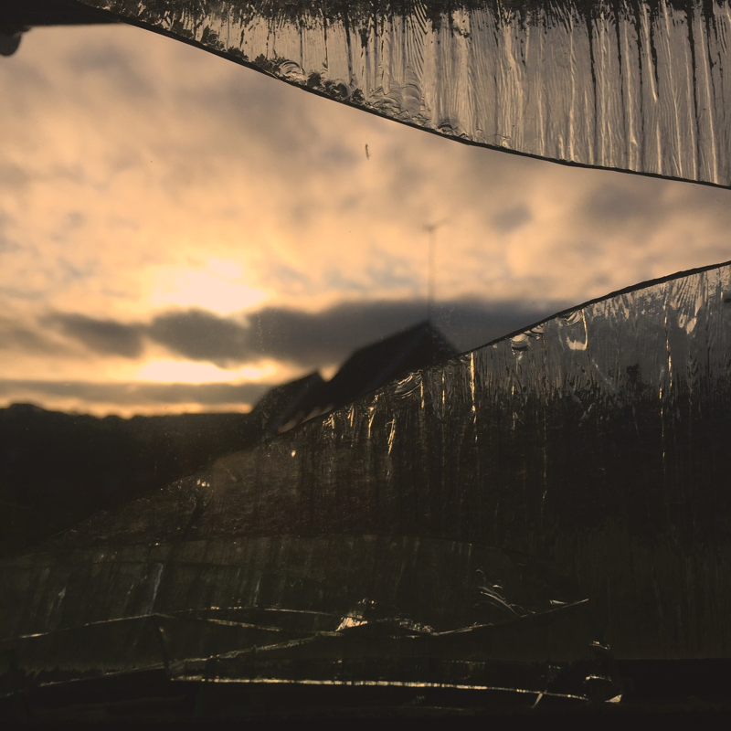
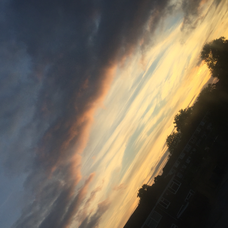
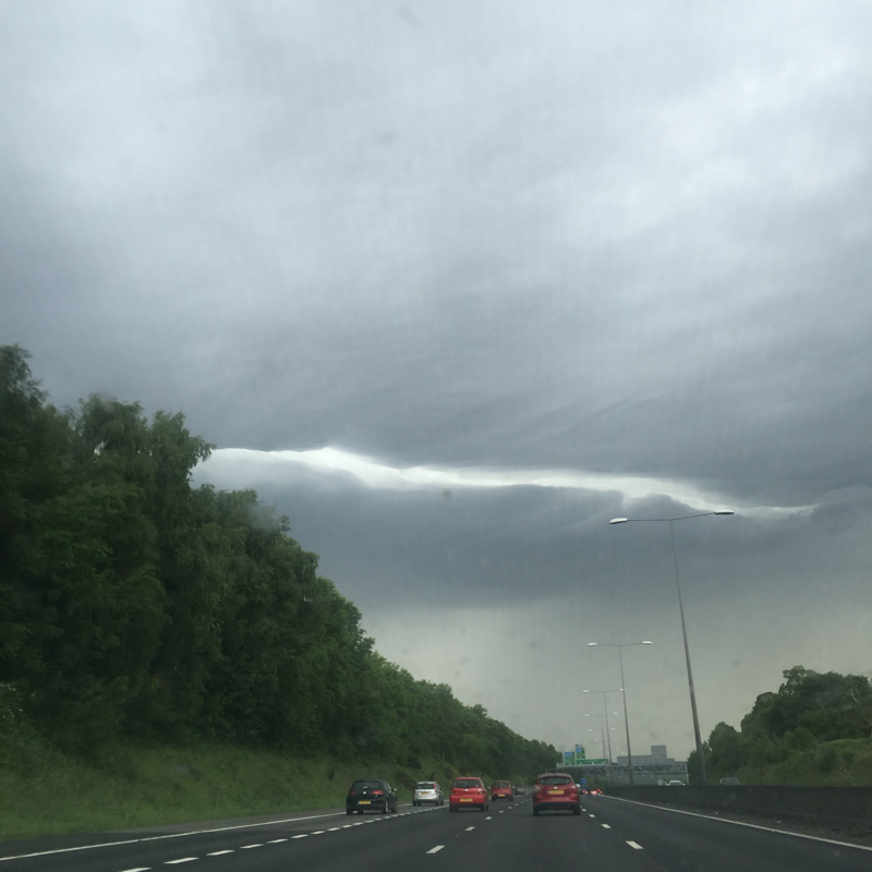
Although I'm still working on my neon project, I saw some really nice opportunities to take images of openings in the sky. The thing I really love about these photos is that although they are all taken in the same city and of the same object, they all have different colours and themes. The first photo has light colours and the last has darker ones whereas the photograph in the centre has a combination of the two. My favourite out of the three is the first one because the shattered glass in the foreground causes the sky to have a nice blurred effect which makes the image softer, contrasting with the harsh lines created by the glass. Furthermore, the setting sun creates small highlights against the glass making it look more three dimensional and adding depth to the image. If I was to improve this photo, I think I would experiment more with the angles to see if this could improve my image.
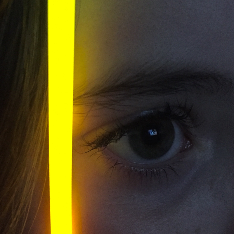
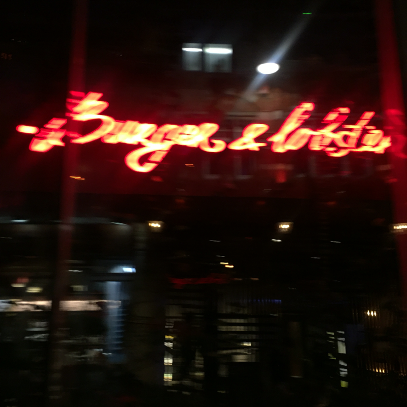
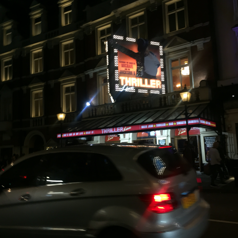
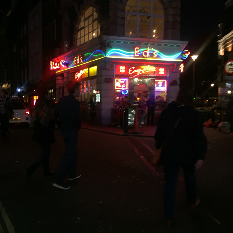
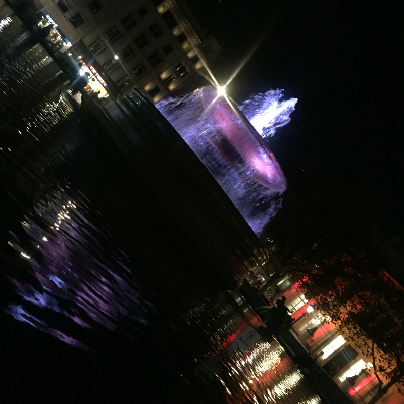
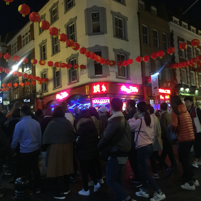
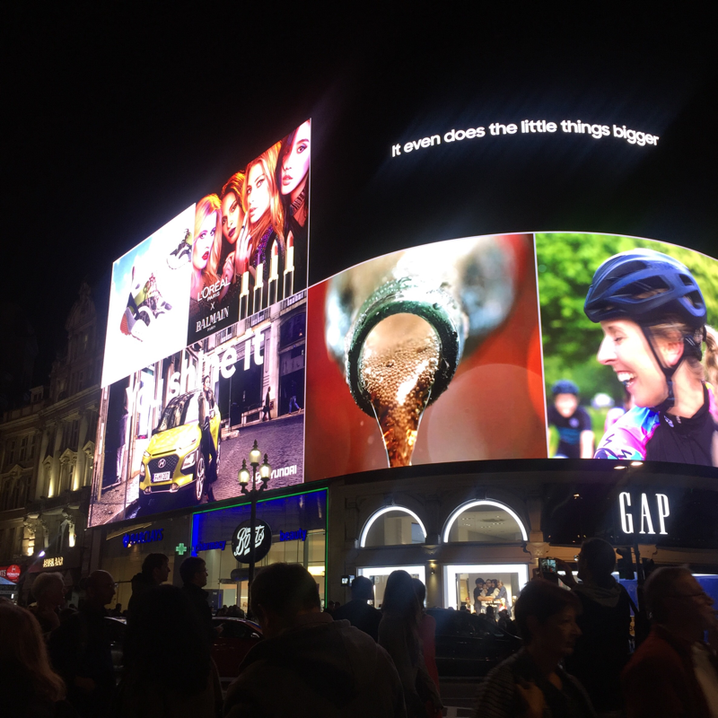
I really enjoyed completing this task. using neon creates a very compelling result. Also, as many shops use bright neon signs as a form of advertisement, this allowed me to easily combine my themes of neon and openings into one project. However, sometimes it was challenging to get my camera to focus on the neon and I was left with blurred lines and less precision. To avoid this, I had to make sure I had a very steady hand which was occasionally difficult because of how busy London's streets are on a Saturday night. I was certainly successful on trying something I had never done before. Additionally, I think that the contrast of dark and light honestly helps to make the photographs appear alive.
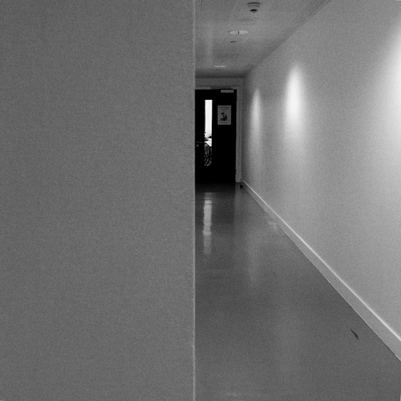
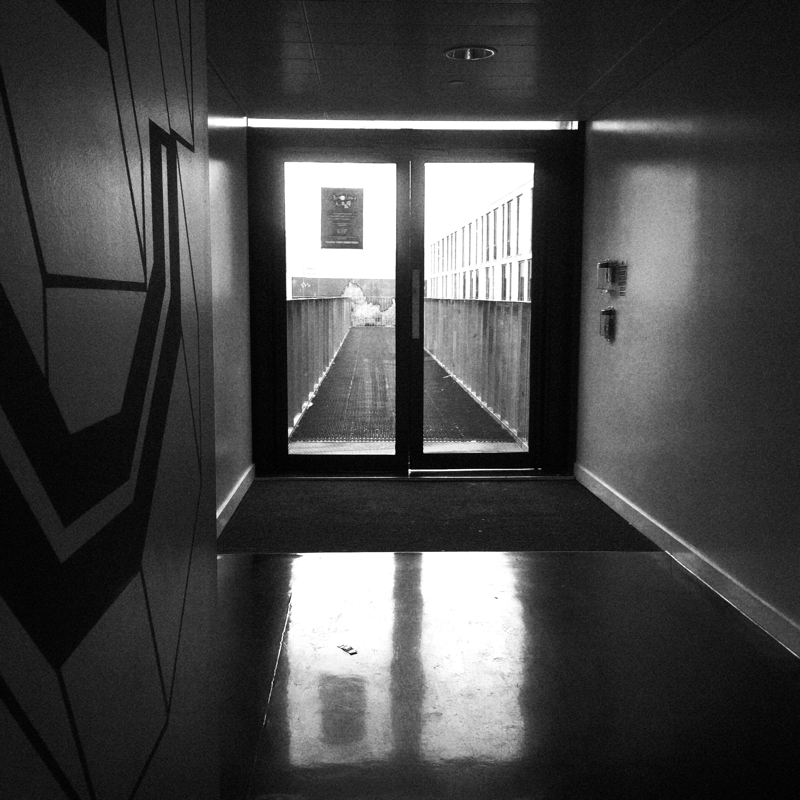
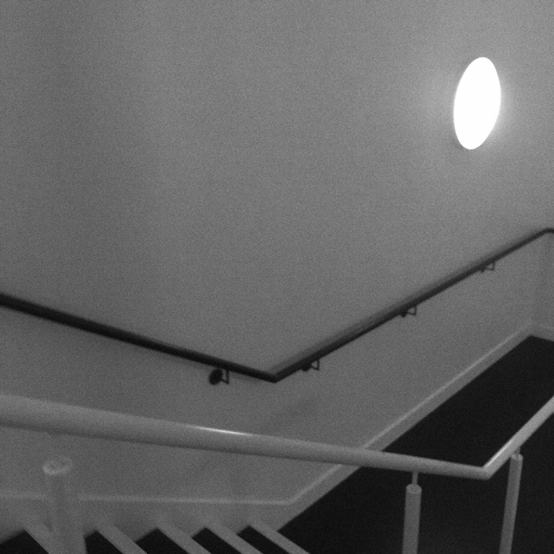
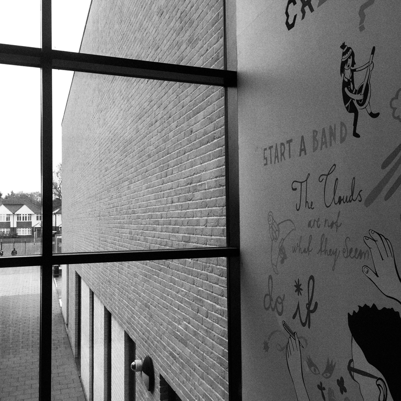
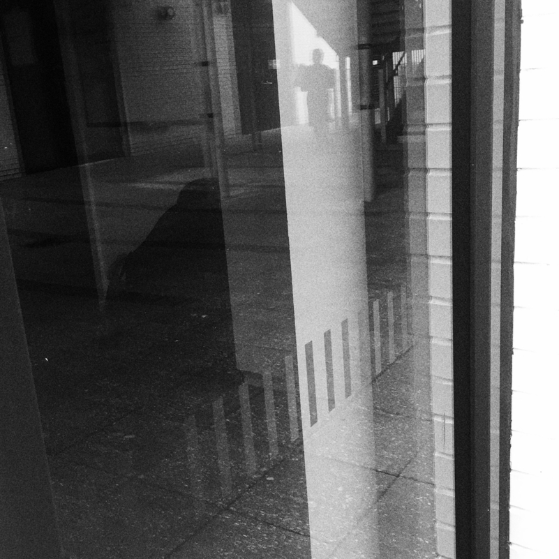
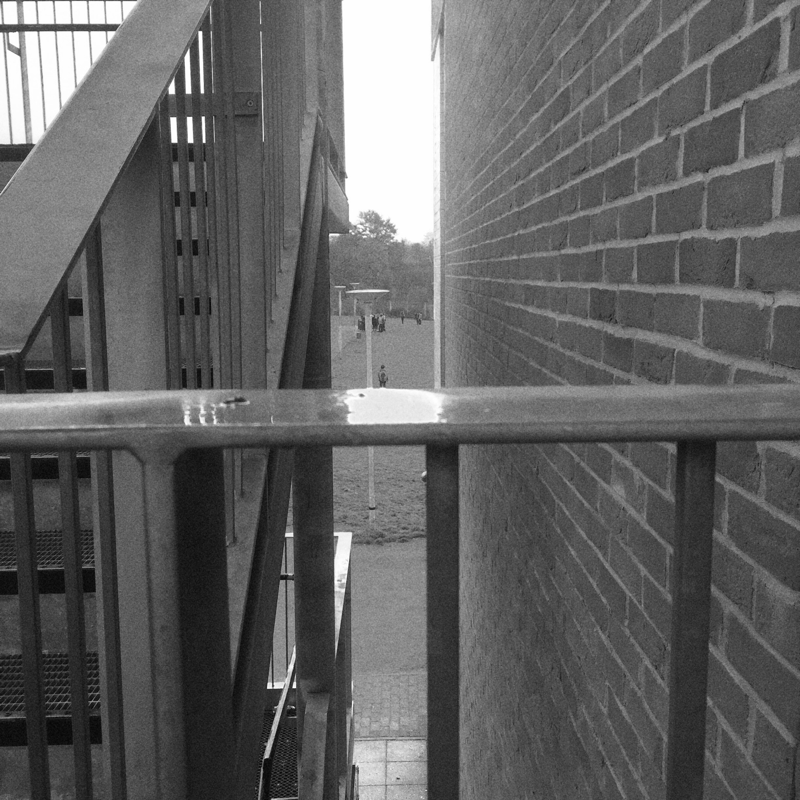
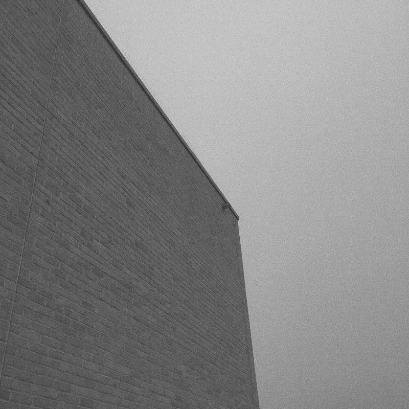
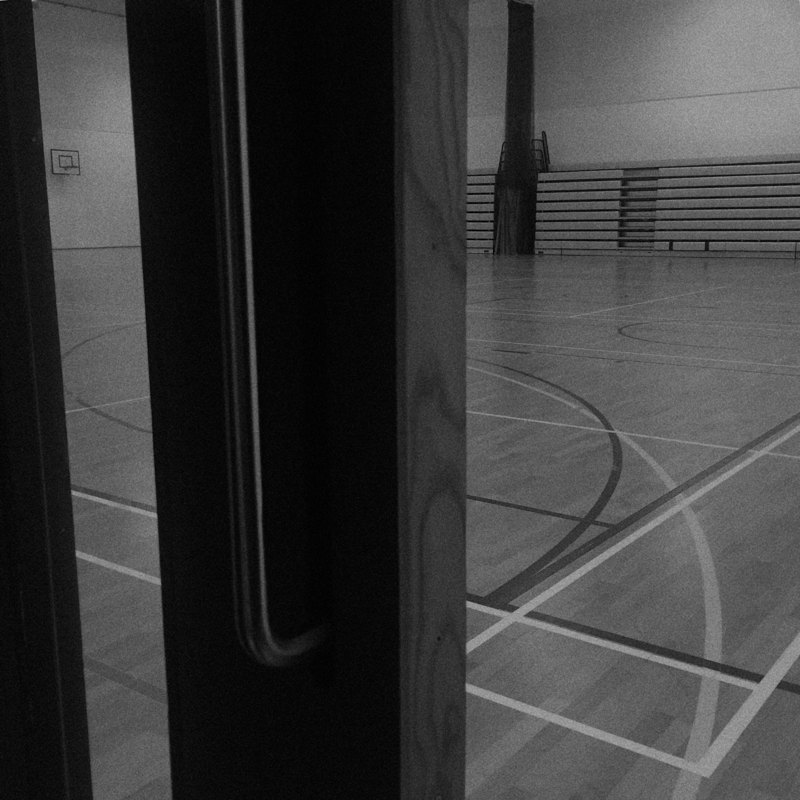
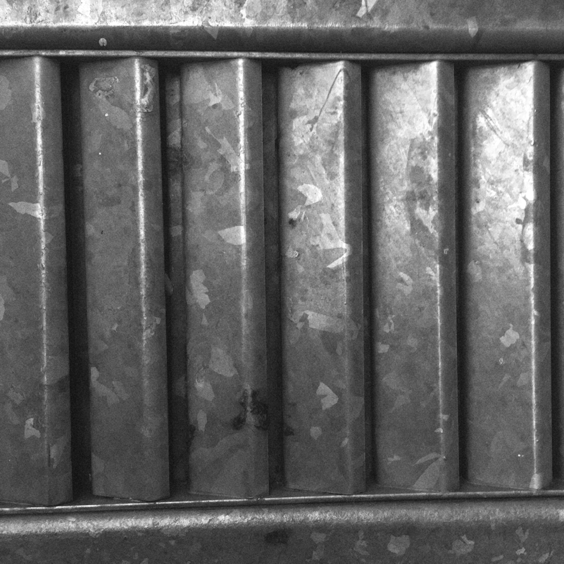
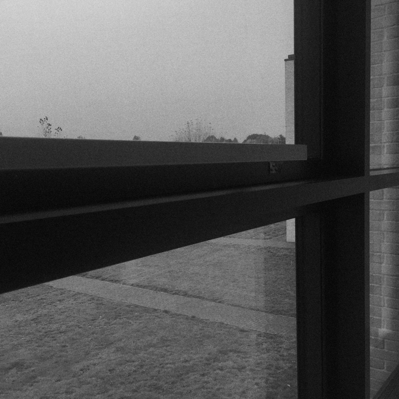
Although my last experiment was neon themed and involved the use of a range of vivid colours, in this task I set out to do the opposite; I captured my photographs using a black and white filter and edited them afterwards to add a grainy, out of focus effect. Usually my favourite thing about taking pictures in school is that there is a wide variety of bright colours in every building so I tend to be drawn towards this, therefore, not being able to use colour in my images within the school grounds increased the difficulty of my task. Despite this, I would say that my outcome was relatively positive. The lack of people outside of classrooms in lesson time creates an unusual atmosphere that doesn't tend to be associated with a school environment. As a consequence, these images have a gothic feel to them, the school looks as though it is isolated or abandoned.
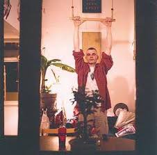
Tom Hunter:
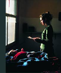
I'm extremely fond of Hunter's photography. One element of his that strikes me in particular is his vary in composition. Although the people in his images are often the central focus of the images he produces they may be in different areas of the photograph such as either the foreground, background, left or right. His use of lighting is also an interesting aspect of his work because it always plays a large role in his photos. For example, In the second image the sun is shining and the background is brightly lit, despite this, the water in the front of the image appears endlessly dark and murky. On the other hand, the lighting in the last picture is the complete opposite of this, which is a demonstration on how Hunter nicely experiments with different techniques within his work.
This is my favourite photograph of Hunter's. When I first saw it, I thought that Hunter had photoshopped his image until I realised this was the natural lighting coming from the windows in the ceiling. This certainly changed my perspective on openings as previously I had only been using the openings in the centre of my image however this photo has encouraged me to vary my composition more particularly in this topic. Additionally, a captivating element of this picture for me is the colour as it is so vibrant and powerful and certainly manipulates the atmosphere and emotions evoked towards the viewer. I'd like to know where this was taken because the scenery seems very unique and it makes me question what is in the background.
Lucio Fontana:
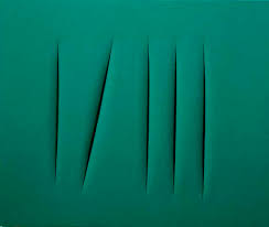
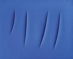
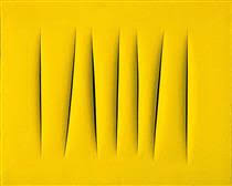
Lucio Fontana was an Italian artist who famously used simplistic slashes as the focus of his images and enscribed philosophical messages on the back. His monochromatic and minimalistic peices are all iconically named "concetto spaziale" or "spatial concept" in english. From this we could infer that the use of composition and space play an important role within his art.
Fontana backed his canvases with a black gauze which seems to make the slashes bolder and more harsh. In the images, the slashes appear in variation of numbers and lengths which differ in each painting. Furthermore, some of the slits are curved; some of the slits are straight. I find this compelling as I feel the need to question if he planned this before cutting the canvas or just followed his insticts. Perhaps his mood influenced his decision. The fact that we will never know is what inspires me to research his work in more detail to gain more of an understanding into his thoughts as an artist.
Fontana backed his canvases with a black gauze which seems to make the slashes bolder and more harsh. In the images, the slashes appear in variation of numbers and lengths which differ in each painting. Furthermore, some of the slits are curved; some of the slits are straight. I find this compelling as I feel the need to question if he planned this before cutting the canvas or just followed his insticts. Perhaps his mood influenced his decision. The fact that we will never know is what inspires me to research his work in more detail to gain more of an understanding into his thoughts as an artist.
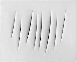
In spite of the fact that I really like the other three images that I chose of Fontana's, this one is certainly my favourite. Although the others look great in a collage due to the monochrome in the paintings, the lack of complexity in the black and white presents the peice as more effortlessly elegant concept. The lighting used is an evident element in the photographs "concetto spaziale" as the painting looks most effective when shown in a bright light which remains consistent throughout each of the individual concepts. Additionally, the light is also noticeable in this particular image because faint shadows are visible on the left of each slit. This is where it becomes less of a painting and more of a sculpture in my opinion, considering Fontana is known to have produced both paintings and sculptures it isn't easy to determine which this particular concept would be and the perception of it may vary depending on the viewer. What these slashes actually represent also depends on the viewer. He may have been inspired by constellations, war wounds, female genitals, and even the wounds of Christ. His series of sculptures entitled "nature" are undeniable references of the female reproductive organs so it might not be unlikely that Fontana was trying to make connotations of this in this concept too.
It is also important to note that he gave the images in this concept the subtitle of "attesa" if they had one cut and "attese" if they had two or more cuts. Attesa is an Italian word translating to waiting or expectation and attese is the plural of this word. This is a fascinating notion to me as it provokes the viewer to be inquisitive. What is he waiting for? What is the expectation?
Fontana blurs the lines between three dimensional and two dimensional as by making incisions he seems to make the paintings appear alive. It may also be argued whether he destroys or creates his work by slicing the canvas. Personally, I think the break in the canvas is what makes his work art however perhaps it could also symbolise breaking a personal barrier, the non-existent rules we convince ourselves to abide, allowing our creativity to suffer.
It seems to me that people may be quick to criticise Lucio Fontana's style and artwork, perhaps due to the simplicity. Despite that at first glance it may seem plain, I would argue against this because there is so much about his work and his style to comment on which may not always be true for other artists or photographers that use less minimalistic techniques. Whilst studying his work in class I overheard a student say that they could do the same thing, but they didn't, Lucio Fontana did.
Ralph Gibson:
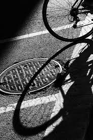
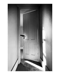
Although Ralph Gibson has been taking photos for over 50 years, his style has remained quite consistent. I'm very fond of his work particularly the intresting composition and angles; they don't abide by photography norms. In the images above, he uses doors, shadows and the human body to create his own interpretaton of openings. Speaking of shadows, they seem to play an important role within Gibson's images especially in the third photo where we can see a bold shadow of a bike. I think the shadow is entirely what makes this photograph intresting and the circular shapes overlap eachother.
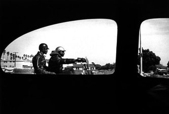
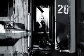
In this photograph of Gibson's, there are two people riding on a motorbike which can be seen from a car window. I'm not sure where this was taken as the architecture and plants don't seem to be like anything I've seen before, perhaps it is in another country. The heavy black and white contrast matches Gibson's style and creates a smoky effect in the background.
There is a lot of black space in this image so the focus immediatley leans towards the area outside the window. The thing that I engaged with the most was the two people on the motorbike due to the fact that we can't see their faces and it shrouds them in mystery. Instantly, we are encouraged to ask questions about who they are, where they're going, and why they're doing it.
There is a lot of black space in this image so the focus immediatley leans towards the area outside the window. The thing that I engaged with the most was the two people on the motorbike due to the fact that we can't see their faces and it shrouds them in mystery. Instantly, we are encouraged to ask questions about who they are, where they're going, and why they're doing it.
Black and white openings:
My response to Lucio Fontana and Ralph Gibson:
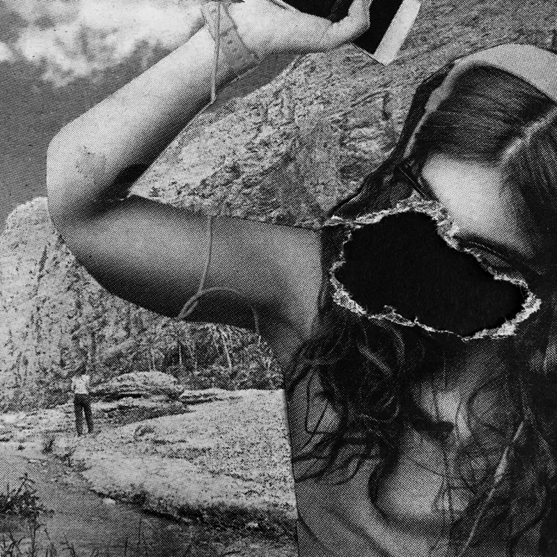
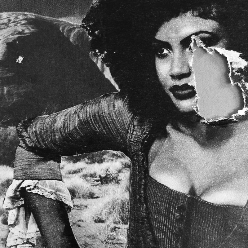
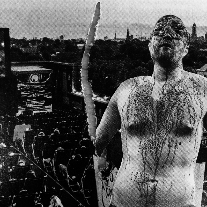
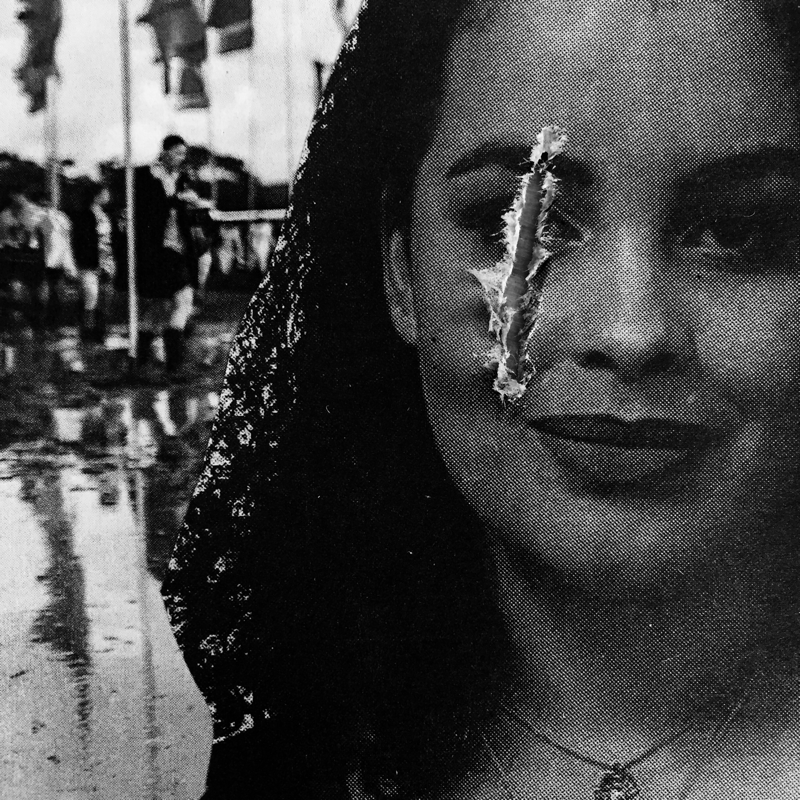
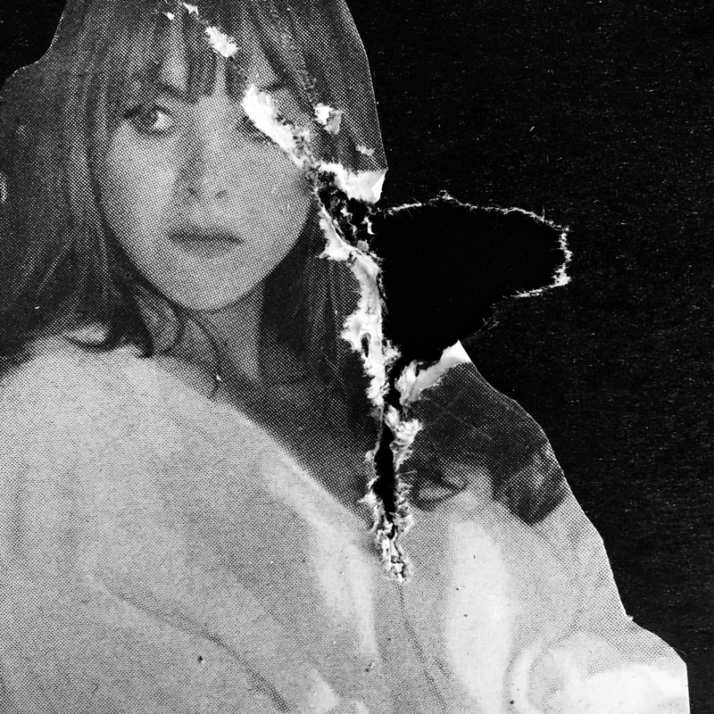
I created this photographic response by aiming to use Ralph Gibson's heavy black and white contrasts whilst tearing the photographs to resemble that of Lucio Fontana's work. However there were certain changes that I made in this process. Firstly, I wanted to create slits in my page that were more like tears than slits because I did not want to copy Fontana completely but just be inspired by him. I'm actually pleasantly surprised with the outcome of this as I thought it may just be hard to do and appear messy but it actually looks quite artistic and seems as though the photographs are burning. Another way I intended to differ my work Fontana's was to actually use images rather than a painted canvas. Although his work is incredible, I had to give my own work a twist so I decided to create a variety of miniature collages from magazine pages and I ripped them with scissors. I'm proud of my work and my idea to combine Gibson's colour scheme and Fontana's slits to end up with something I could call my own.
Now that I know this works, I want to repeat the experiment however this time I will use my own images inspired on each openings artist that I have researched. I want to push myself to make a final piece that tributes all of these people in a positive way and to show all that I have learnt through my extended project of openings!
Now that I know this works, I want to repeat the experiment however this time I will use my own images inspired on each openings artist that I have researched. I want to push myself to make a final piece that tributes all of these people in a positive way and to show all that I have learnt through my extended project of openings!
Photos based on one artist I have researched:
The following images are all based on one atrists work and are infused with the colour scheme of Ralph Gibson. The artists are Rinko Kawauchi, Tom Hunter, Amanda Charchian and Dragan Todorovic.
The first photo in this gallery is inspired by Rinko Kawauchi. I found this quite difficult because one of the main components of Kawauchi's work is her use of pastel colours and subtle contrast. Using Gibson's colour scheme whilst maintaining Kawauchi's style of photography was incredibly challenging yet in my opinion it created something beautiful. Furthermore, I increased the granulation on this image to create an effect which is more similar to that of Gibson's as this isn't common when taking photos of vegetation such as flowers as I have done here. Although the flowers are in black and white, I like that from this photograph we can clearly see that they are all different colours shapes an sizes. The lighting is also something quite noticeable in this image as there is a clear gradient within the centre of the flower where the lighting creates a smooth blend between black and pale grey. The petals appear very soft and delicate which also resembles the style of Kawauchi, I love how two worlds came together to create something magical here.
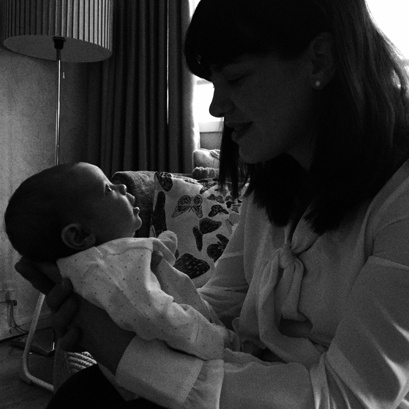
The second photo in this gallery is inspired by Tom Hunter. Hunter often takes photographs of families and unusual lighting, therefore for this experiment I took an image of my own family whilst they were unaware of it. The lighting is intresting here and it is dark but a small amount of light seeped into the room through the windows and bathed my sister's face in a soft, subtle light. Although she was only three weeks old at the time of the photograph, it is clear to me that her face demonstrates sheer inquisitivity. The domestic setting and lighting arrangment is deffinatly familiar to Hunter's without looking to alike.
The third photo in the gallery was one inspired by Amanda Charchian. I took this photo just outside of London as this is the best oppurtunity I had to take photos displaying evidence of natural scenery; living in such an industrial city. Charchian uses nature in her images as she travels the world, and it is rare to find anything man made in her photos. Although there are some man made objects in the image that I have taken, we can still see wildlife, trees and a mountaineous terrain. Infusing Charchian's style with Gibson's is very peculiar as Charchian's images are vivid, full of colour and life. On the other hand, Gibson opts for an entirely different approach which lacks any colour. The granulation in the sky also seems to have a nice effect on the image as a whole because the location appears gloomy and isolated. This photograph is my favourite in the gallery.
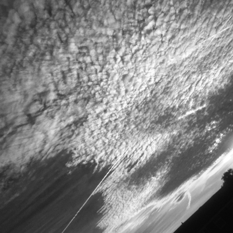
The fourth photograph in this collection is inspired by Dragan Todorovic. He uses intresting cloud patterns in many of his images which encouraged me to try this myself. I absolutley love how the clouds blend from defined, harsh shapes into soft, fluffy and whipped cream like shapes. The colour scheme of Gibson's also adds a nice touch to the image as we can no longer see what time of day it is which makes us want to question ourselves. Luckily for me, the sun was tucked neatly behind the thickest area of the cluster of clouds so the natural sunlight did not overpower the image and we can see everything in a much sharper detail.
The second photo in this gallery is inspired by Tom Hunter. Hunter often takes photographs of families and unusual lighting, therefore for this experiment I took an image of my own family whilst they were unaware of it. The lighting is intresting here and it is dark but a small amount of light seeped into the room through the windows and bathed my sister's face in a soft, subtle light. Although she was only three weeks old at the time of the photograph, it is clear to me that her face demonstrates sheer inquisitivity. The domestic setting and lighting arrangment is deffinatly familiar to Hunter's without looking to alike.
The third photo in the gallery was one inspired by Amanda Charchian. I took this photo just outside of London as this is the best oppurtunity I had to take photos displaying evidence of natural scenery; living in such an industrial city. Charchian uses nature in her images as she travels the world, and it is rare to find anything man made in her photos. Although there are some man made objects in the image that I have taken, we can still see wildlife, trees and a mountaineous terrain. Infusing Charchian's style with Gibson's is very peculiar as Charchian's images are vivid, full of colour and life. On the other hand, Gibson opts for an entirely different approach which lacks any colour. The granulation in the sky also seems to have a nice effect on the image as a whole because the location appears gloomy and isolated. This photograph is my favourite in the gallery.
The fourth photograph in this collection is inspired by Dragan Todorovic. He uses intresting cloud patterns in many of his images which encouraged me to try this myself. I absolutley love how the clouds blend from defined, harsh shapes into soft, fluffy and whipped cream like shapes. The colour scheme of Gibson's also adds a nice touch to the image as we can no longer see what time of day it is which makes us want to question ourselves. Luckily for me, the sun was tucked neatly behind the thickest area of the cluster of clouds so the natural sunlight did not overpower the image and we can see everything in a much sharper detail.
Photos based on one artist I have researched:
The following images are all based on one atrists work and are infused with the colour scheme of Ralph Gibson. The artists are Shizuka Yokomizo and Colin Roohan.
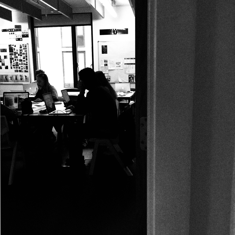
I took the first image with Shizuka Yokomizo's photography in mind. He takes images of people in domestic setting through their windows and gives us an insight into their daily lives. I wanted to re-create this but I decided that I wanted to change a few things. Firstly, I captured the photograph in a classroom setting because I thought it would be intruiging to compare how people behave and compose themselves in their homes and in a school environment. In conclusion I do think that people appear to be more comfortable within their own homes which they have decorated and personalised to suit them. Infact I think the element of personalisation in itself allows people to be more creative and true to who they are and their personalities, whereas in school we are confined to the areas that have been provided to us, perhaps restricting our ability to be our own honest person.
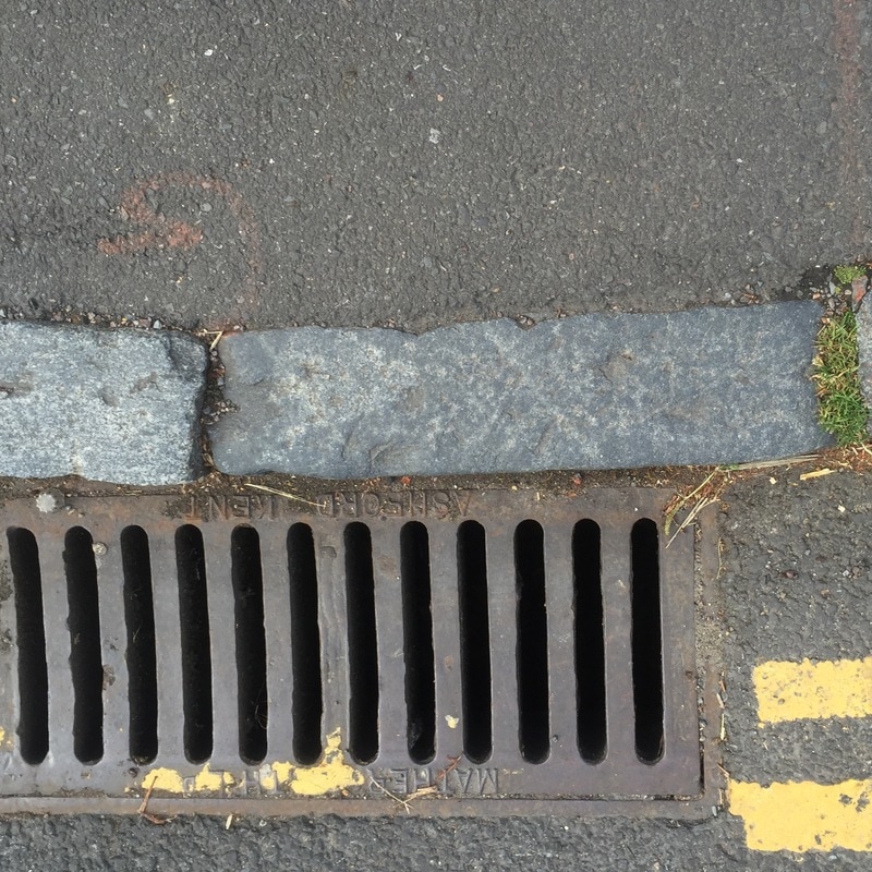
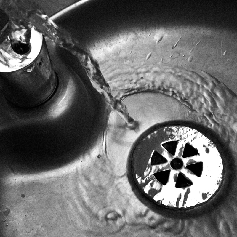
The picture on the right is one inspired by Colin Roohan. I wanted to take an image that was water themed but also linked closely to openings. I do think that I was successful in this but I would have preffered to take a photograph within a more natural setting such as by the ocean. However, it still is very much water based which was my main goal and also combines the topic of openings with the drainage system and the water dispenser itself. The water looks great in black and white and I actually think that it becomes more clear with the lack of colour as it was transparent to start with. I think the photo will look even better once an incision inspired by Fontana is made into the main flow of water.
The picture on the right is one inspired by Colin Roohan. I wanted to take an image that was water themed but also linked closely to openings. I do think that I was successful in this but I would have preffered to take a photograph within a more natural setting such as by the ocean. However, it still is very much water based which was my main goal and also combines the topic of openings with the drainage system and the water dispenser itself. The water looks great in black and white and I actually think that it becomes more clear with the lack of colour as it was transparent to start with. I think the photo will look even better once an incision inspired by Fontana is made into the main flow of water.
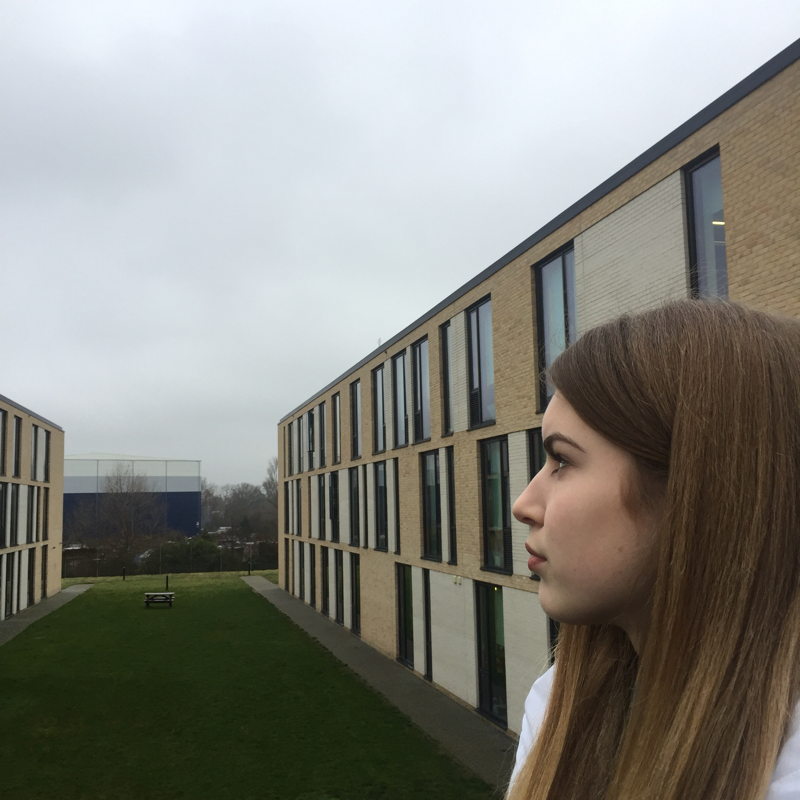
Portraits:
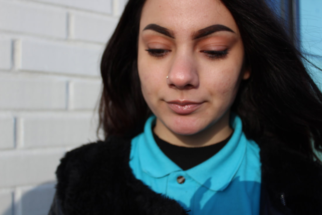
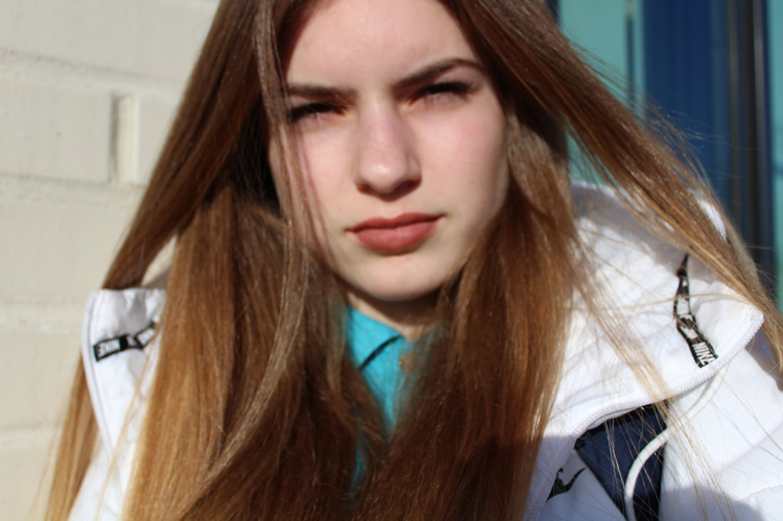
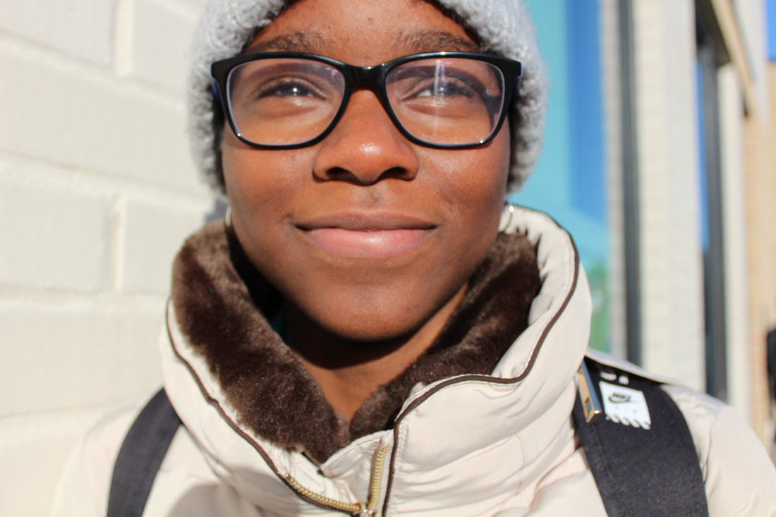
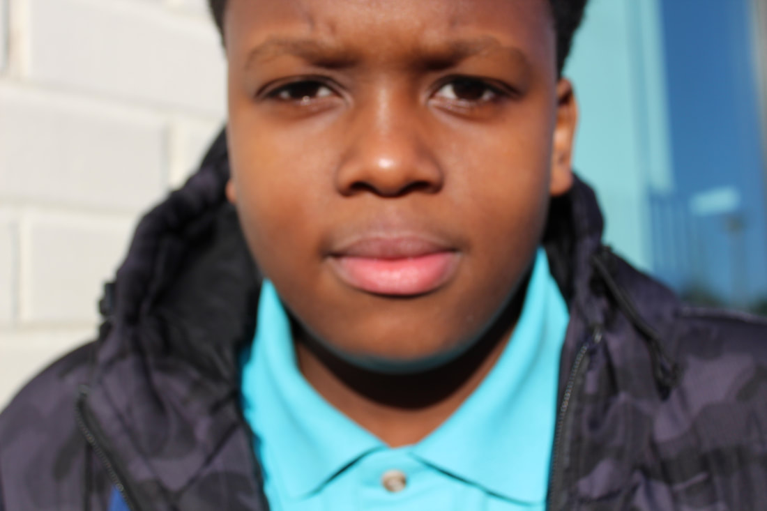
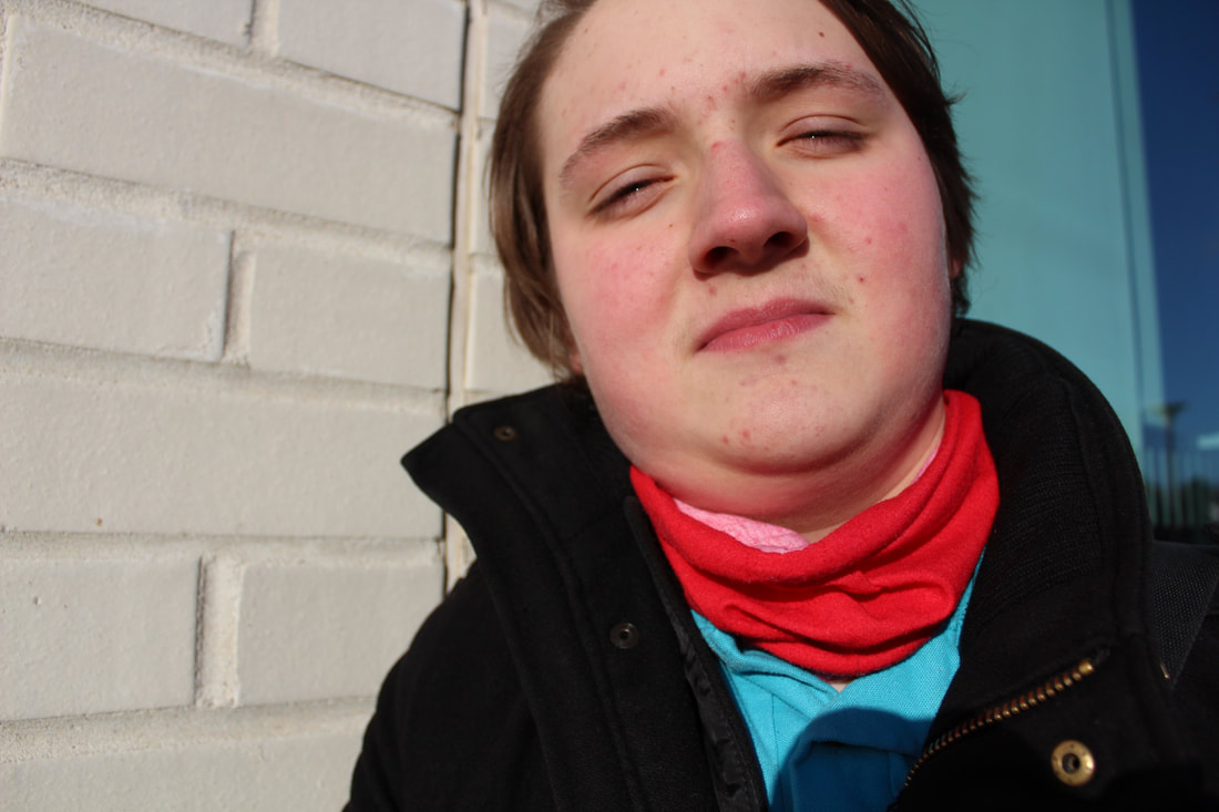
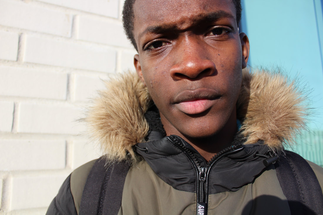
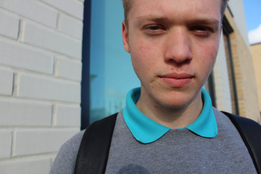
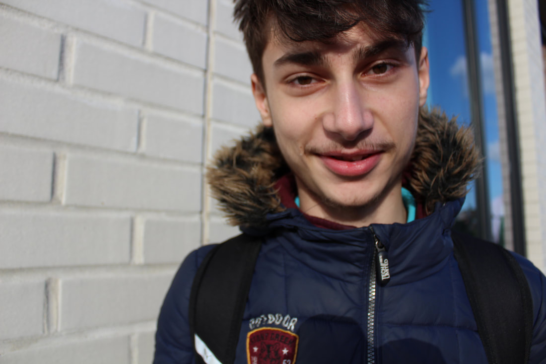
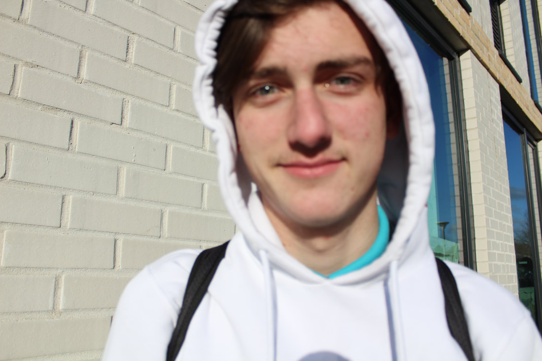
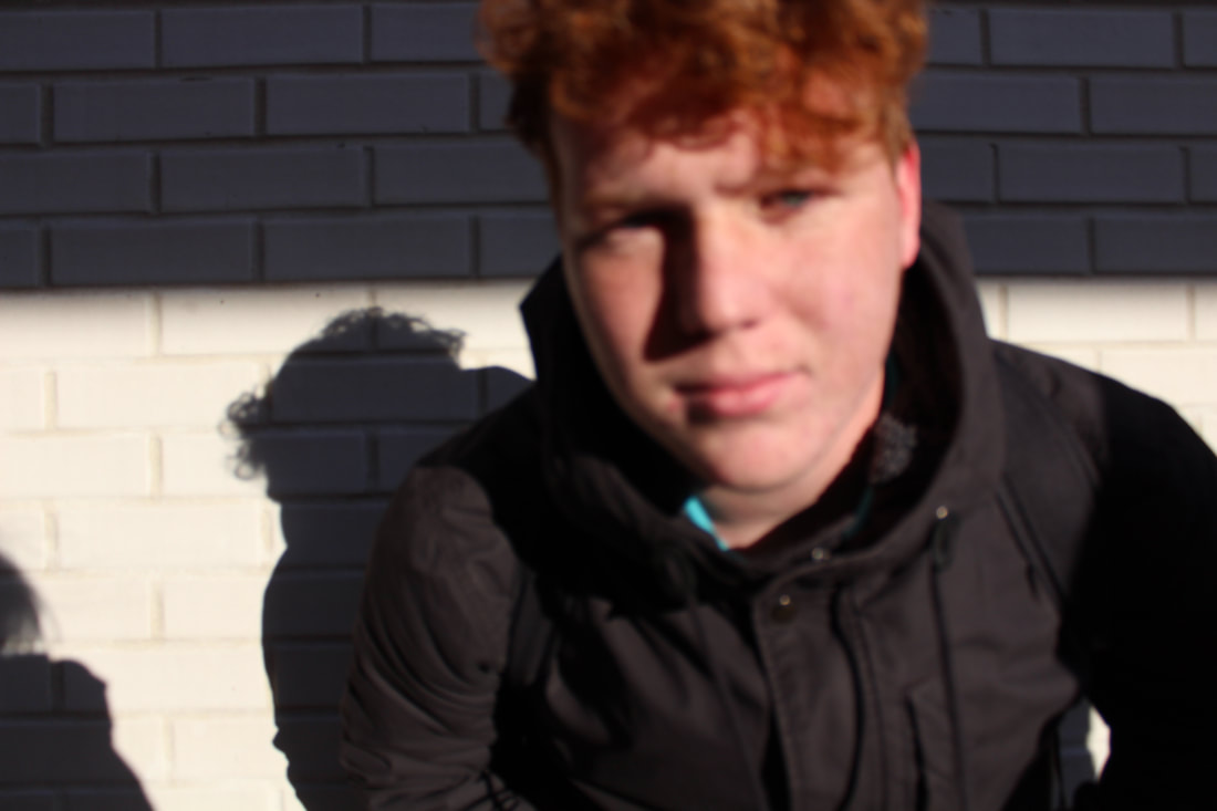
I decided to capture some portraits of my peers which I'm planning on printing, cutting and eventually forming a collage. I took in total ten images and I will also take ten more landscape photographs so I can have a different one for each shot. It was my first time using the canon 3000D so it was interesting to use a higher quality camera than that of my iPhone 6 and taking portraits was a really great opportunity to do so. Personally, I think it's really nice to find a range of people with different features to use when taking a group of portraits, this can vary from the way they dress to their visual appearance to the way they decided to display their emotions for their own portrait.
Landscapes:
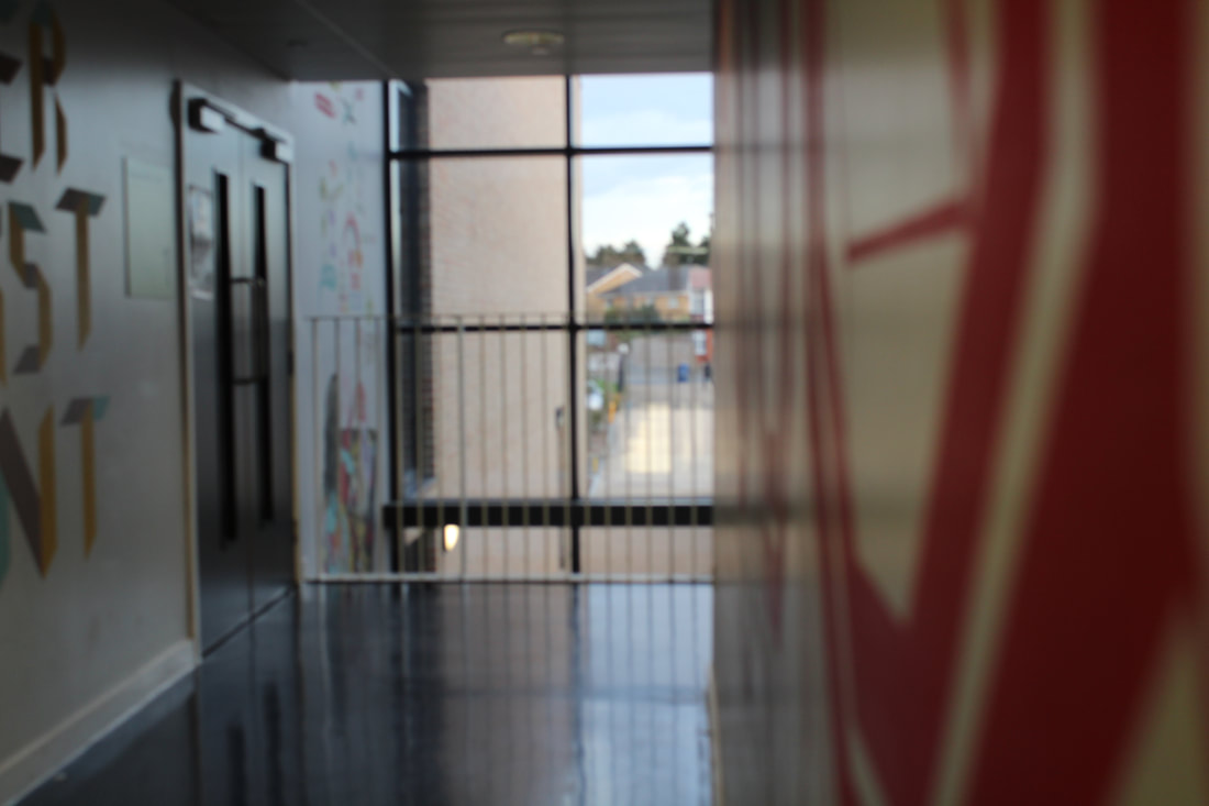
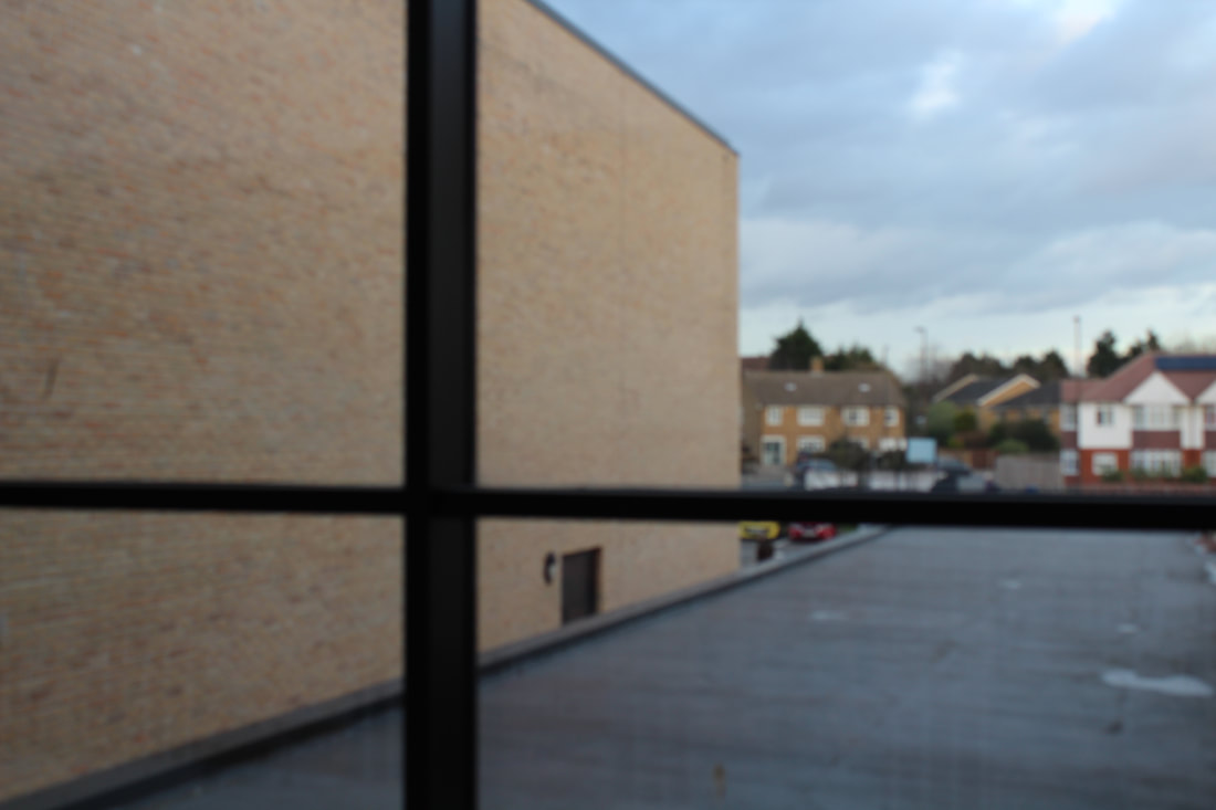
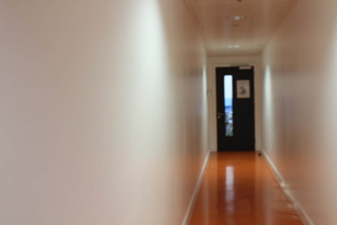
For my landscapes, I didn't want to limit myself to anything specific so I simply decided to capture photos of whatever happened to catch my eye within the school grounds, as this is where the portraits were taken.
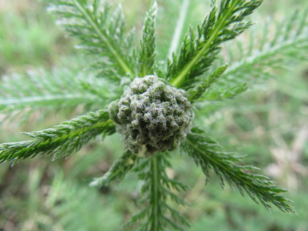
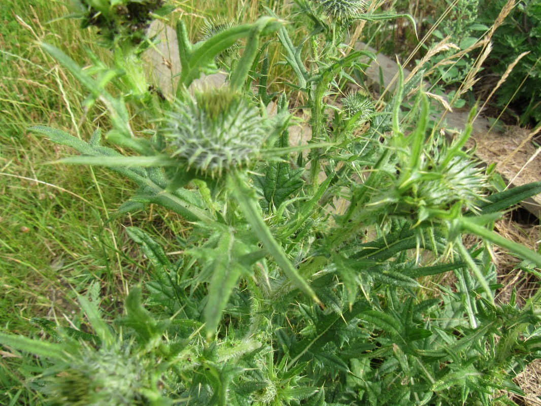
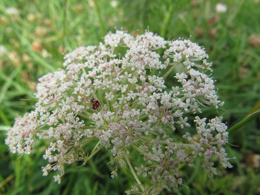
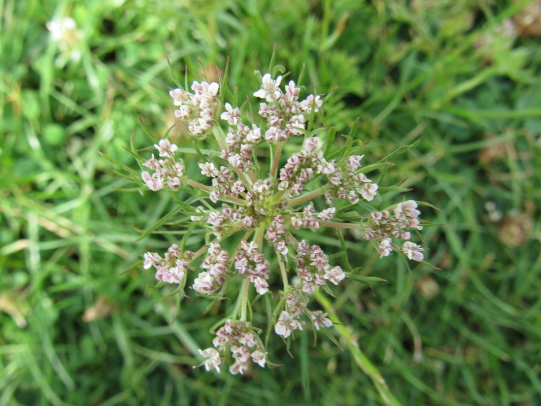
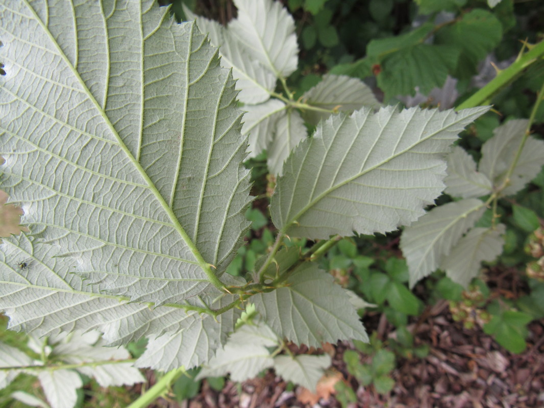
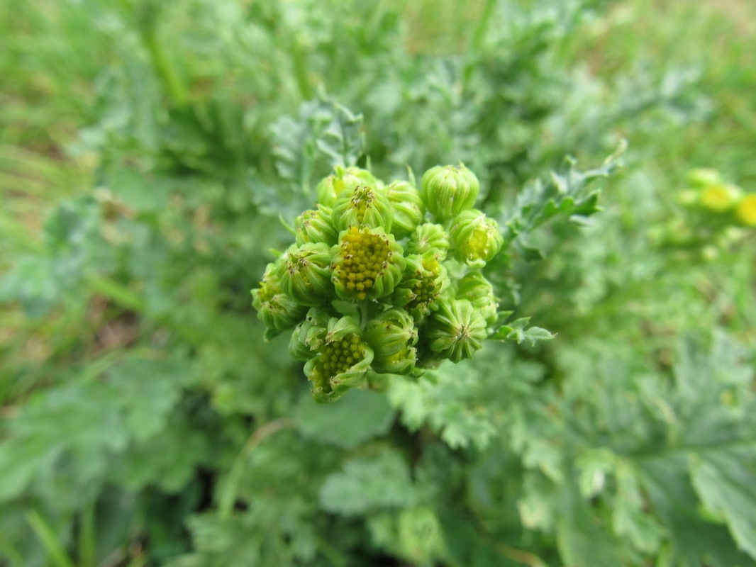
Close ups in nature:
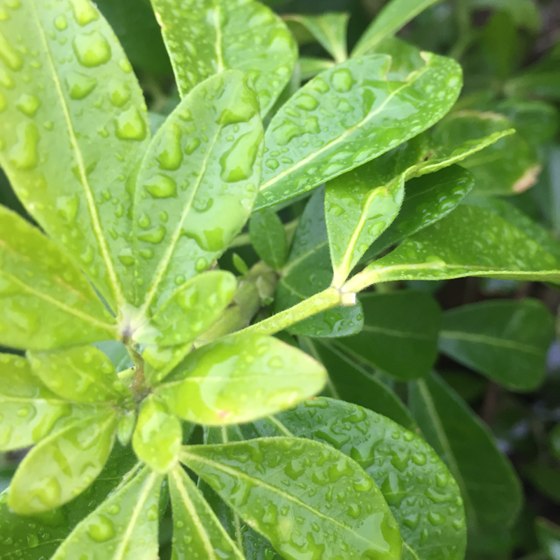
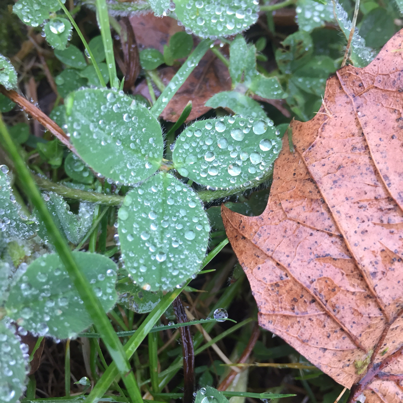
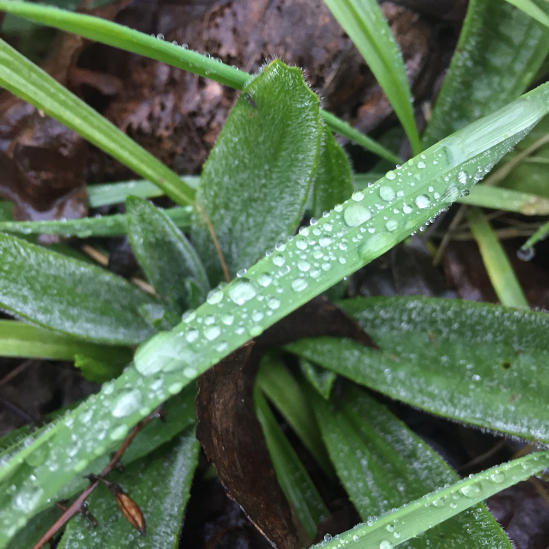
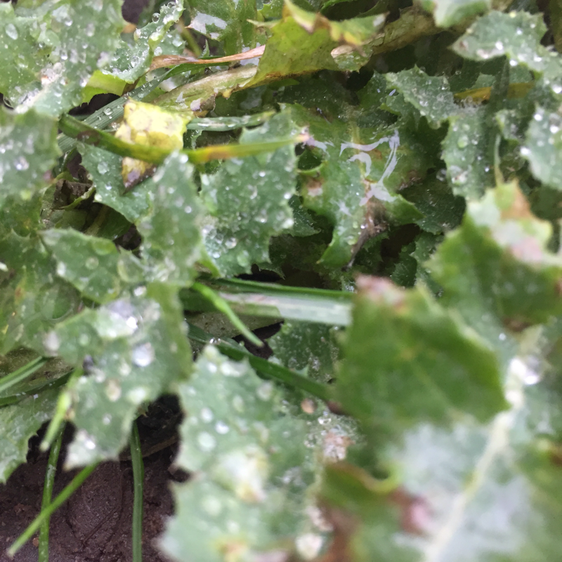
In this experiment, I wanted to use the rainy weather to my advantage and photograph plants close up. Unfortunatey for me there wasn't a large variety of plant life due to the weather in the UK during January, however, there were some plants that withered in accordance to the weather and were nicely complimented by the droplets of rain and the definition of the photographs. Although I do like this collage, my goal for my next project is to further develop my ideas by using people too because I feel like this would bring more life towards the photo and it would also likely add a larger variety of colour because due to the season there is a lack of vibrancy in the images. Despite this, I am pleased with my outcomes and I'm positive that they have expanded my depth of knowledge within my openings subject because it allowed me to experiment with different weather conditions and particularly due to the closeness of the photographs, it allowed me to play around with macro lenses and different focuses to blur different sections of the photos.
Developed results:
I'm pleased with these three outcomes. Firstly, using human life in my photos aswell as plant life certainley provided me with more oppurtunities to take detailed and well planned images which were more focused on the openings topic than my previous set. At this moment in time, I'm slighlty unsure as to wether I should edit the photographs or leave them looking more simple. Due to this I will spend some time editing these photographs and then decide which style I prefer, I may even decide to use a combination of both.
Final piece:
I decided to edit four of my favourite photographs into a collage to create the desired, contrasted effect. I like the quality and contemporary theme so I think this makes them work nicely in a collage together. It also appeals to me that there are two natural openings and two man made openings so it perfectly sums up the different styles I have been working with whilst experimenting with the topic. The composition of the images is also something that immediatley stands out to me because two of them have been shot from a medium range distance whereas the other two are close ups. The fusion of these different elements within my images contrast eachother quite elegantly from the colour schemes, lighting and the harshness of lines.
In my opinion, this is a strong final piece for 'openings' as a topic as a result of the fact that it incorporates many of the elements of 'openings' that I have studied and experimented with such as natural openings, portraiture, varying compositions and bold use of colour. However, as I have invested a large amount of effort and interest into this topic in particular I have actually studied both bold and bright colour use and also use of black and white. In terms of my final piece though, I decided that it should be colourful in order to truly represent my experience of the topic because this is what I tended to use most and found the most effective. In this experiment I particularly thought that bold colour use worked best because of the prevalence of vivid and bold vegetation. The brightness of the greenery really accommodates and supplements the photographs beside them and the lifelike nature of the plants is only enhanced by it remaining in colour.
In my opinion, this is a strong final piece for 'openings' as a topic as a result of the fact that it incorporates many of the elements of 'openings' that I have studied and experimented with such as natural openings, portraiture, varying compositions and bold use of colour. However, as I have invested a large amount of effort and interest into this topic in particular I have actually studied both bold and bright colour use and also use of black and white. In terms of my final piece though, I decided that it should be colourful in order to truly represent my experience of the topic because this is what I tended to use most and found the most effective. In this experiment I particularly thought that bold colour use worked best because of the prevalence of vivid and bold vegetation. The brightness of the greenery really accommodates and supplements the photographs beside them and the lifelike nature of the plants is only enhanced by it remaining in colour.
