I am vaguely familiar with abstraction having studied it in art but despite that I have never experimented with it in photography. I'm excited to research and produce abstract work because I don't really know what to expect. I'm hoping to explore bold and vivid colours and shapes and learn new things.
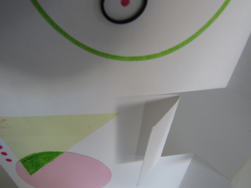
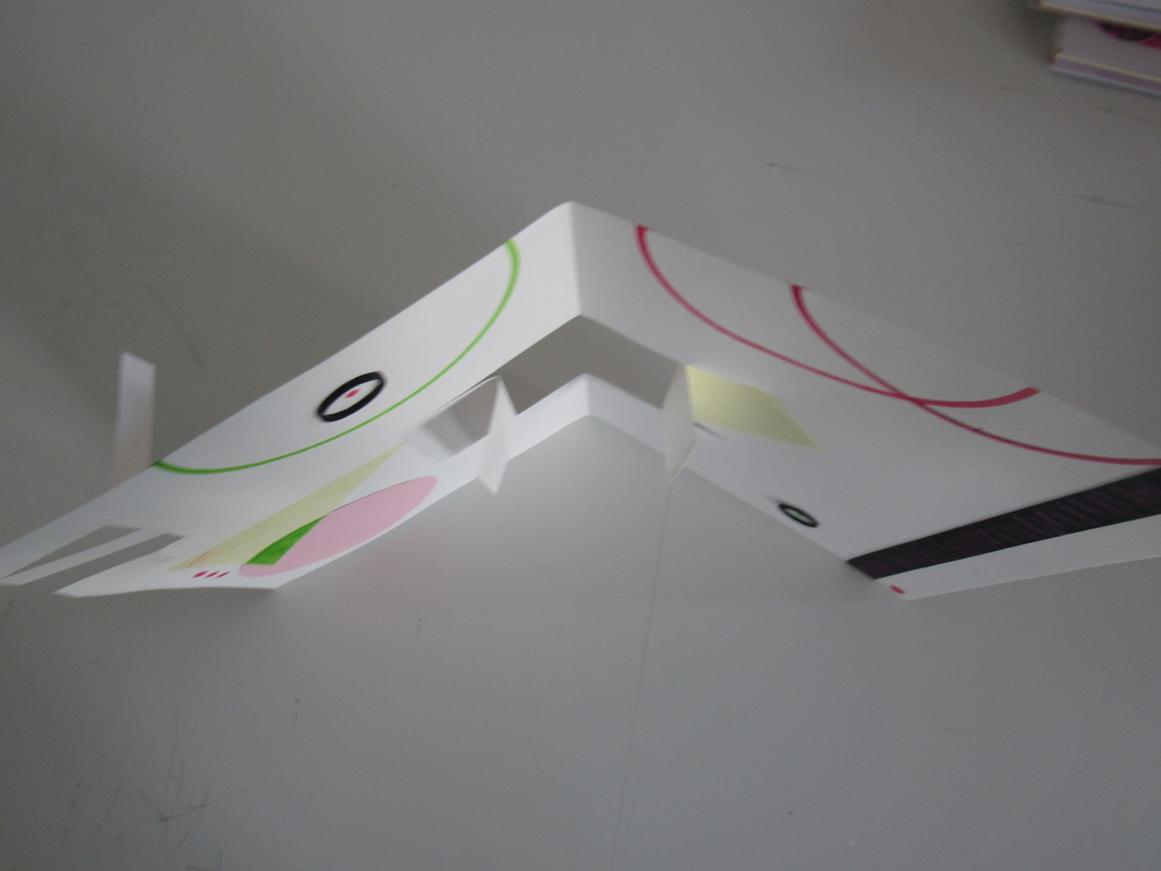
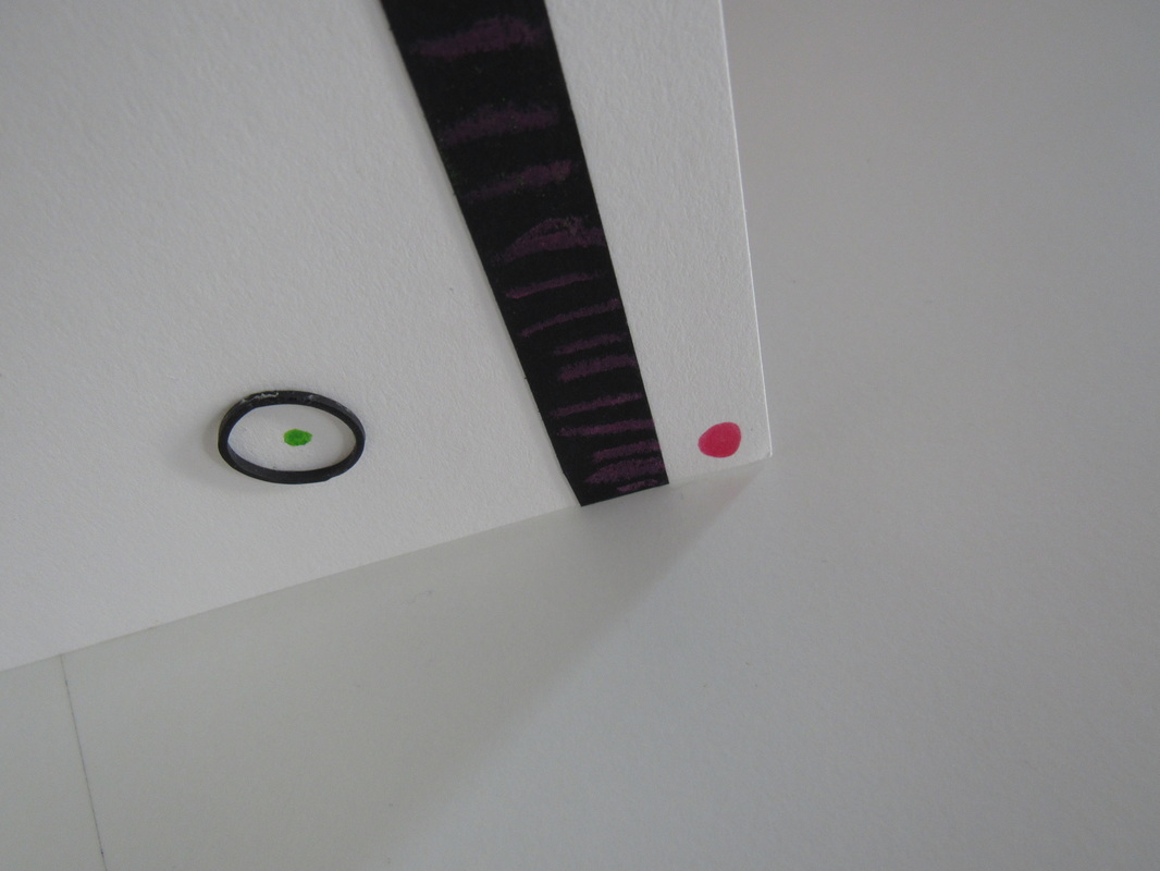
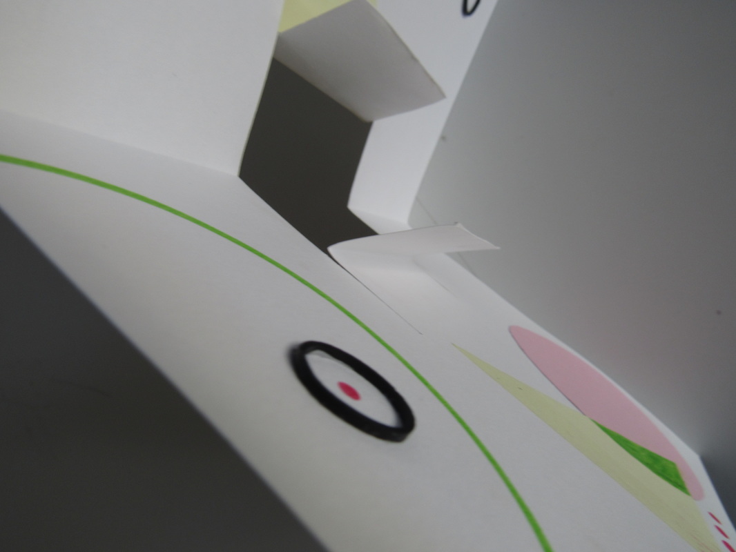
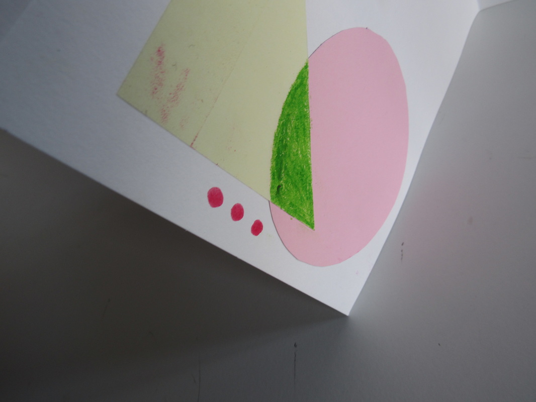
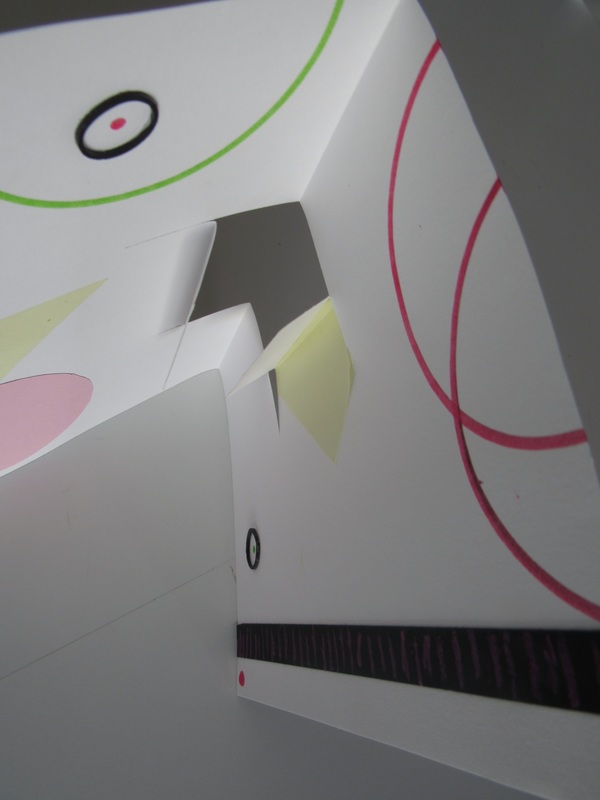
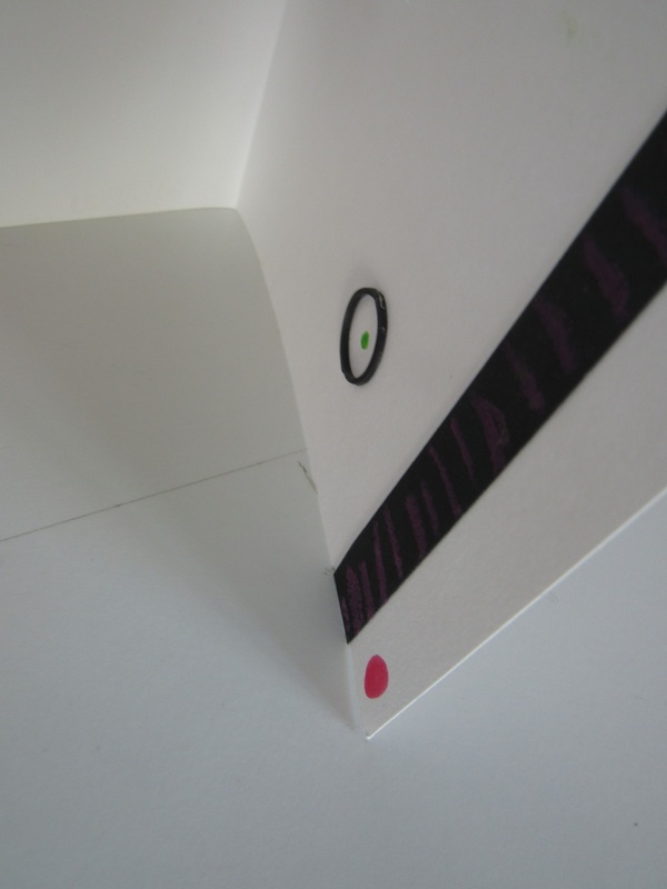
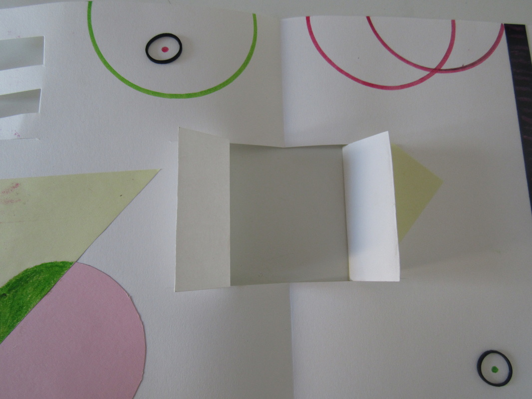
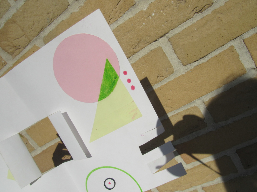
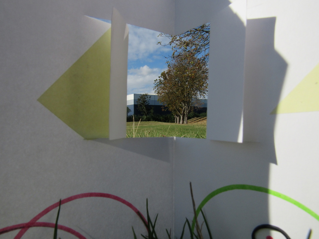
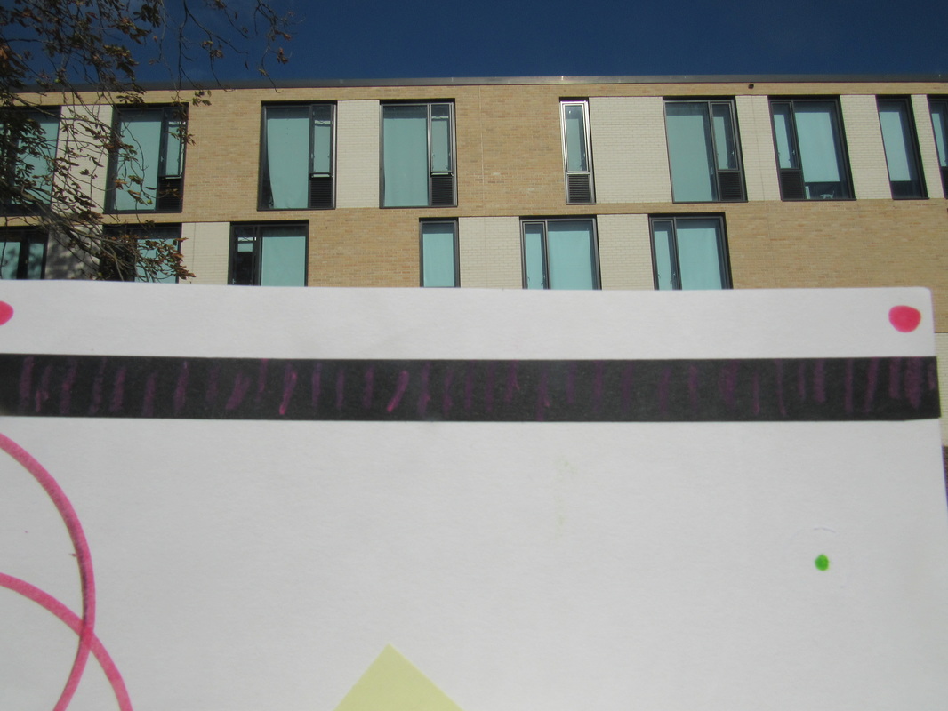
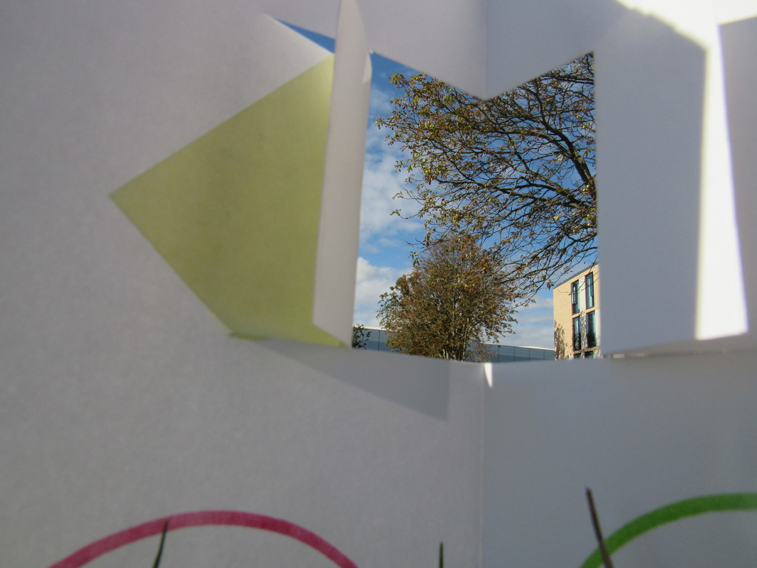
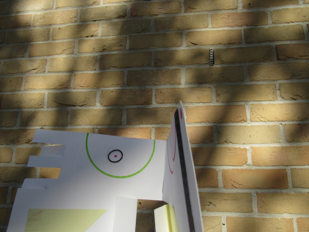
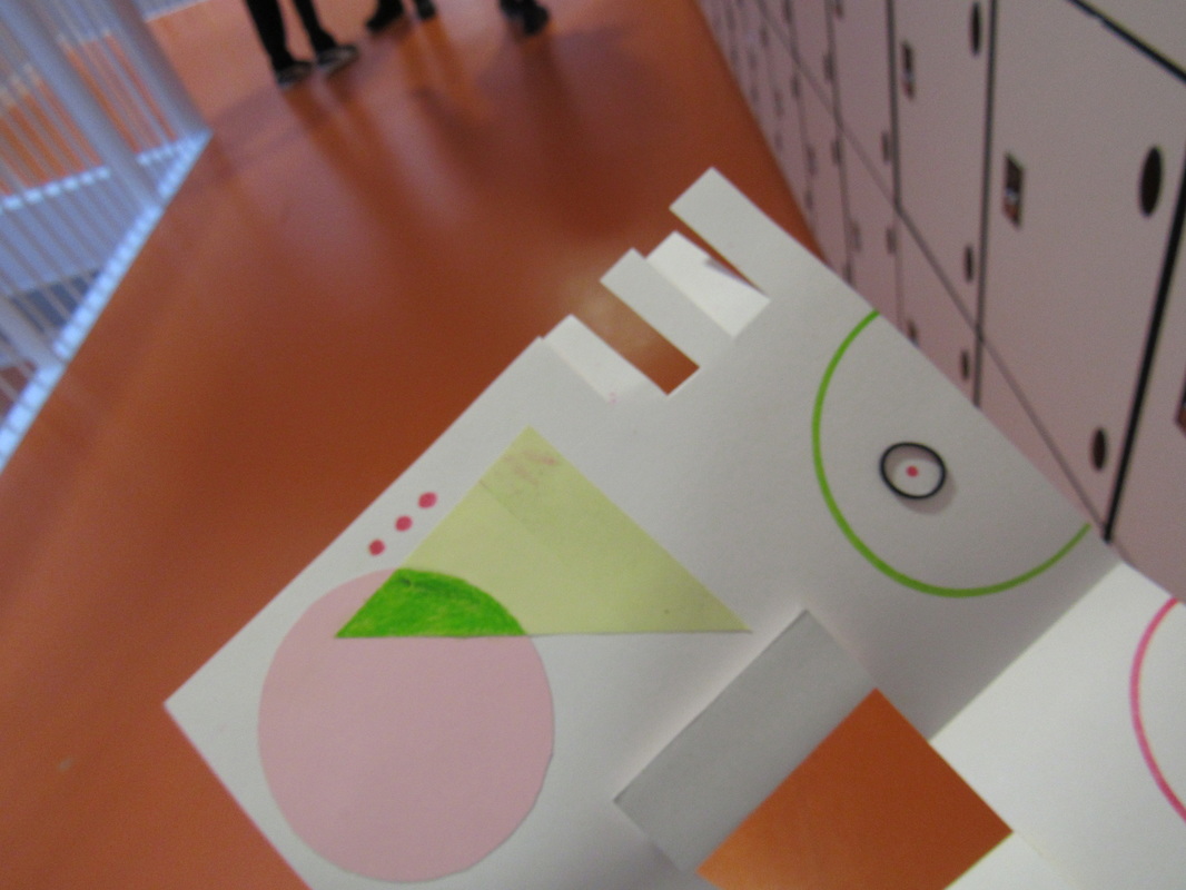
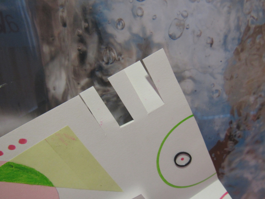
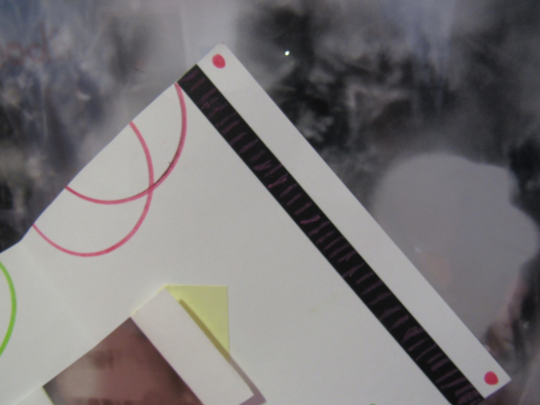
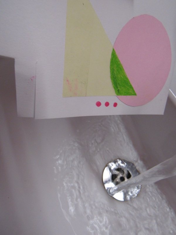
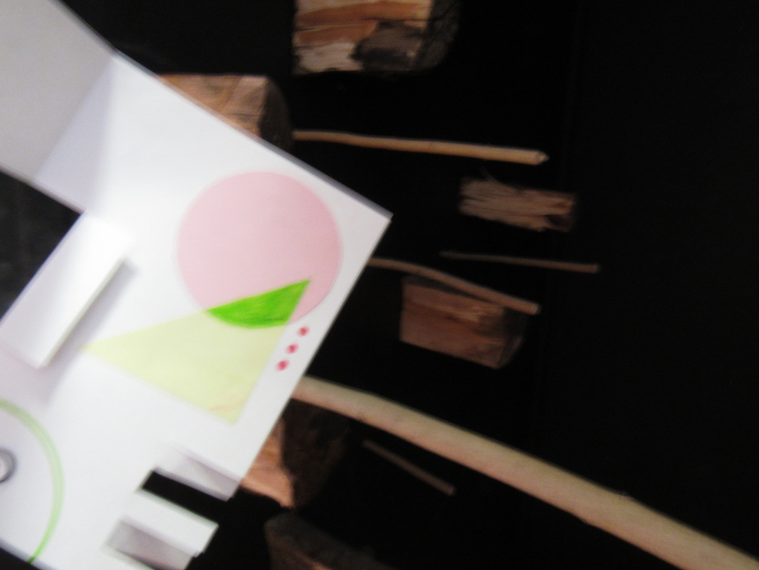
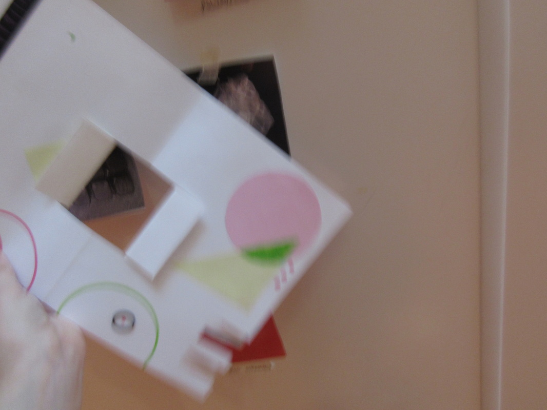
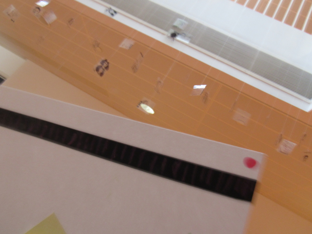
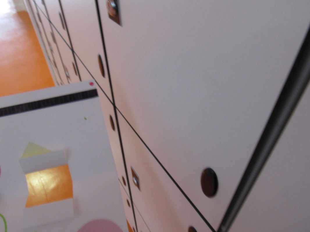
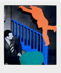
As a class, we decided to make abstract sculptures so that we could experiment with the topic by not just looking at the work of our peers but taking our own photographs and expressing our creativity whilst making our own sculptures, and then photographing them. We all arranged our work in different way but they all consisted of geometric shapes, a variety of compositions and colours and then we also made our sculptures 3D and cut into them. My sculpture has an opening in the centre for light and different flaps, bands, shapes and lines. We decided to take our first set of images in pairs and helped each other take the photographs in order to achieve the desired effect in terms of angles and lighting. In conclusion, I feel like the task went well however next time it would seem more sensible to use a brighter room as this would create a more bold shadow, helping them stand out, and make the pictures look more sharp and defined.
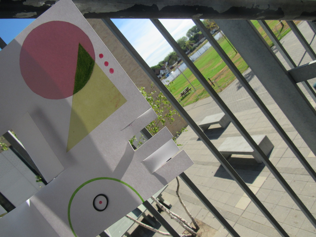
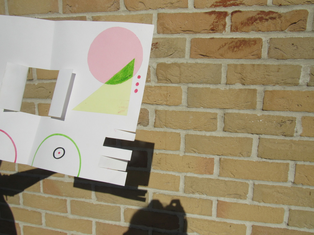
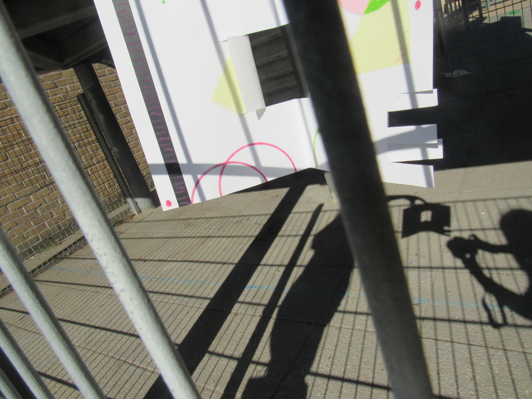
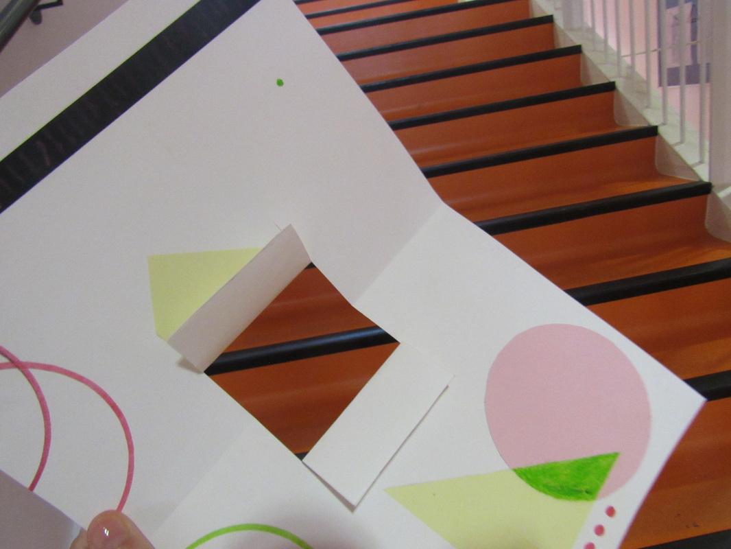
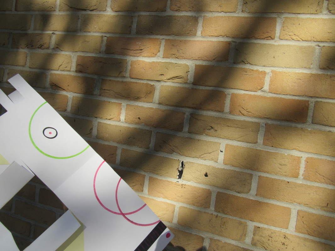
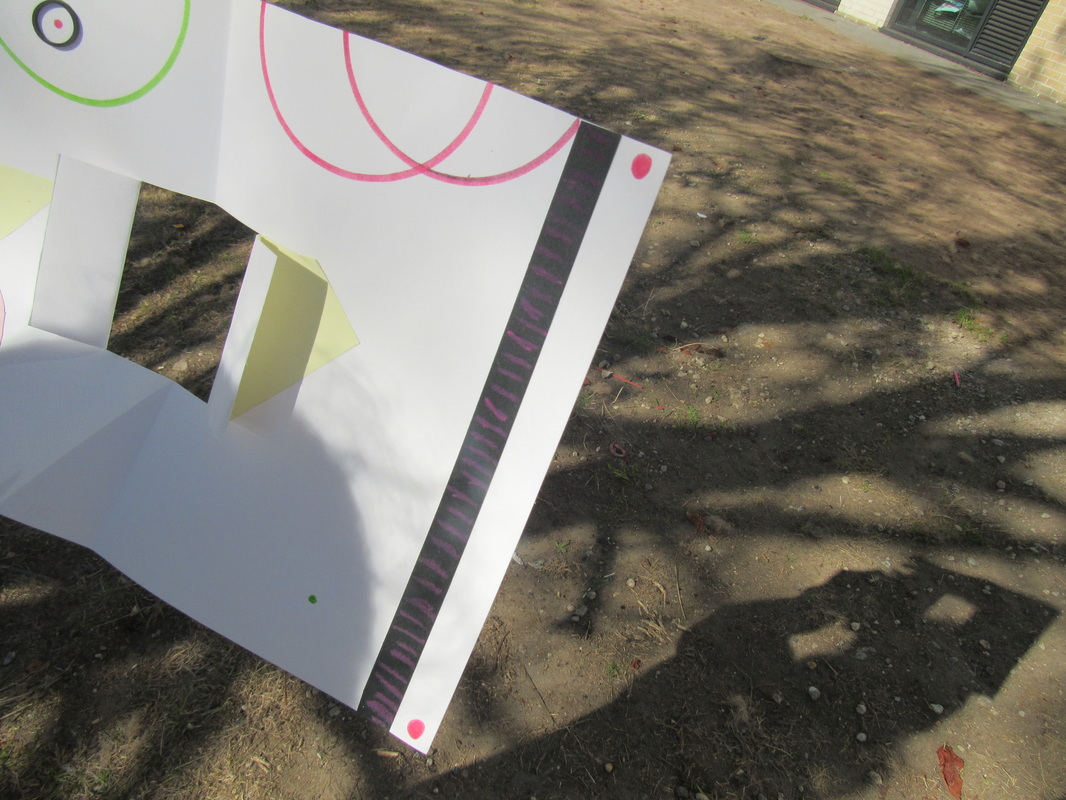
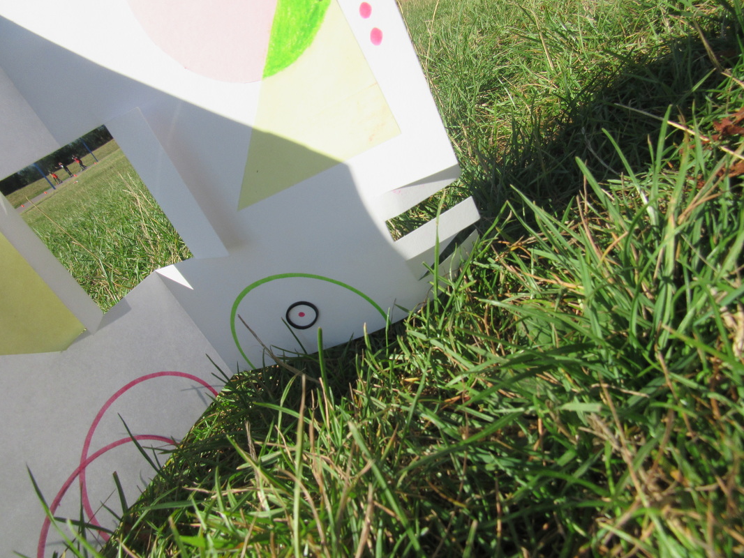
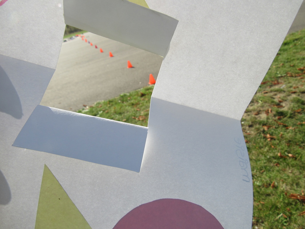
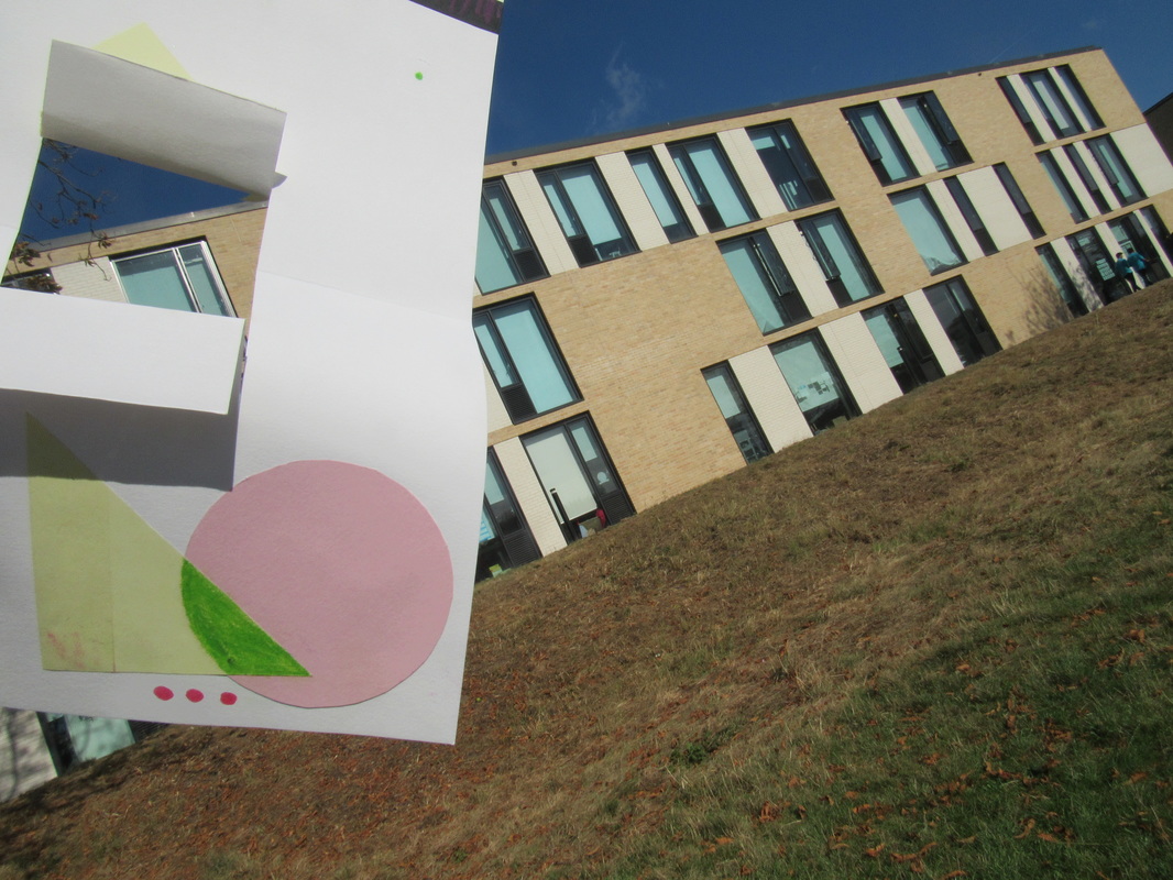
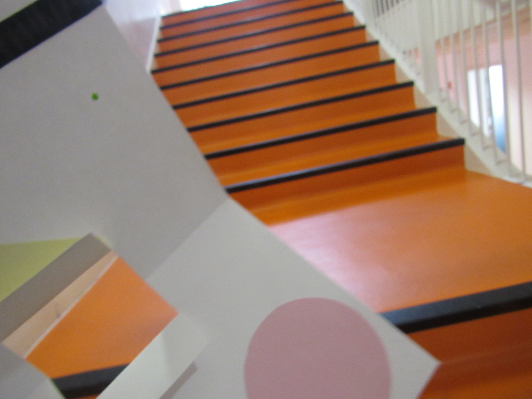
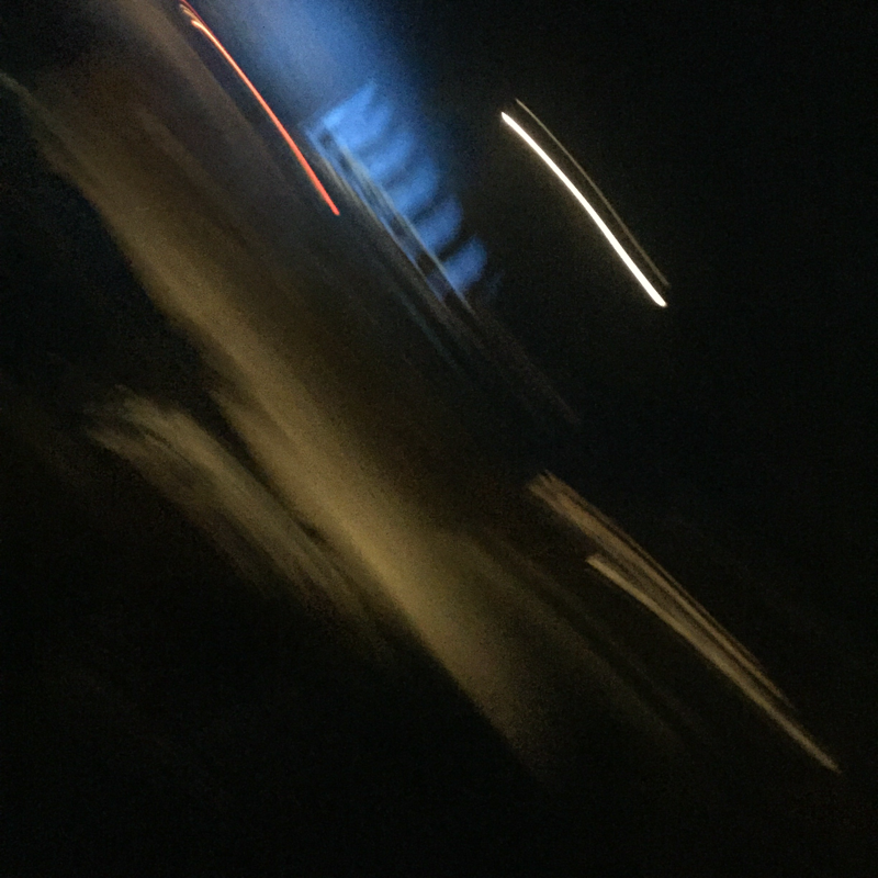
As a result of the most noticeable flaw of my previous experiment being the lighting, I decided I could help improve this by repeating the task but under different conditions. I picked a day where there was quite intense sunlight with no clouds to help manipulate the appearance of lines throughout the usage of shadows. This was successful, I managed to obtain a variety of lines, both straight and curved, harsh and blurred. However, sometimes the sunlight proposed a problem when I took the image from such an angle that failed to conceal my own shadow. I didn't delete these images though because it has allowed me to compare my images to each other and by documenting my mistakes the likelihood of improving them should increase. Moreover, I did take some photographs inside purely because I thought of it at that moment in time. I'm happy with the outcome of this as I found the harsh, bold lines and vibrant orange of the stairs to work well with this theme.
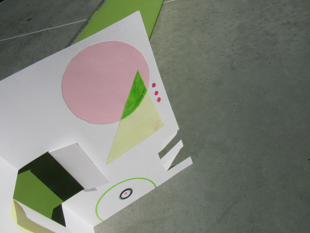
Because of the fact that some of the shadows from this experiment revealed me taking the images, I decided this may be fixed by simply cropping the images. I wanted them to all be the same size so I cropped them in a square shape. Consequently, the images appear as though they are close ups because of the cropping restrictions. Despite the fact that I didn't intend this I do like the outcome because it is primarily focused on the abstraction of the sculpture opposed to the school grounds in the background. This essentially is more fitting towards the abstract theme therefore I'm pleased with the results.
Paper photographs challenge:
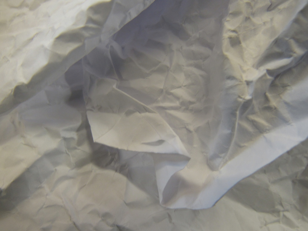
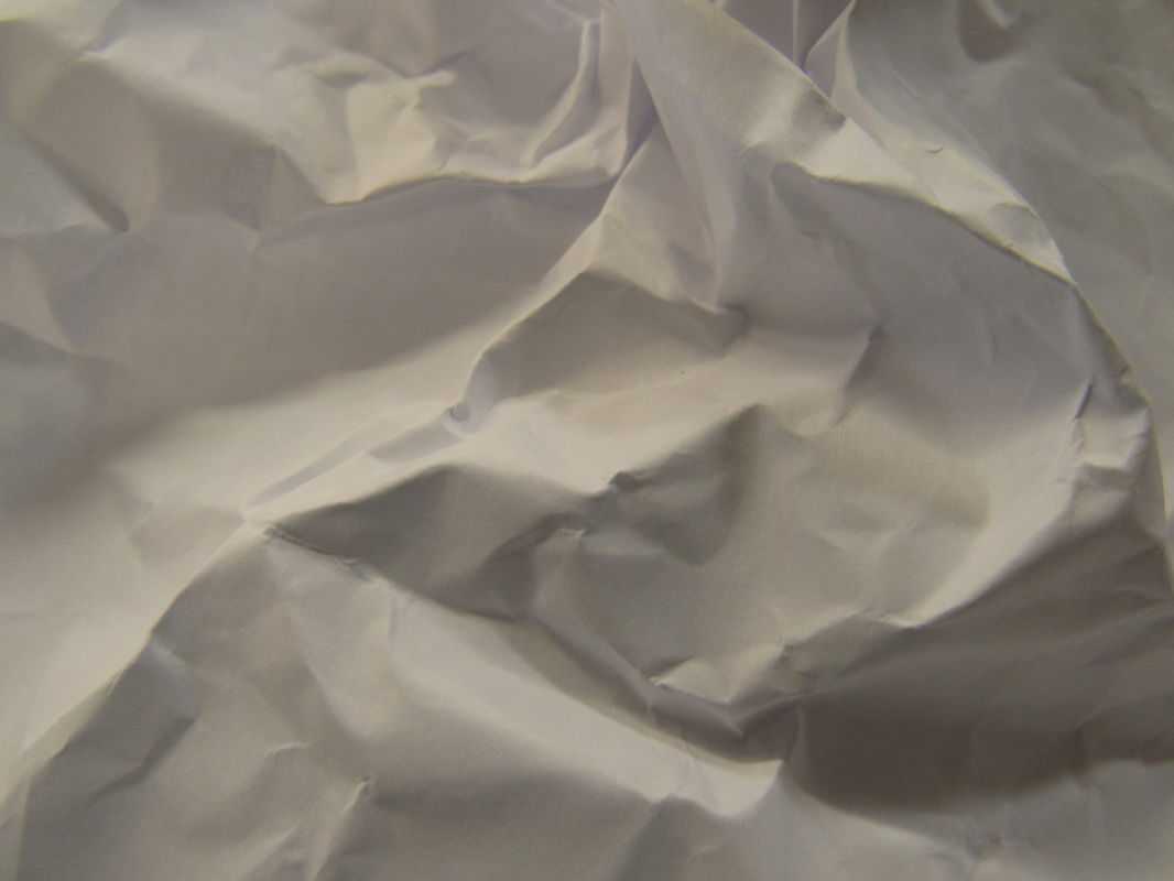
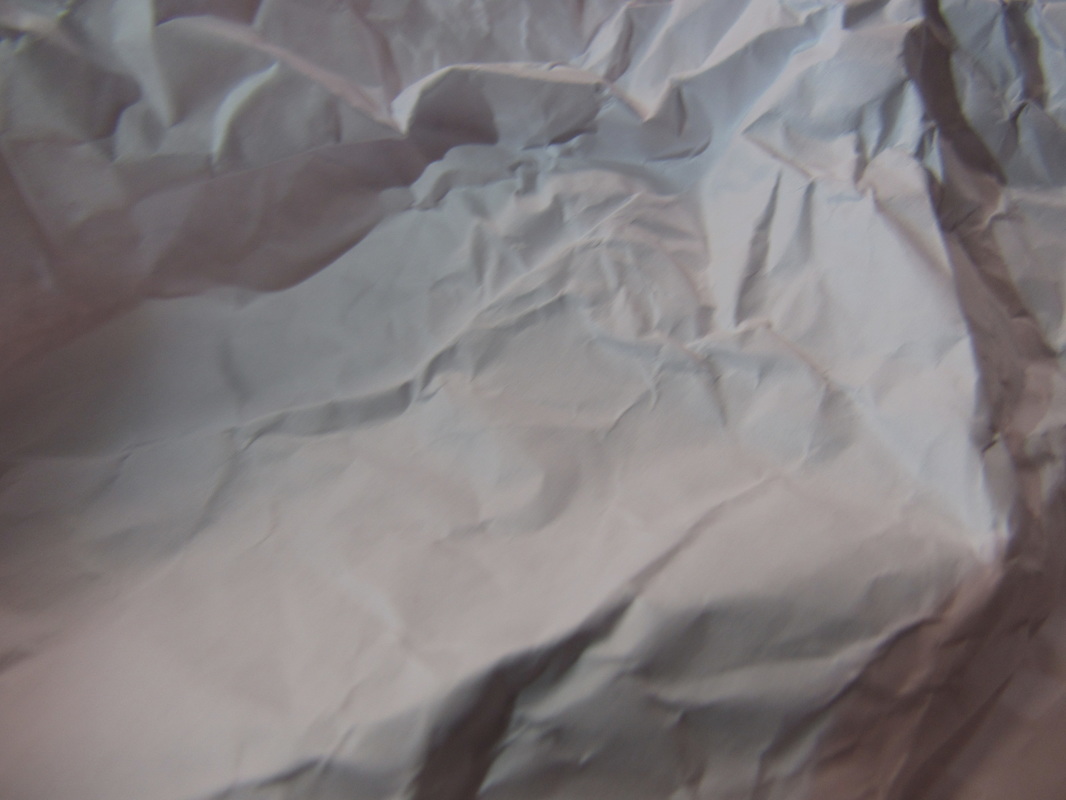
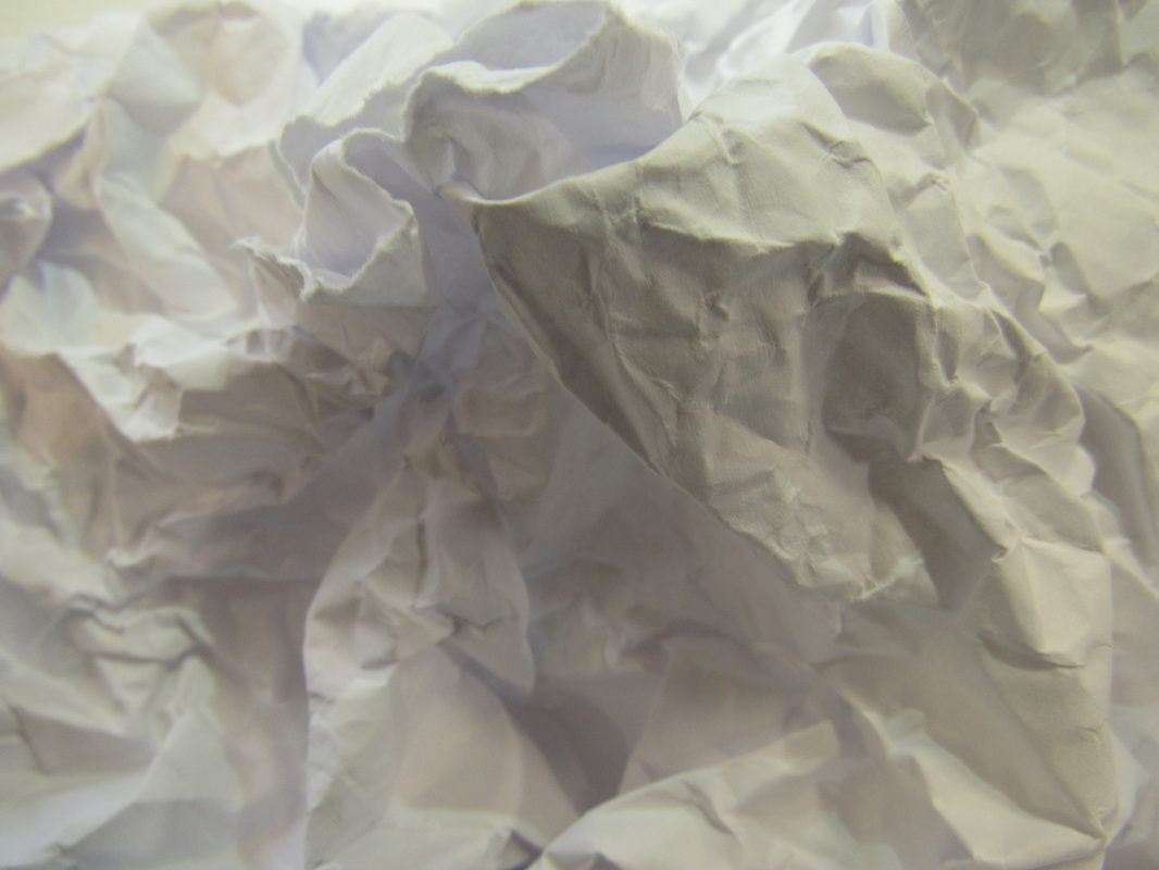
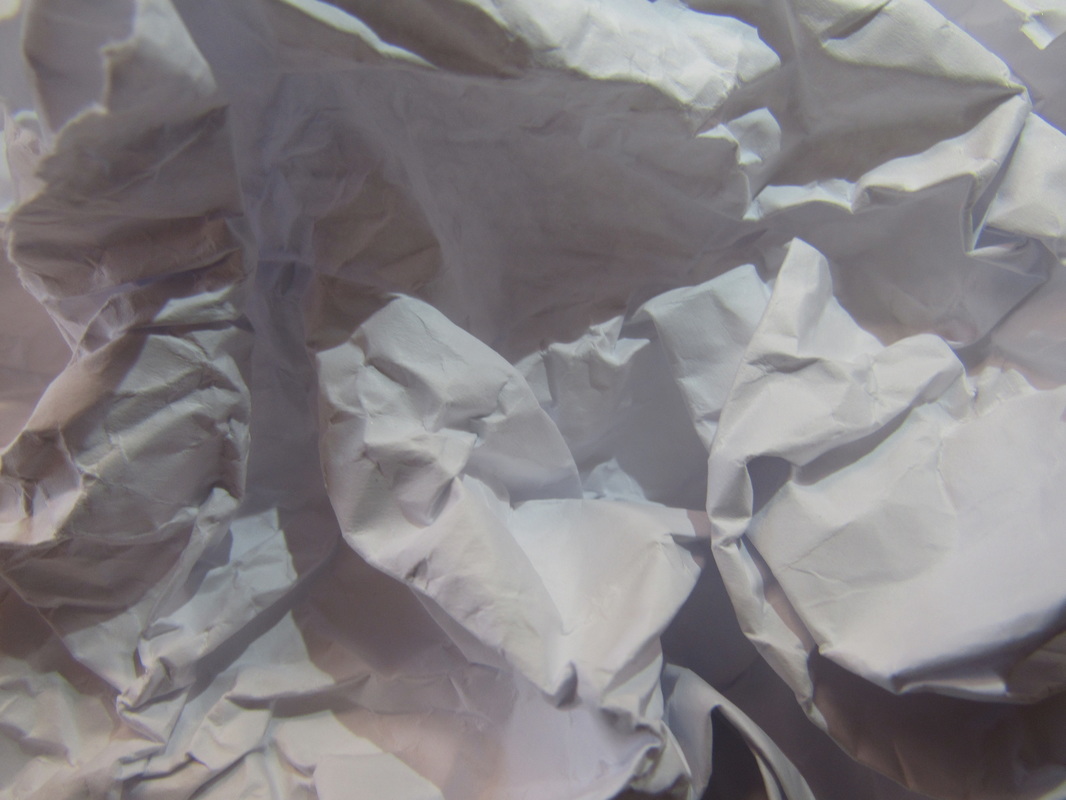
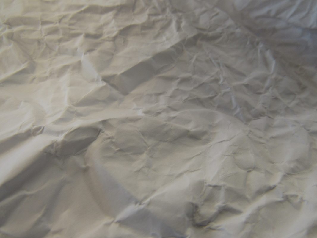
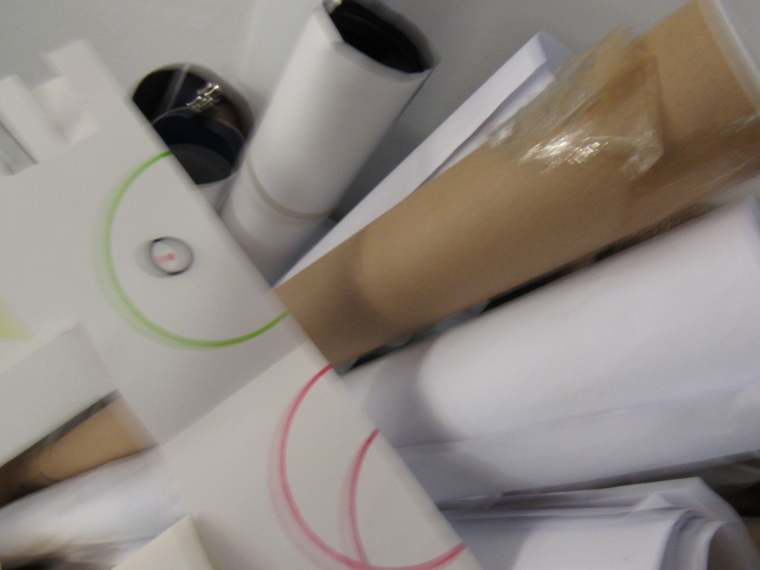
For this challenge, I decided to take a variety of photographs using only a piece of paper not to draw on the paper or incorporate anything else into the image to harness it in its full simplicity, using just light, shadows, angles and creases to accompany it. I found this task difficult to approach at first, due to the freedom of my goal which was to create something beautiful and abstract by using something very basic. The hardest part about the task was trying not to take the same picture twice, but I don't think I did this anyway. For the first group of pictures, I used soft, natural light from the windows an for the rest of the pictures I used the artificial light from my phone. I like the pictures with artificial light better because they produce a cleaner, sharper image and it permitted me to be more creative using lines and shadows.
The surface of the paper looks like is has a rough and crumpled surface and has a lot of layers and depth. The lines created by the creases and light are quite jagged but some are curved and some are straight. Something that I like about the pictures would be that due to the simplicity of the pictures you can visualise other shapes or objects in the image. For example, there are many triangles in the images and some of them look like snowy mountains, it shows how basic objects can create something imaginative.
The surface of the paper looks like is has a rough and crumpled surface and has a lot of layers and depth. The lines created by the creases and light are quite jagged but some are curved and some are straight. Something that I like about the pictures would be that due to the simplicity of the pictures you can visualise other shapes or objects in the image. For example, there are many triangles in the images and some of them look like snowy mountains, it shows how basic objects can create something imaginative.
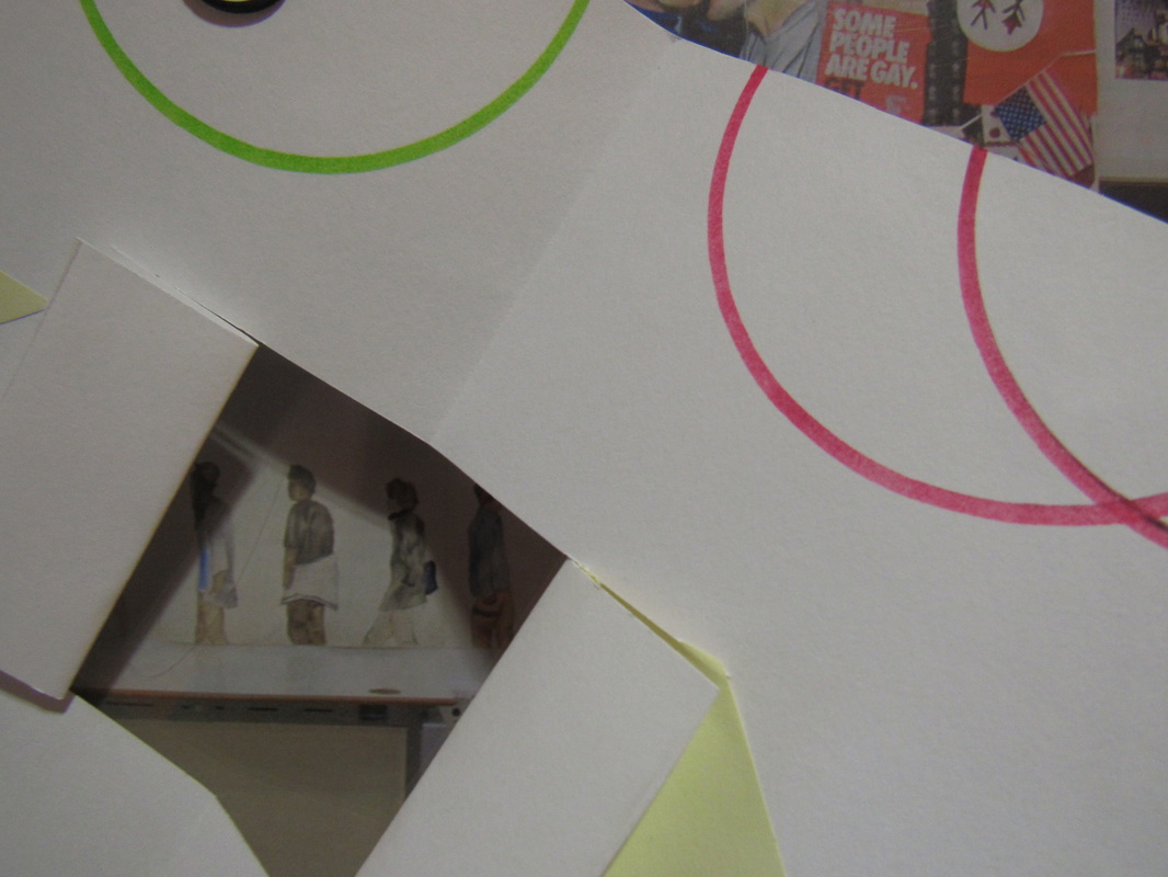
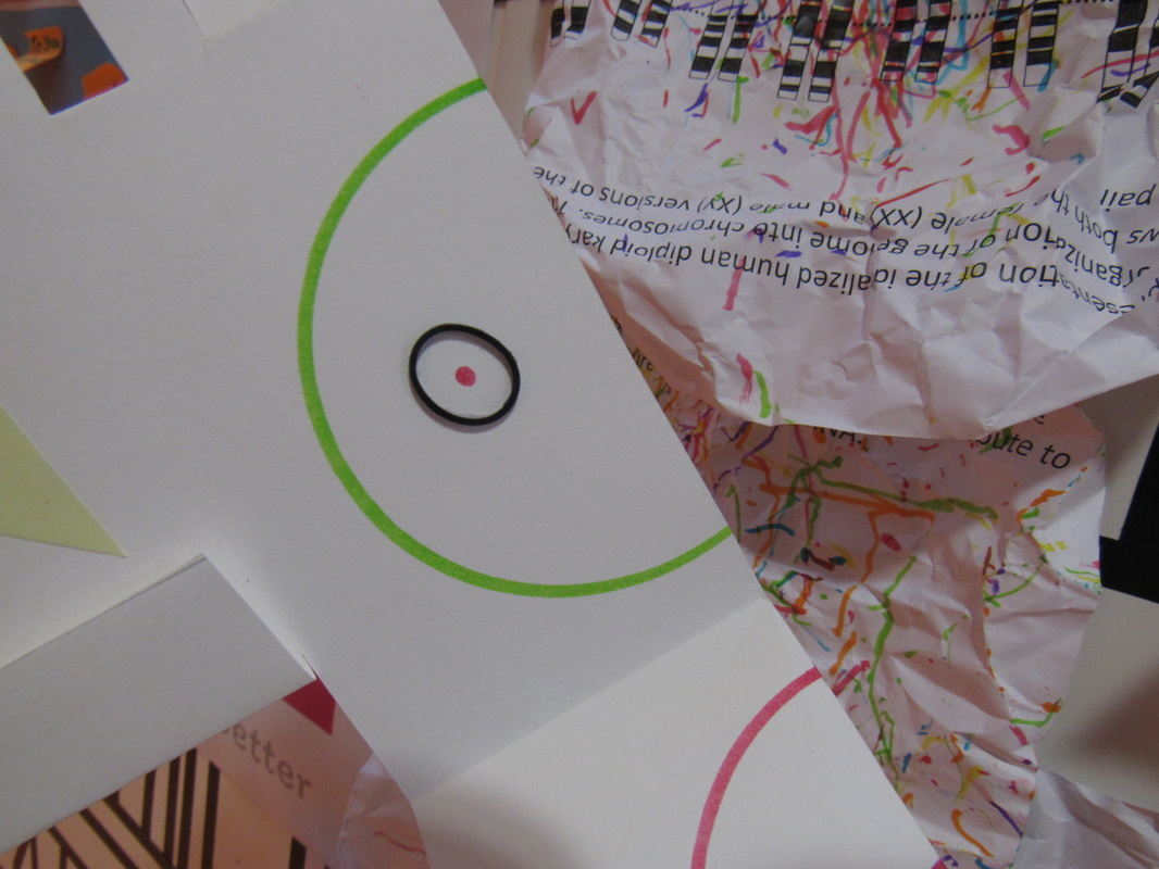
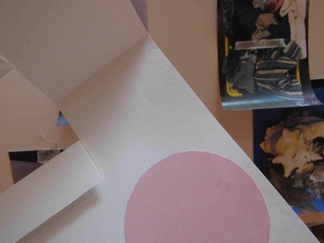
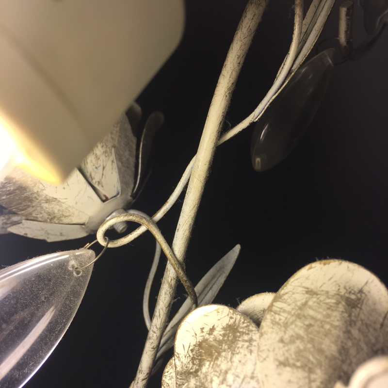
I thought it would be interesting to use the sculptures that I had already made from a previous lesson and photograph it in different focuses and backgrounds. The hardest part of this task was trying to make the images out of focus. I this experiment because there was quite a lot of freedom with what I had assigned myself, but I wasn't too confident to begin with. However I do think the majority of the images I have taken look abstract which essentially was my fundamental goal. I like how the photos combine together in a collage but individually there isn't one particular picture that stands out to me. Moreover, I like taking photos in the art department as there is a lot of creativity which can become a impressing component of the images and may also inspire my work. One aspect of this project I found to be difficult was limiting the artwork in my image. I wanted to avoid using other people's work and crediting it as my own, hence I tried to restrict using the artwork slightly.
Abstraction homework:
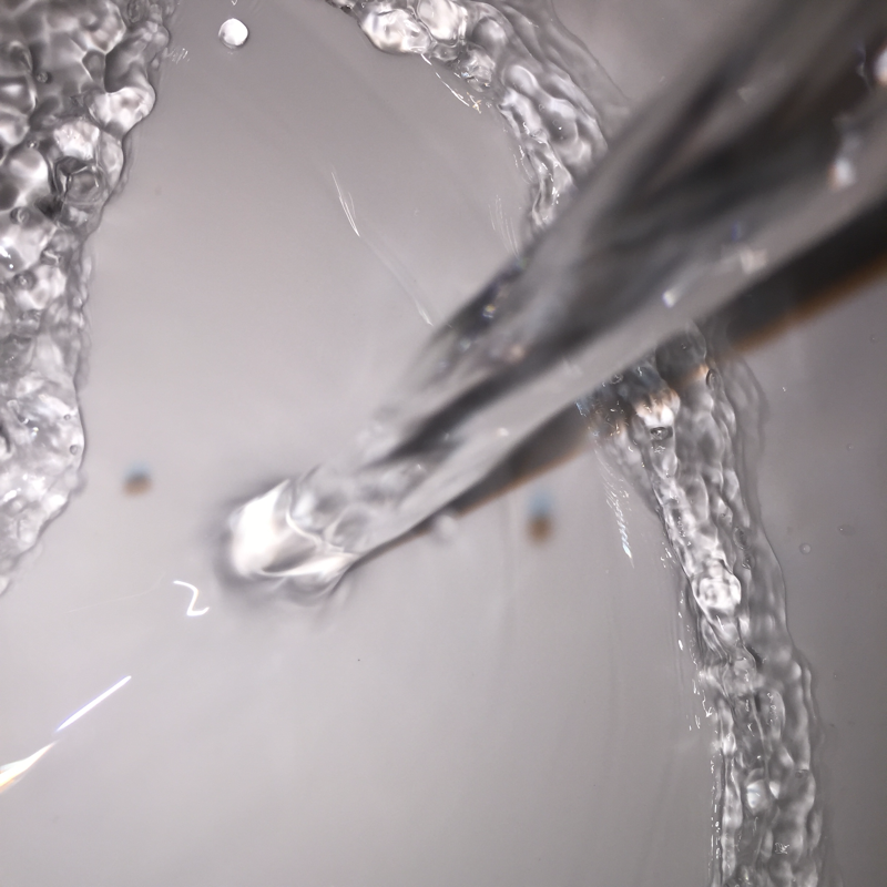
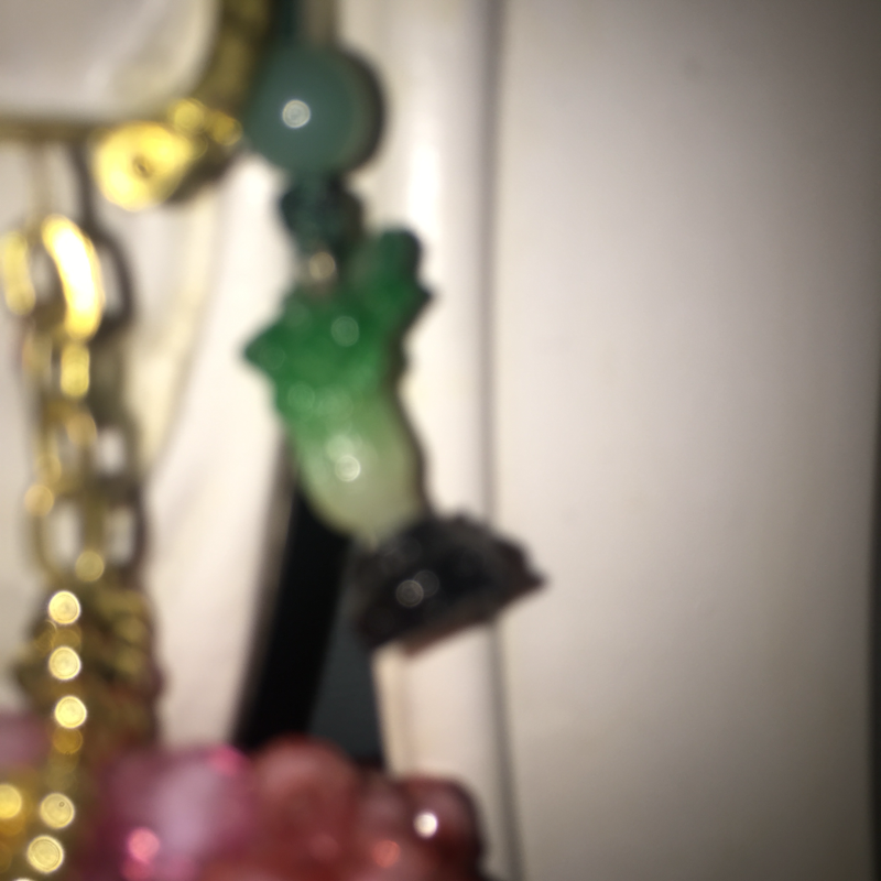
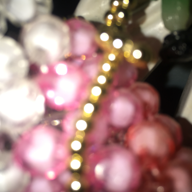
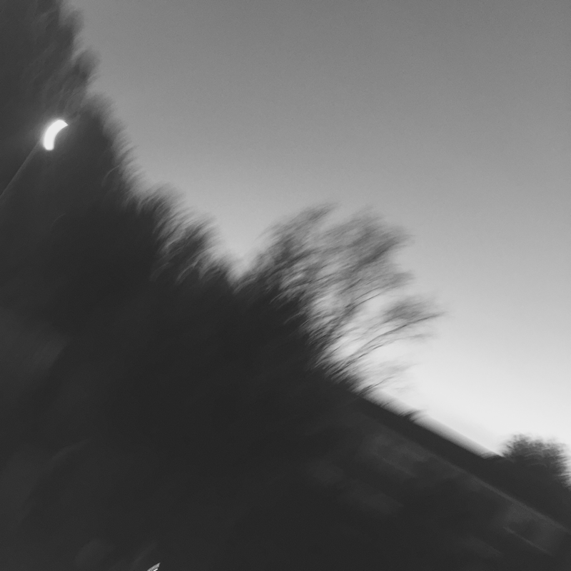
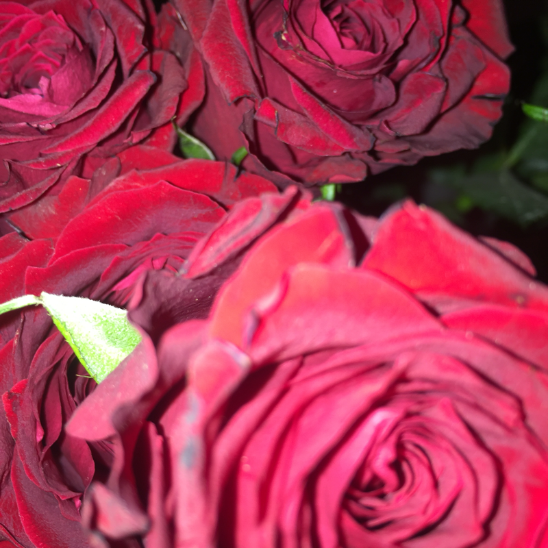
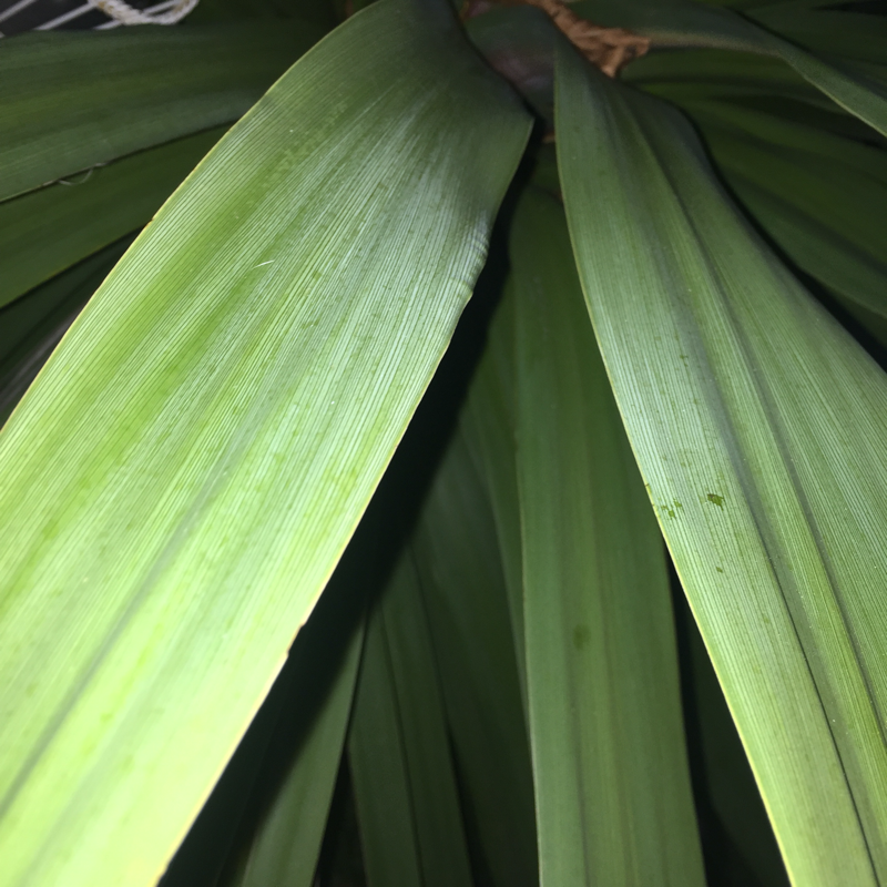
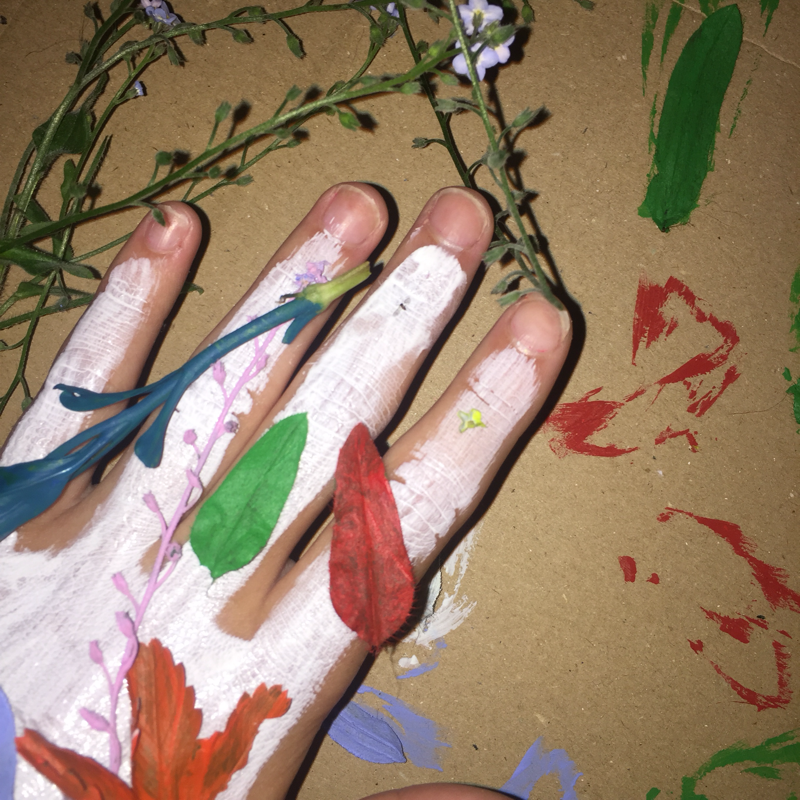
For my personal abstraction quest, I chose to explore the topic by taking a selection of photos that were all out of focus or close up. I enjoyed doing so as there was alot of freedom in this task, so I liked taking photos of things I don't that often, such as plants and nature. I liked all of the images I produced and I feel like I successfully created some abstract images. One aspect of the task that i found challenging was to go take very close up images, beyond what im used to or what was comfortable to me. However, when I did I was very happy with the results and began to be more imaginative.
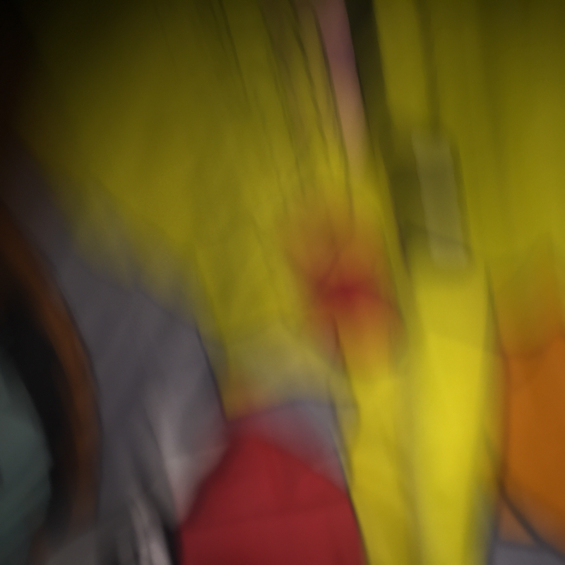
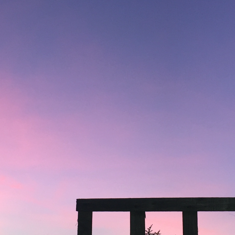
Dramatic cropping was one of my main focuses for this task. I tried to incorporate this into my photographs by taking pictures from different angles and cropping them, in different ways. Once i had taken many images, I chose the ones that I liked the most and uploaded them. Personally, the photos that I like the best from this task are the ones with vivid splashes of colours.
Dramatic cropping was one of my main focuses for this task. I tried to incorporate this into my photographs by taking pictures from different angles and cropping them, in different ways. Once i had taken many images, I chose the ones that I liked the most and uploaded them. Personally, the photos that I like the best from this task are the ones with vivid splashes of colours.
Saul Leiter
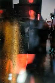
From these images, we can see that Leiter is fond of using bright colours, reflections and a variety of weather conditions in his images. I really like his style and I like how the reflections commonly used in his pictures warp the image make you question what is actually present in the photograph. The bright and vibrant colours also frequently used in his pieces make them stand out and make them different. I like the fact that his work is different and has the power to create illusions and I think that Leiter perfectly captures abstraction in his images. Saul Leiter has influenced the way I take my own images because the way he uses windows/reflections is visually appealing and I aspire to apply some of his ideas into my own work. The way the reflections are capable of manipulating his photos is definitely something I will be trying in the future.
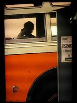
I chose to evaluate this particular image by Saul Leiter as the bright blocks of colours stood out to me immediately and I like the contrast that is also created due to this. The image is unusual because the image is taken from the outside of the bus and there are two windows in the image that we can see through, and although we are initially drawn to the red in the picture there are a lot of other elements in the background of the photo that also stand out. I think that light plays an important role in this picture as there are some darker shadows in the image yet some components are bright and vibrant. The scenery in the background is made of orange and red shades which ties in with the overall colour scheme in the photo. The fact that there are some areas of darkness allow the viewer to be creative and view the photo from their own personal perspective. There is a large variety of lines in the picture but almost all of them are straight lines, and they form geometric shapes. Yet the image is taken from a straight angle so the lines in the photo are parallel but slightly diagonal.
John Baldessari
Baldessari is an American photographer/artist who creates abstract images. He is famous for once saying 'I will not make anymore boring art,' and in the views of many, sticking to his word. Furthermore, he is largely recognised for his unusual hobbies such as searching for old photgraphs in bins and making them his own by giving them an abstract feel. Personally, I really like his work, I like the boldness that he adds to black and white pictures by using vibrant primary colours. By doing so, a picture that was once simple and formal is infused with quirkiness and vivid colour. In his work he creates his own world where there is never a lack of colour or excitement. Interestingly, Baldessari was initially a painter and I think that this shows in his ability to observe and appropriate images by adding his own artistic observation.
Hannah Hoch:
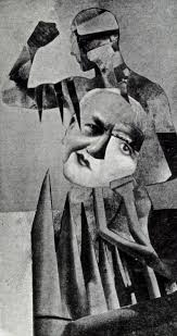
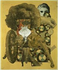
Hannah Hoch was a German Artist who used collages to create photographs that are visually striking and unique. She is also known as being a feminine icon and not allowing her gender to define her or her art. I think she was an inspiring artist and she produced high quality abstract peices throughout her career. There isnt a huge range of colours within her pictures, however, she still managed to generate a distinctive style in all of her work. She also made statements about racial and gender equality in her work which is portrayed by different people's body parts being united as one work of art in her collages. Additionally, she promoted the concept of women pursuing more creative roles in society by doing so herself and and using women as a focus of her work.
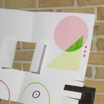
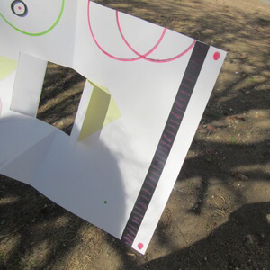
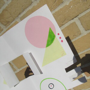
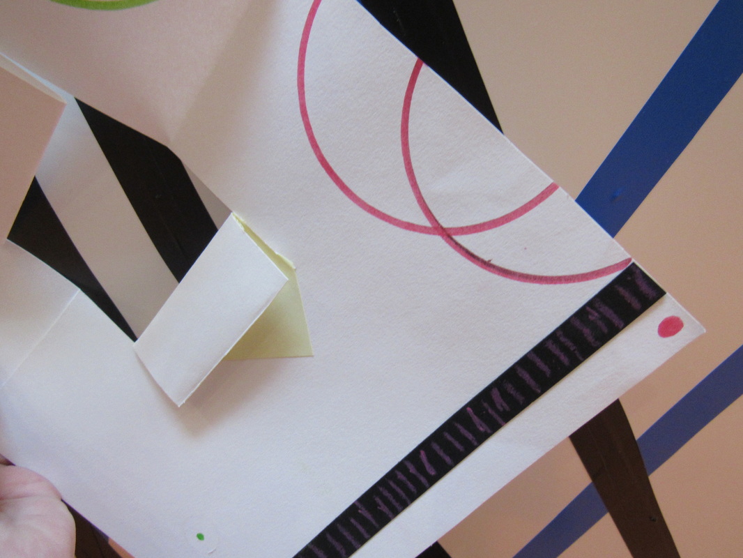
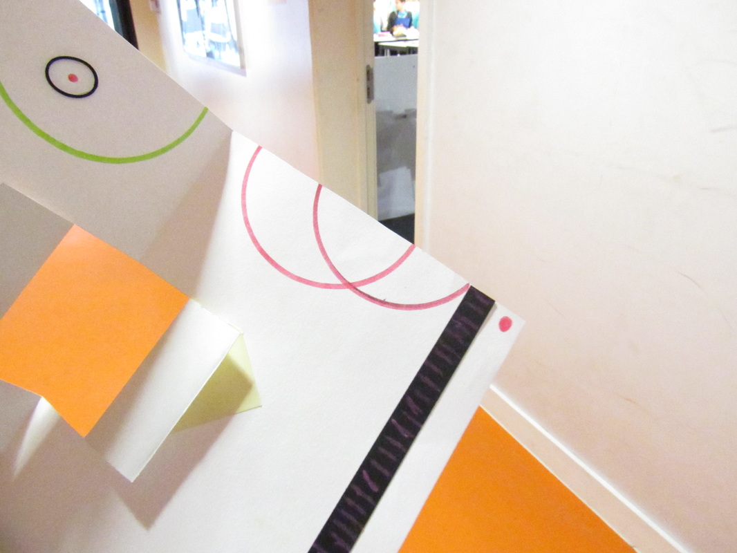
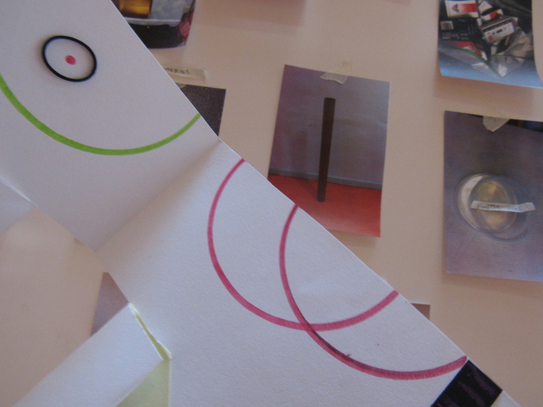
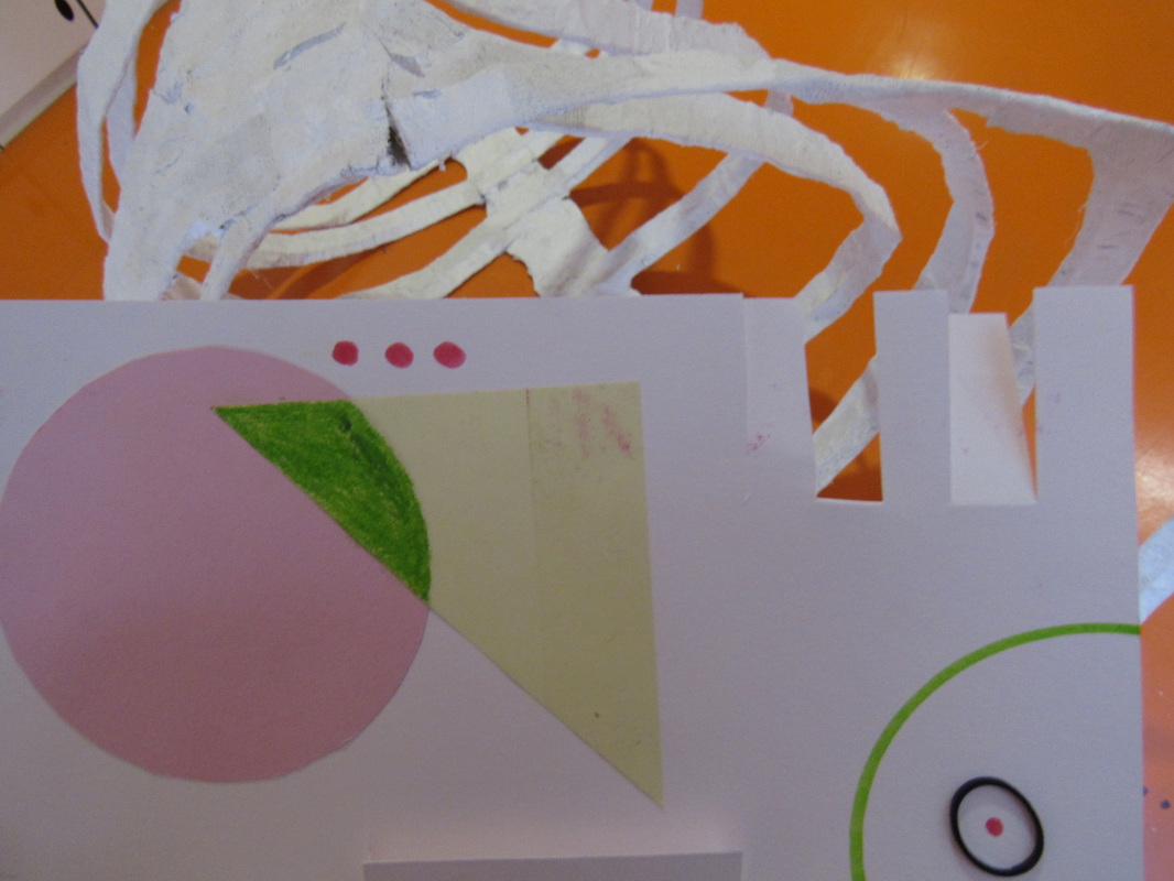
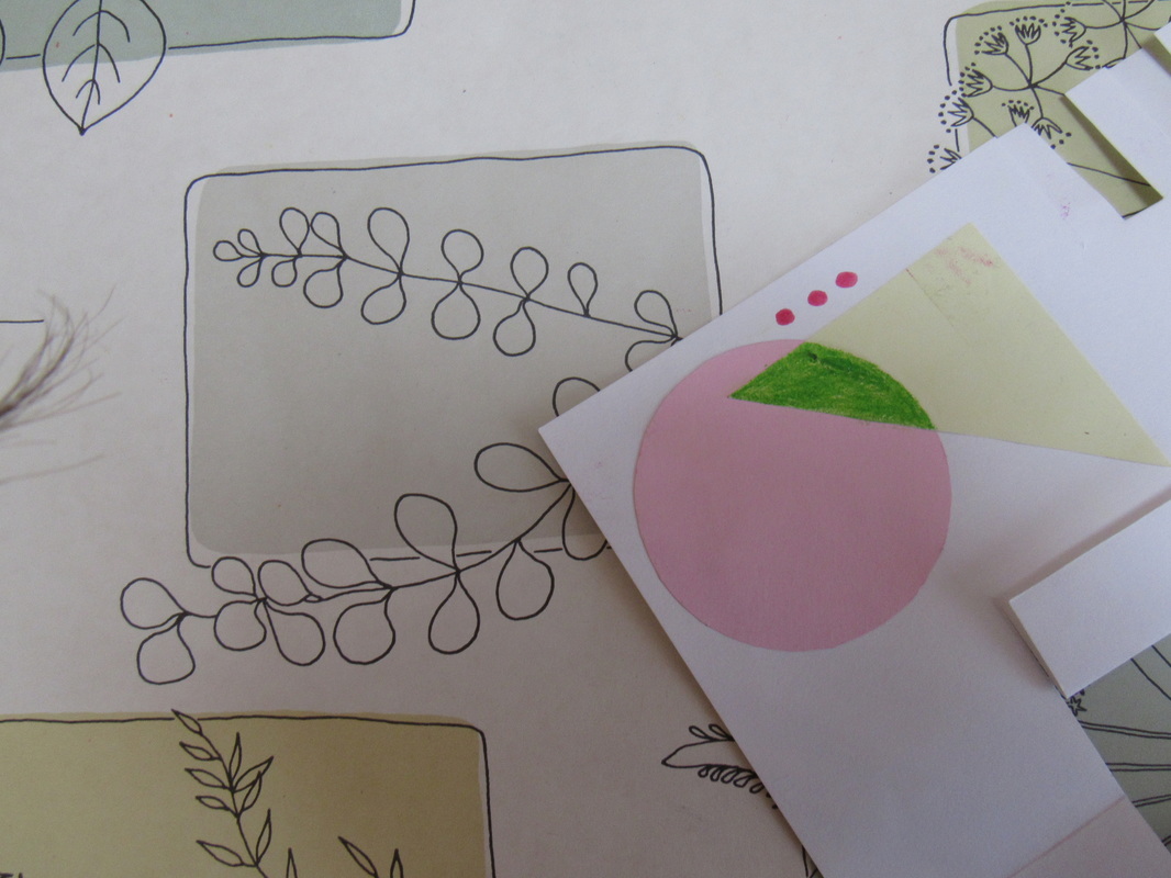
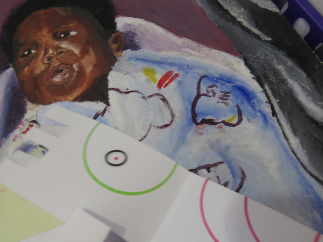
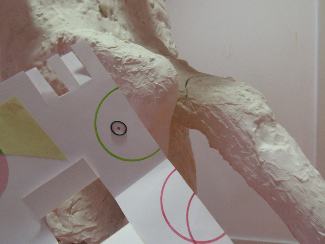
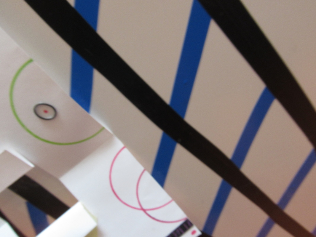
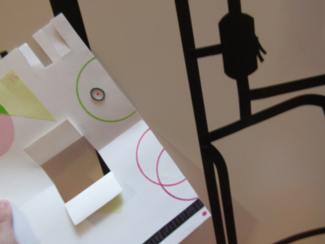
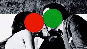
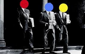
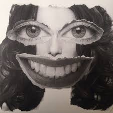
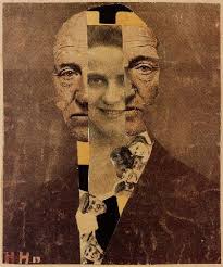
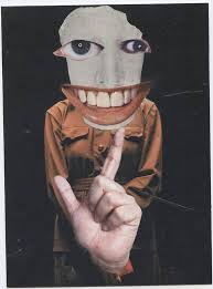
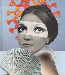
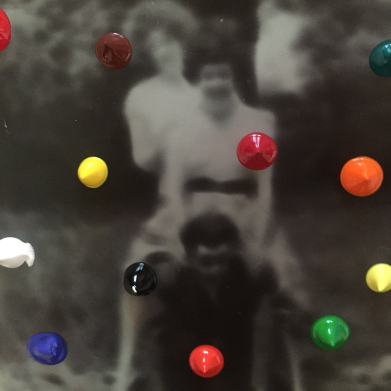
My work inspired by Hannah Hoch and John Baldessari
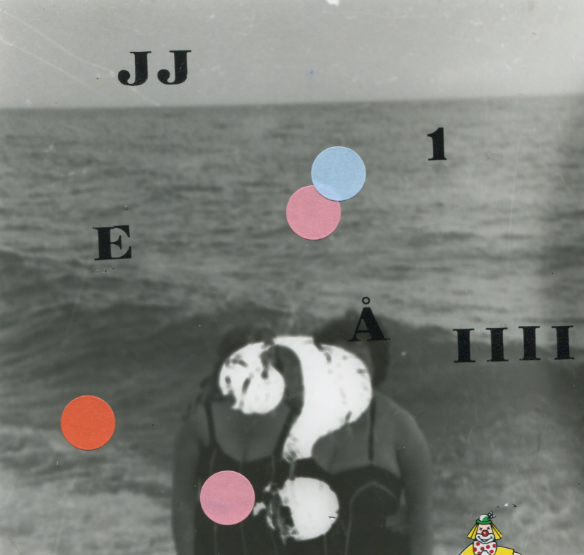
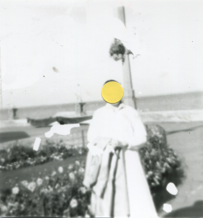
These peices I have created were influenced by the style and use of abstraction by Hannah Hoch and John Baldessari. I think overall my photographs were relativley successful however, there are things that I dislike too, for example, the cropping of my images. However, I do particularly like how the original images are in black and white. This makes the multicoloured dots stand out more and create a distinctive image, analogous to that of John Baldessari's work. My images are also influenced by Hannah Hoch's style because I have created a collage effect to create a completely new image. By adding my own prints and stickers I have produced a unique image, modified completely from the original to make it my own. The simplicity of the second image really appeals to me, it allows the viewer to be able to focus more on other elements of the image opposed to trying to interpret the letters and numbers in the first photograph. The yellow sticker provides a high contrast from the black and white causing it to stand out. This draws our attention to the person in the image despite the fact that their face is concealed behind the sticker. This further enables the viewer to ask question and process the image in their own way.

Final Peice:
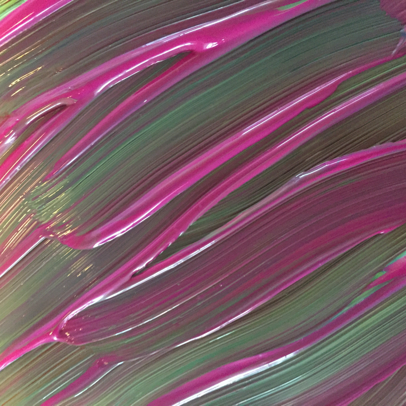
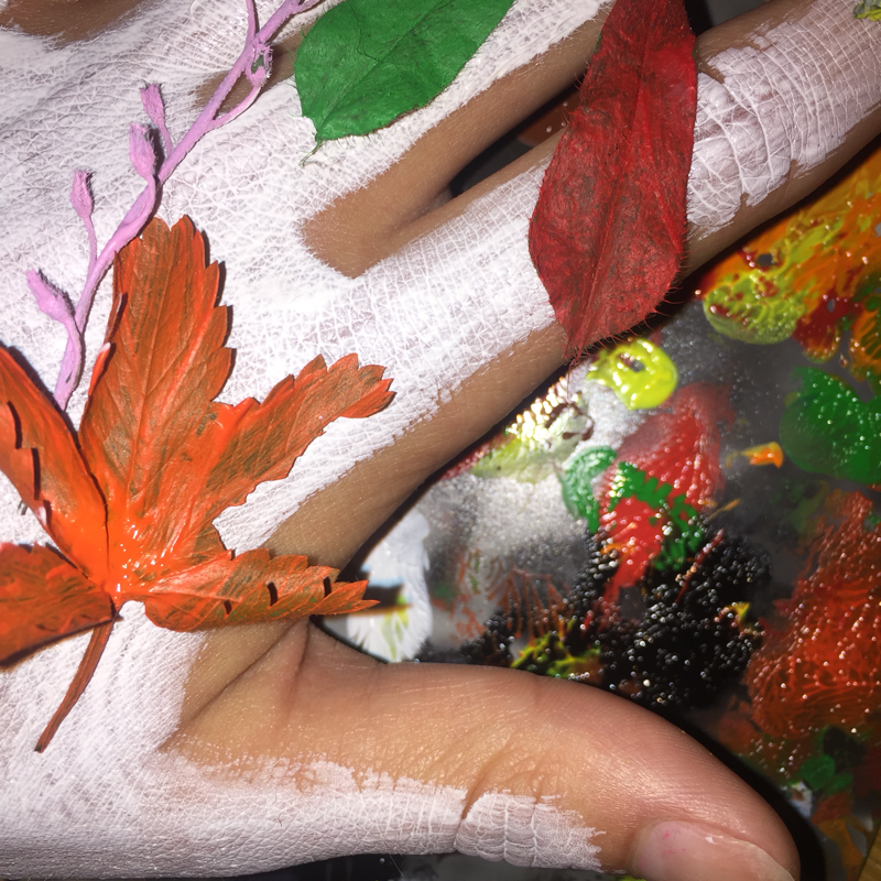
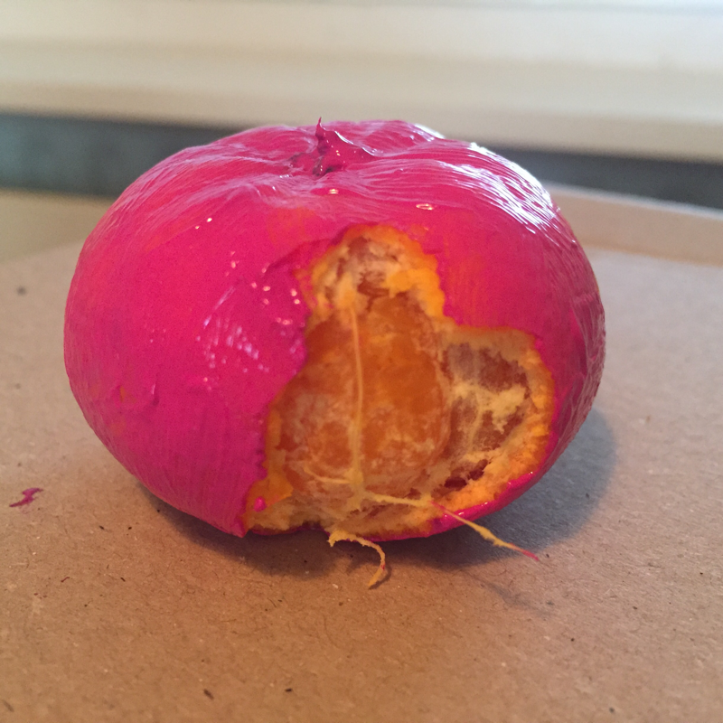
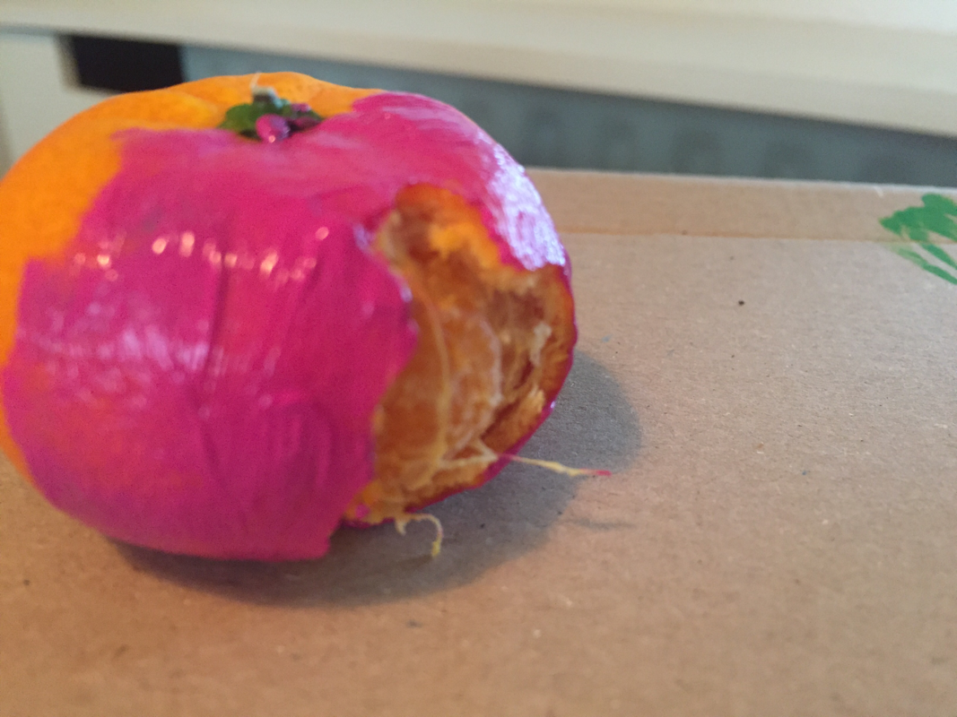
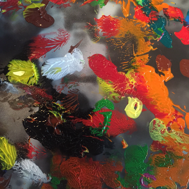
I decided to chose only one image as my final peice purely because it is bold and captivating enough on its own and I think it is quite a powerful photograph. As it is split in half, it has allowed me to almost combine two images into one and each section has a variety of activity within it. I used old negatives found from a junkyard and used dots of bright paints then mixed them all into eachother to allow new colours to form. The irregularity of the pattern as a result of sporadic movements creates quite an abstract ambience as it is fairly unique.
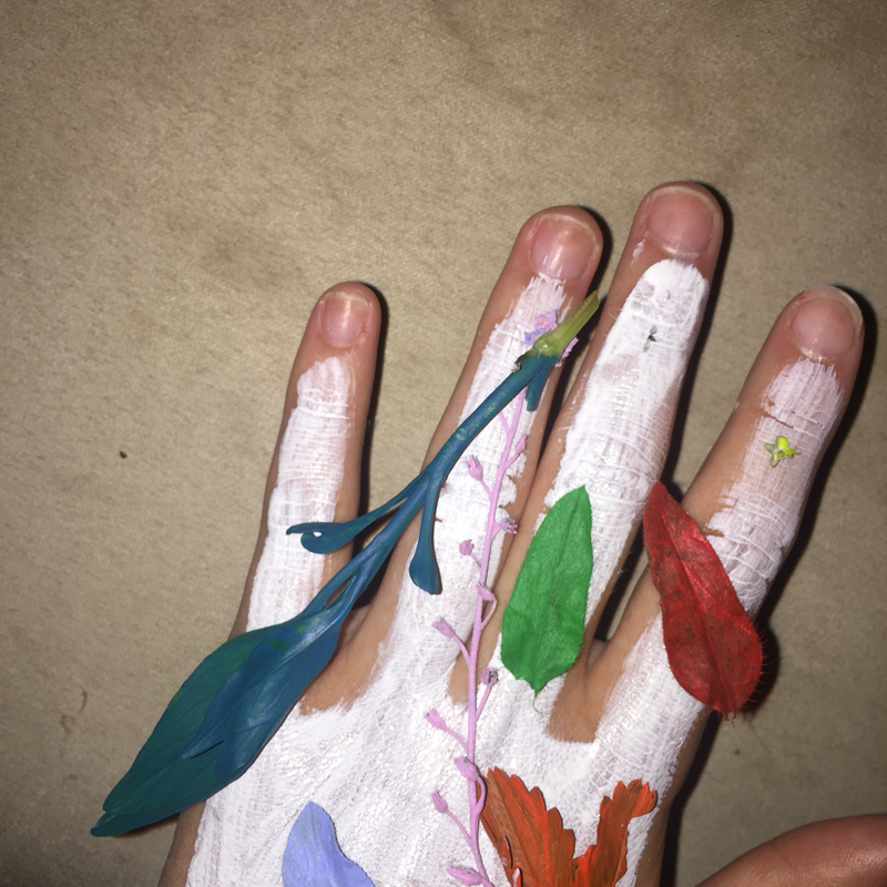
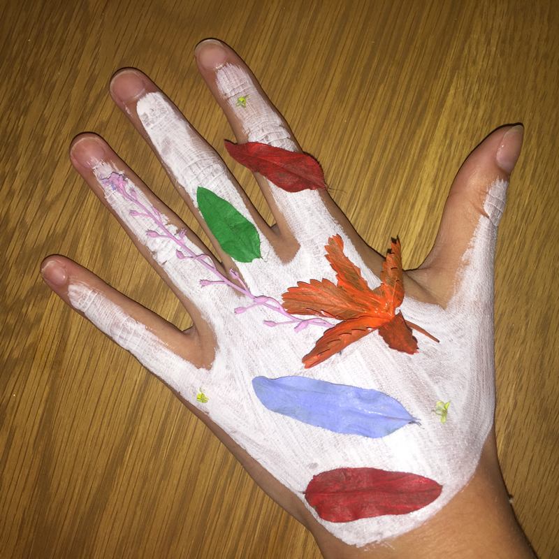
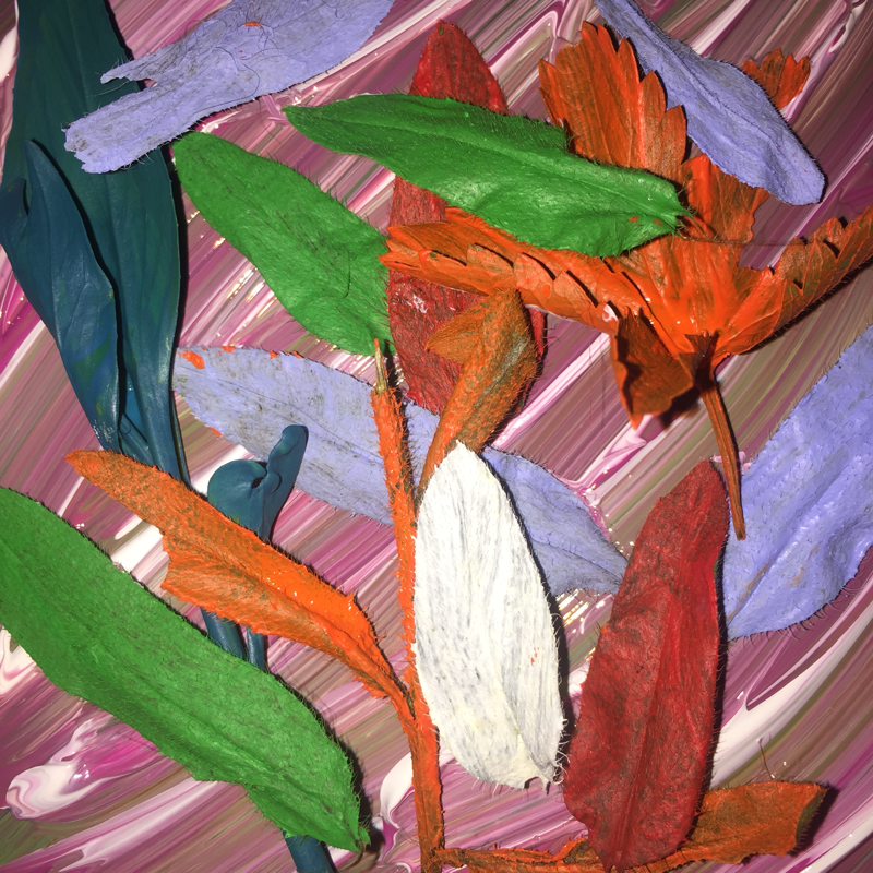
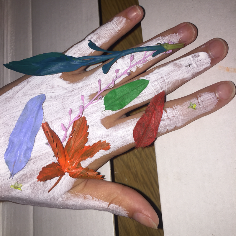
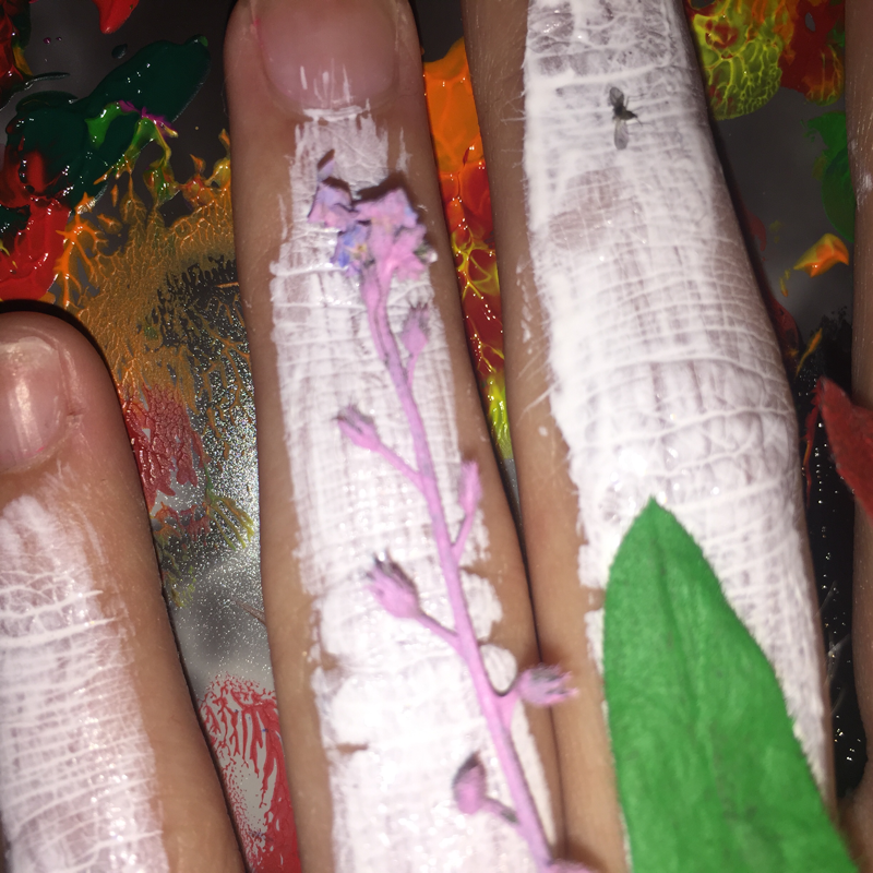
On the opposing side of the image, I painted small leaves with vibrant colours to make them appear more lifelike but still abstract and out of the ordinary. I placed these leaves in no particular order on some swirled paints and I think this seemed to illuminate the leaves in the foreground. I’m very pleased with my final peice because I created my own abstract ideas visually rather than relying on chance and photographing regular objects in an abstract style. Furthermore, unlike many other abstract images I have not used any form of editing or photoshop and it is my belief that this allows my image to stand out.
On the opposing side of the image, I painted small leaves with vibrant colours to make them appear more lifelike but still abstract and out of the ordinary. I placed these leaves in no particular order on some swirled paints and I think this seemed to illuminate the leaves in the foreground. I’m very pleased with my final peice because I created my own abstract ideas visually rather than relying on chance and photographing regular objects in an abstract style. Furthermore, unlike many other abstract images I have not used any form of editing or photoshop and it is my belief that this allows my image to stand out.
